TATHOR
Services
Web, Web app, Logo design, Brand design, API, Software
Tathor is a business intelligence and competitor analysis tool. We built the brand and product from the ground up in Figma — the logo, the marketing site, the in-app dashboard, and the API — then wired billing through Stripe. Below is the build in order: the landing experience first, then the product suite pages, the dashboard, and the API and billing setup underneath it.
Hero
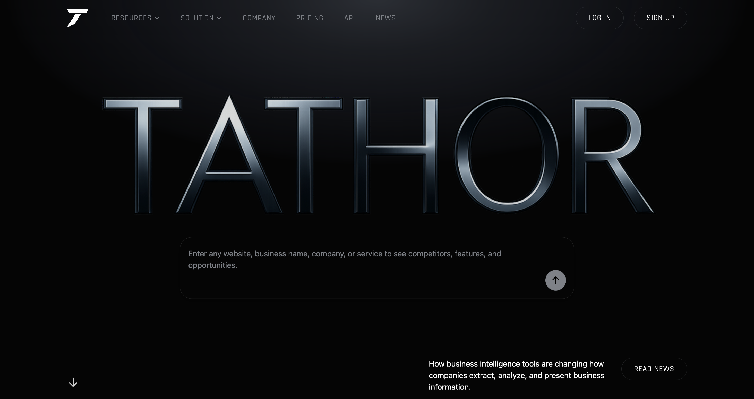
The homepage opens with the Tathor wordmark rendered in a brushed metal, chrome-style finish against a black background — it's the one place on the site where the logotype gets this treatment, so it reads as an entrance rather than just a header. Below it sits a single search field: enter a website, business name, or service, and Tathor returns competitors, features, and opportunities. No secondary hero copy competing for attention — just the mark and the one thing the product does.
Product Suite
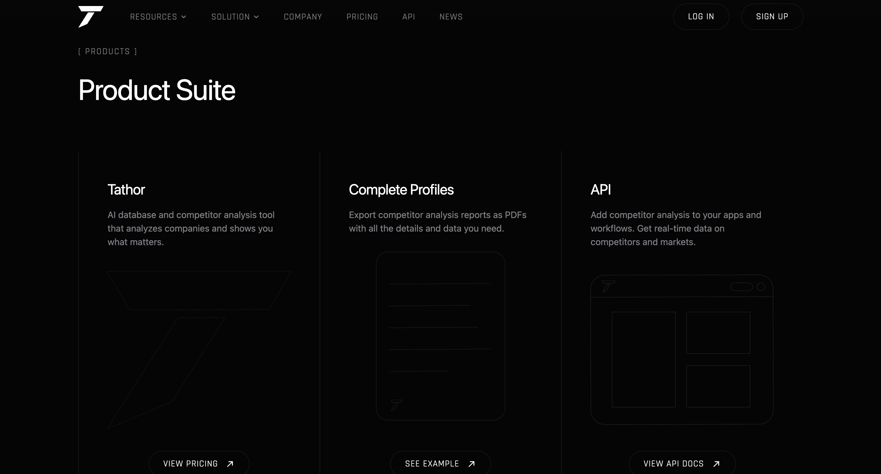
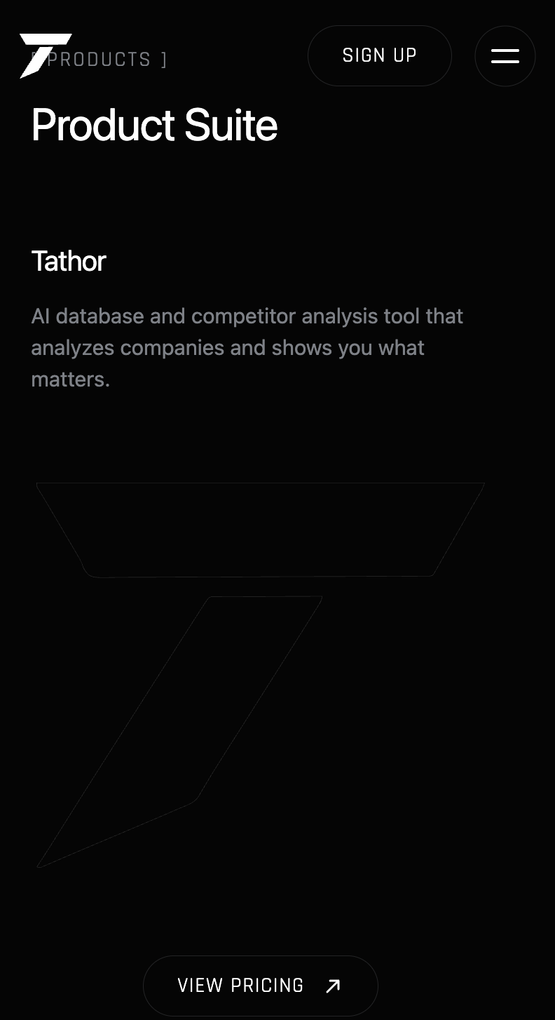
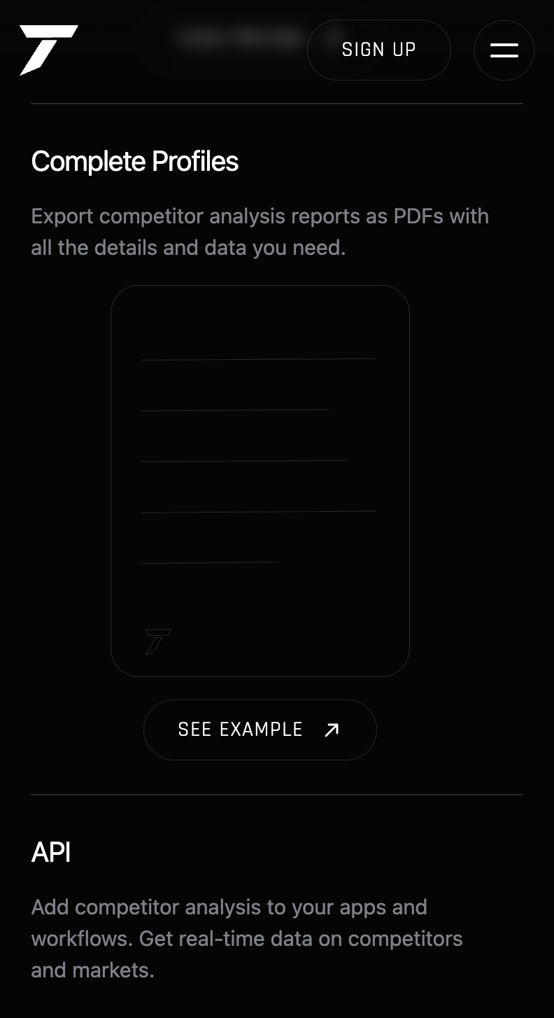
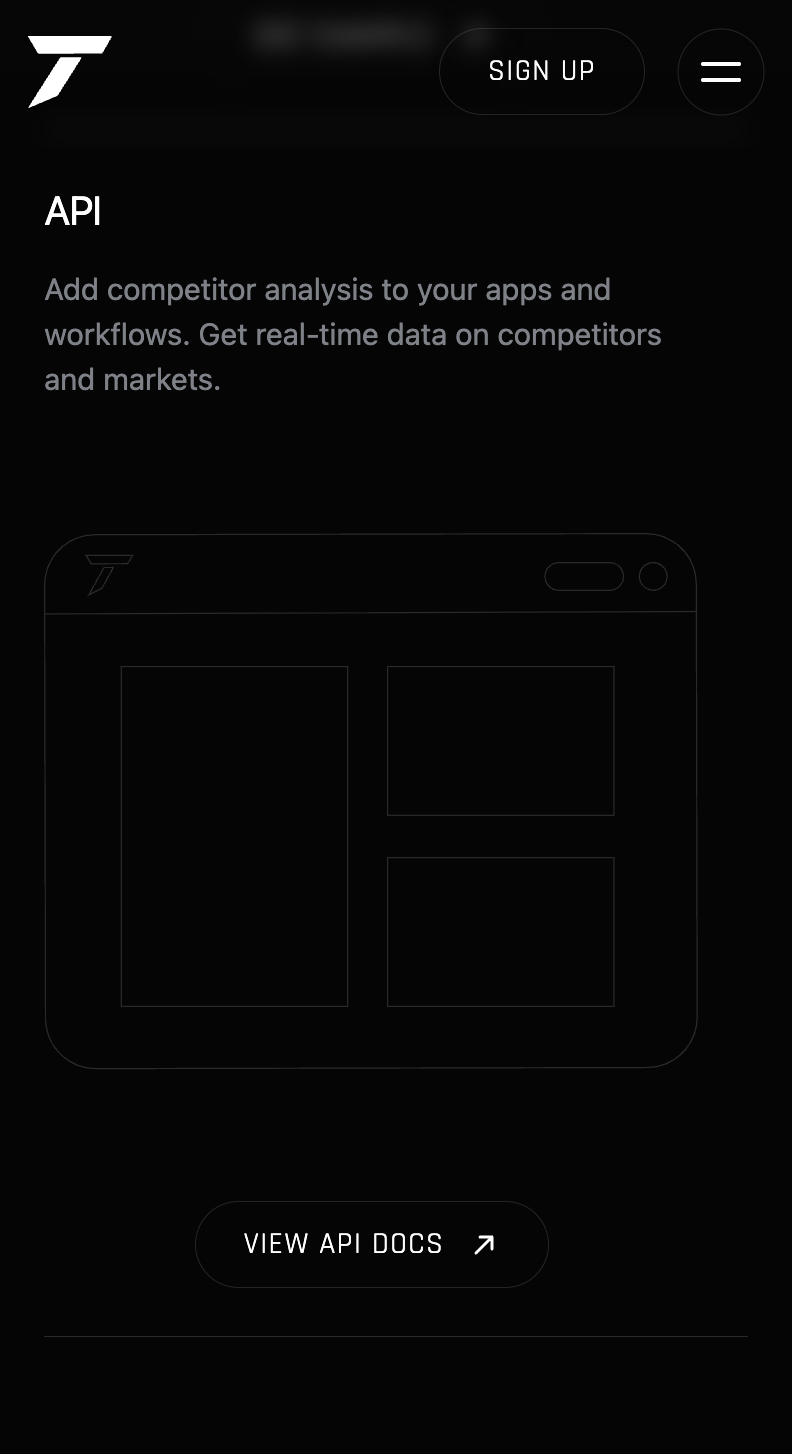
Three cards lay out what Tathor actually is: the core tool, Complete Profiles (exported reports), and the API. Each card uses a faint wireframe-style illustration instead of a photo or icon set, which keeps the page feeling technical and restrained rather than like a typical SaaS landing page. Every card links straight to what it's describing — pricing, an example report, or the API docs.
Stay ahead & Build with API
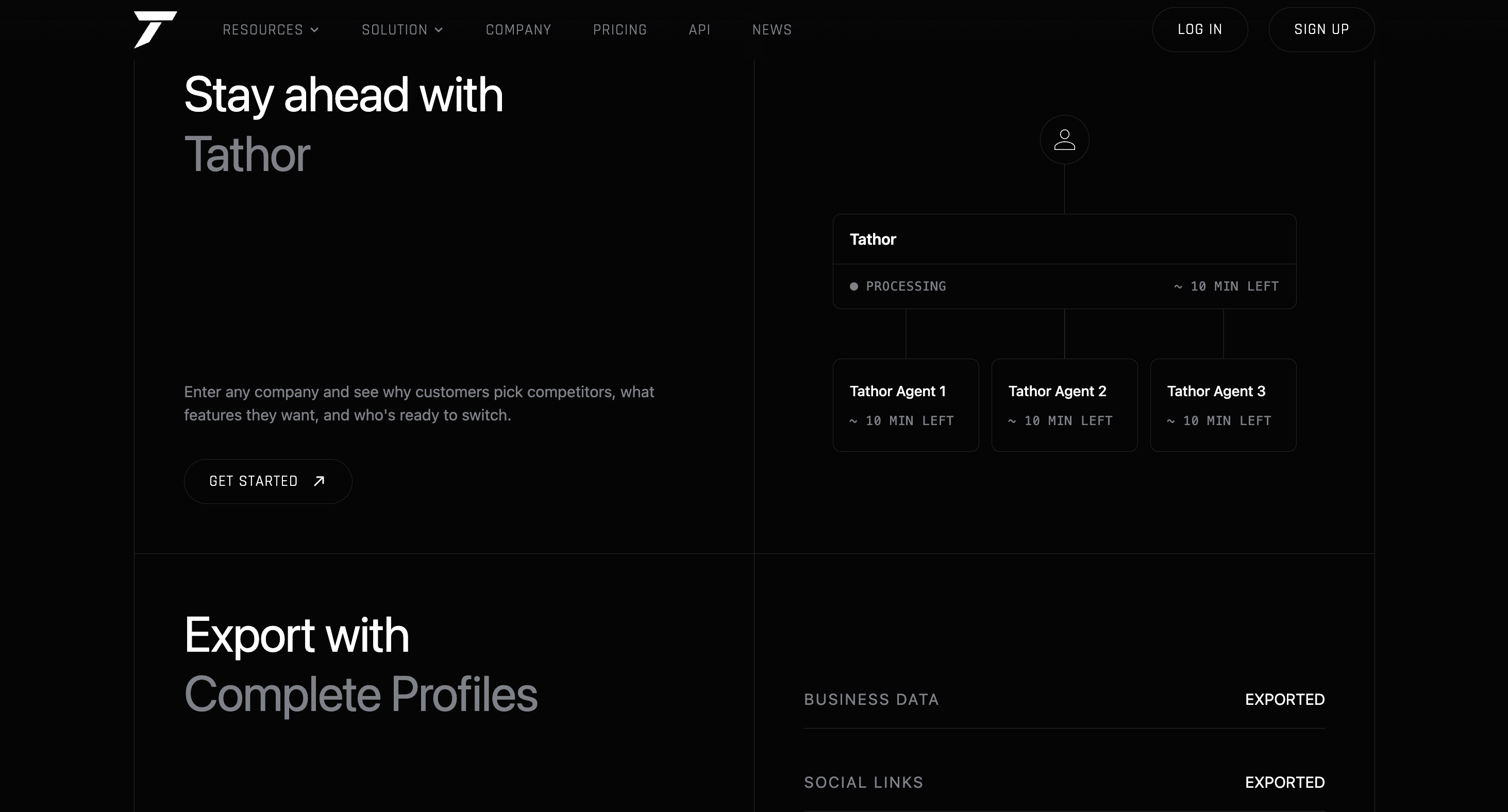
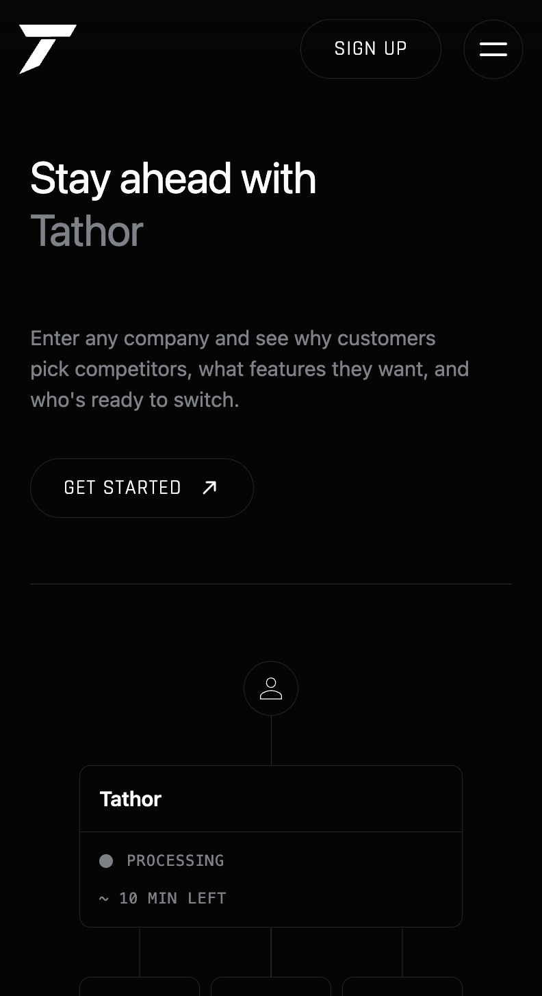
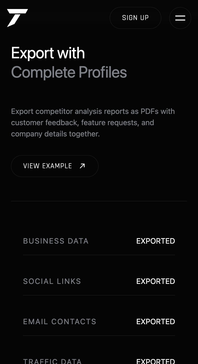
After a search, Tathor Agents process in parallel with live status and time estimates — a real look at the product working, not a staged result. When processing finishes, exports list business data, social links, and email contacts, each marked as exported.
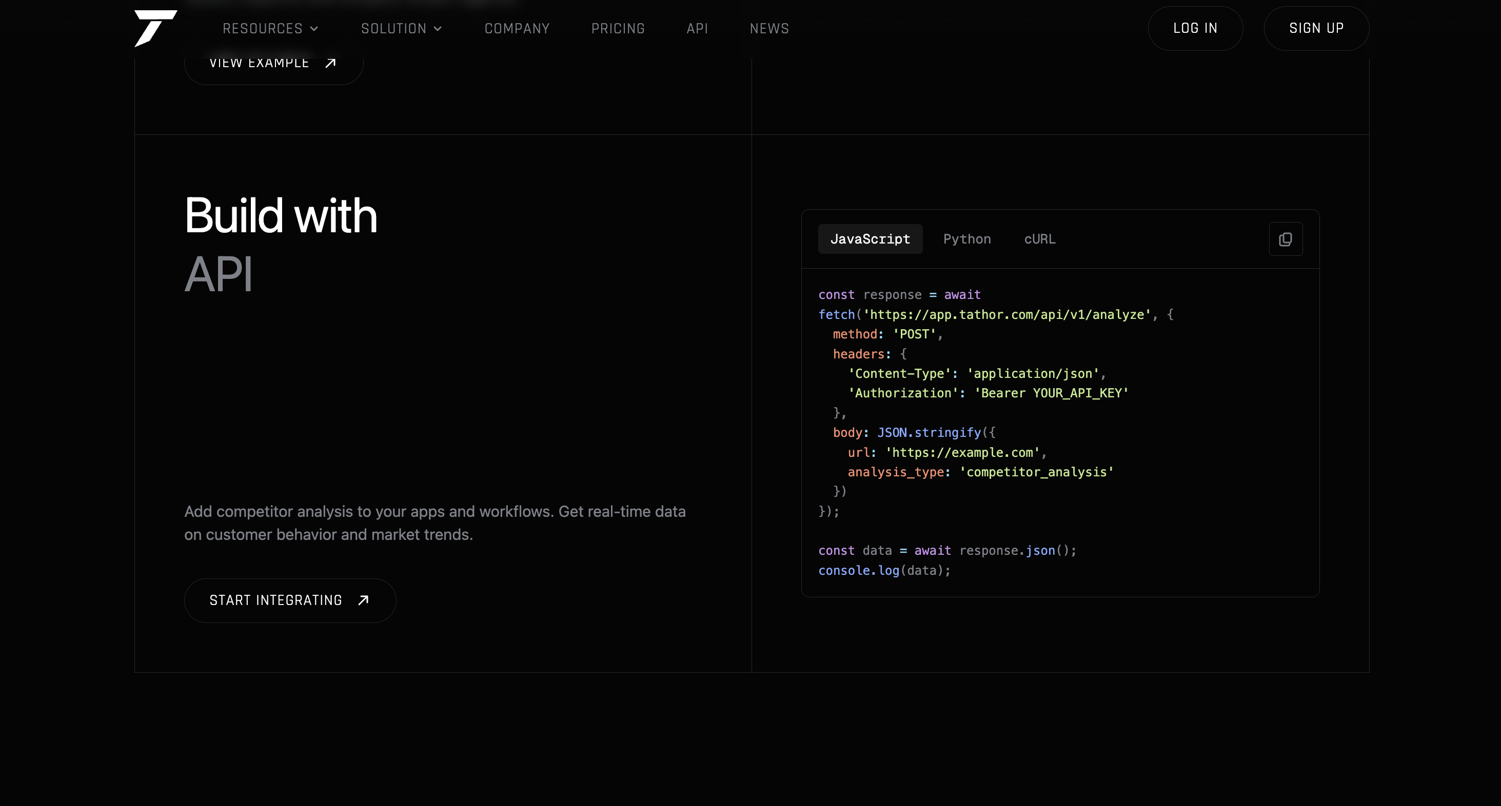
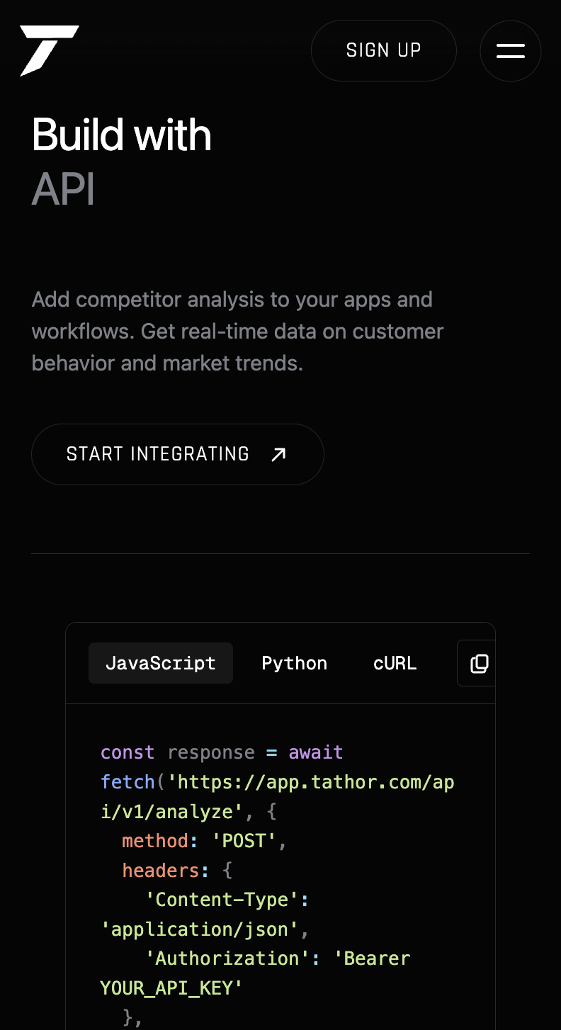
The API section shows a live code sample — JavaScript, Python, or cURL — hitting the analyze endpoint directly, with the request and response shape visible. Showing the real request instead of describing the API in prose is aimed at developers who want to see the shape of the data before reading anything else.
Latest News
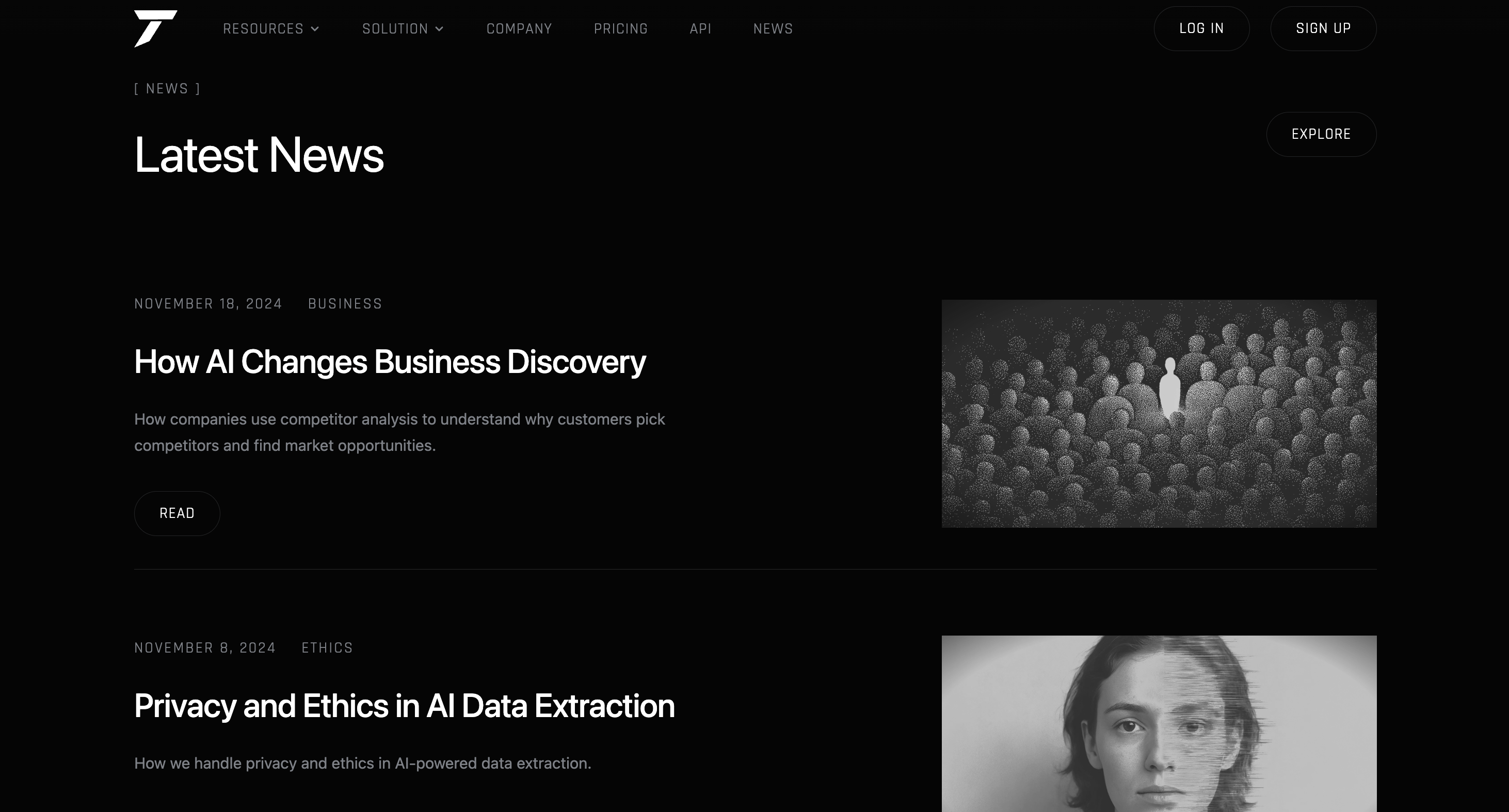
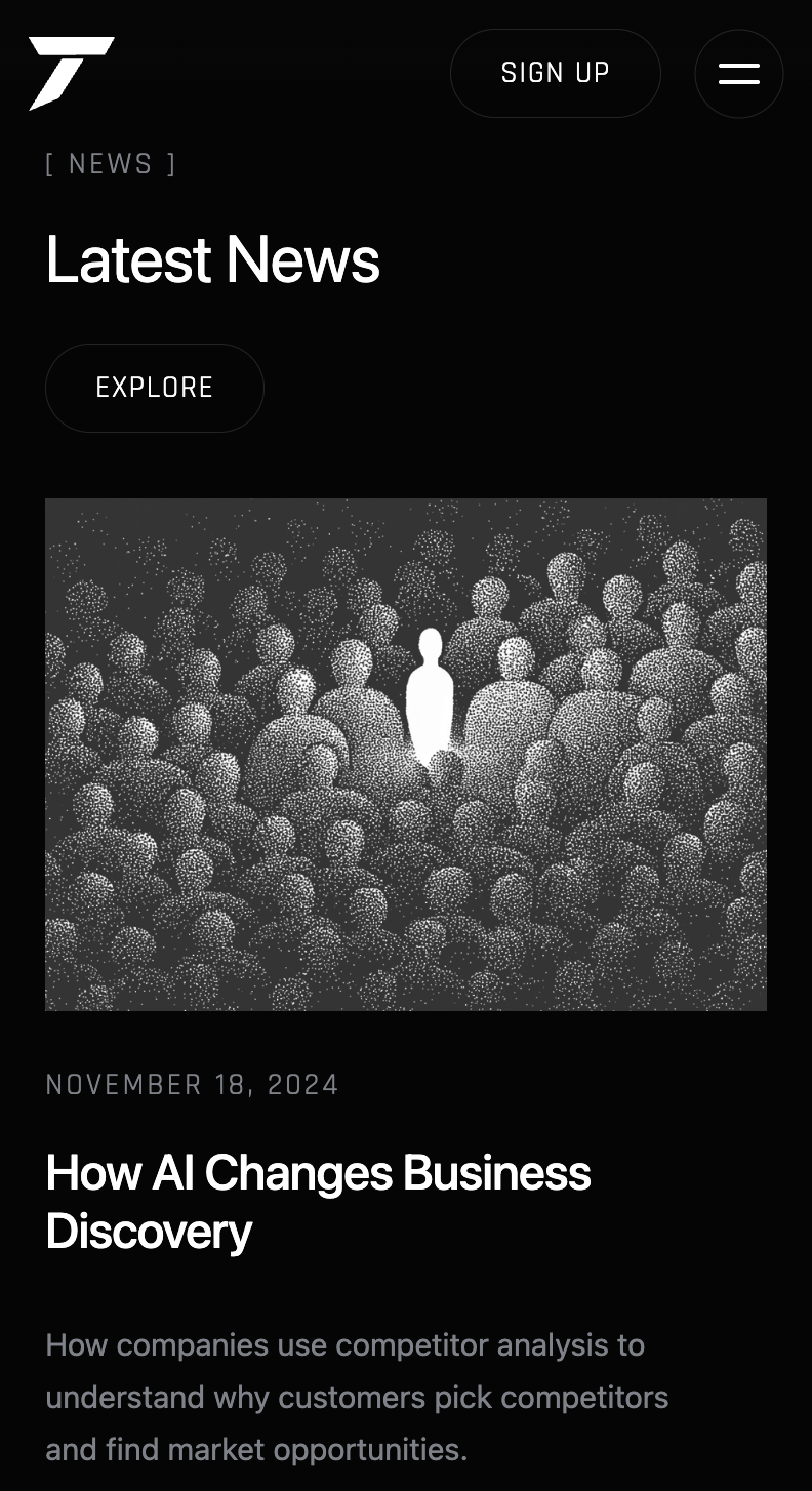
News entries use a grainy, halftone photo treatment instead of standard stock photography, which keeps the tone closer to a magazine or press piece than a typical blog roll. Each entry has a date, category, headline, and a one-line summary — kept short enough to scan the whole list quickly.
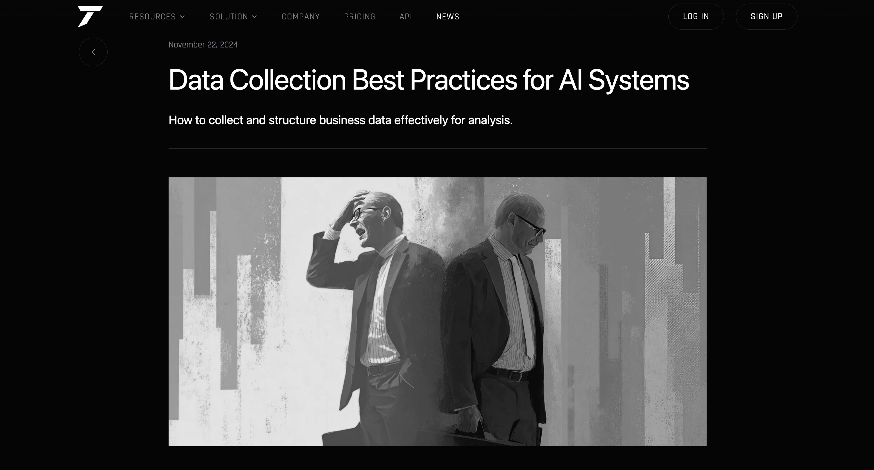
Opening an article keeps the same type, spacing, and image treatment as the listing, so the news pages feel like part of the marketing site rather than a bolted-on blog template.
Pricing & Compare Plans
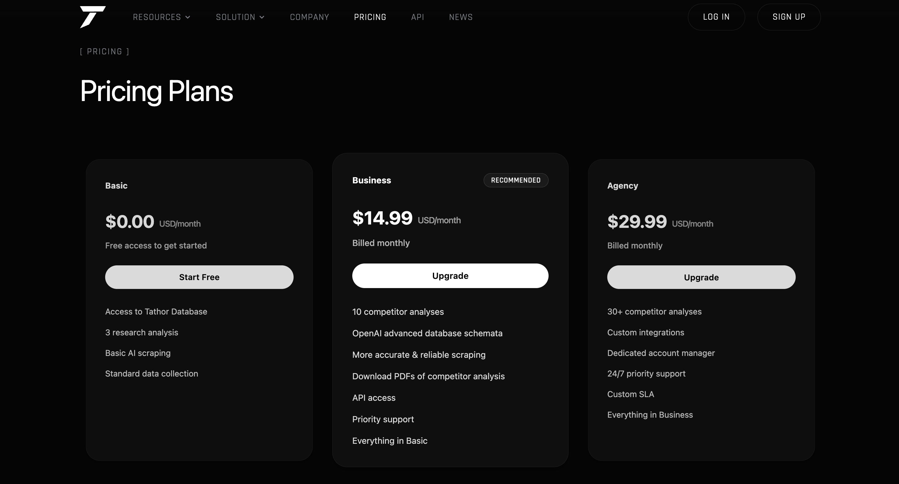
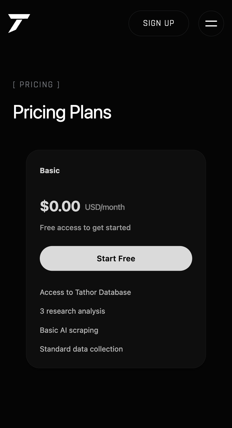
Three tiers — Basic, Business, and Agency — laid out as cards with the Business tier marked "Recommended." Each plan lists what's included underneath it, so monthly cost and what's in the tier can be scanned without opening another page.
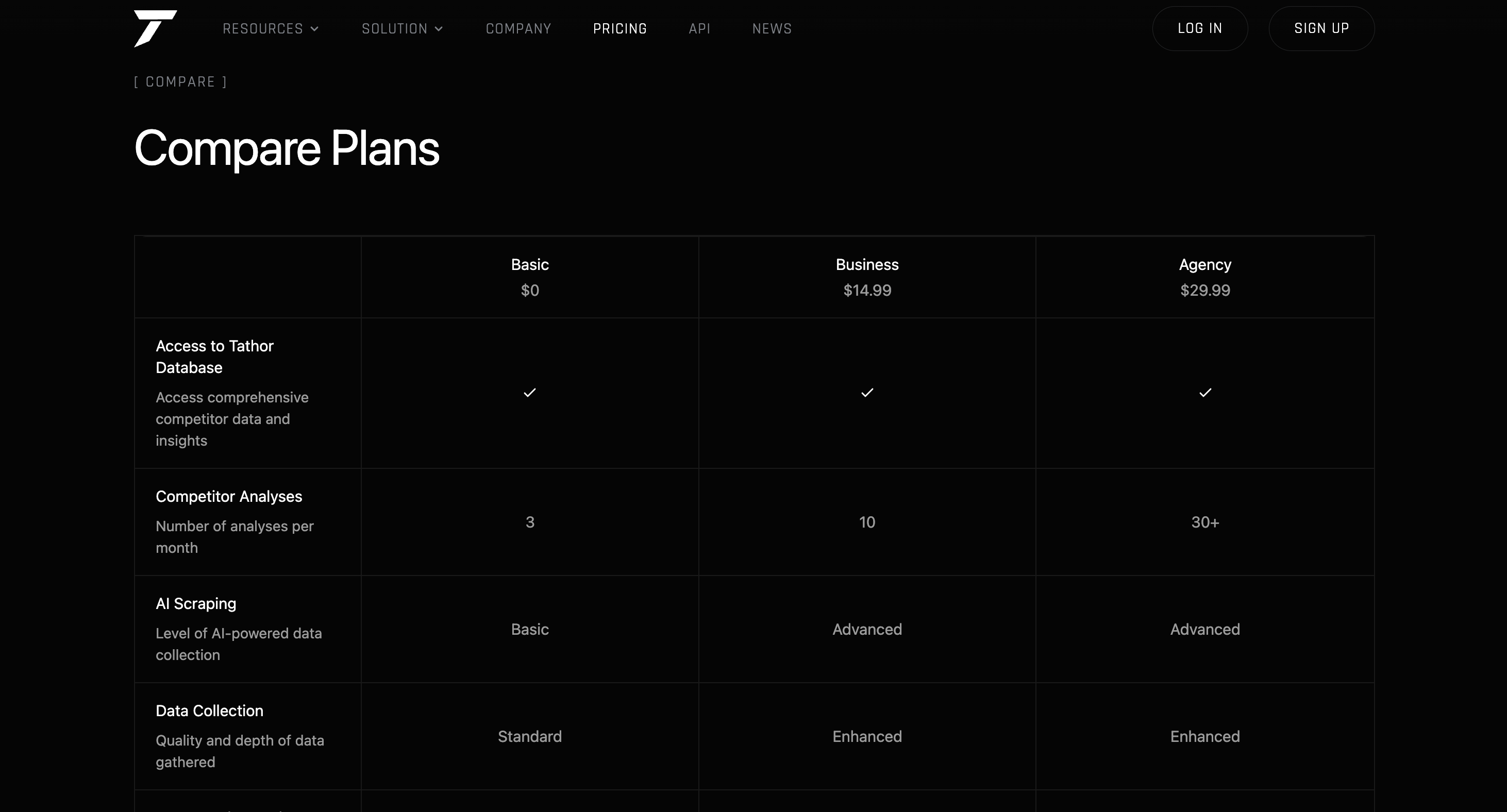
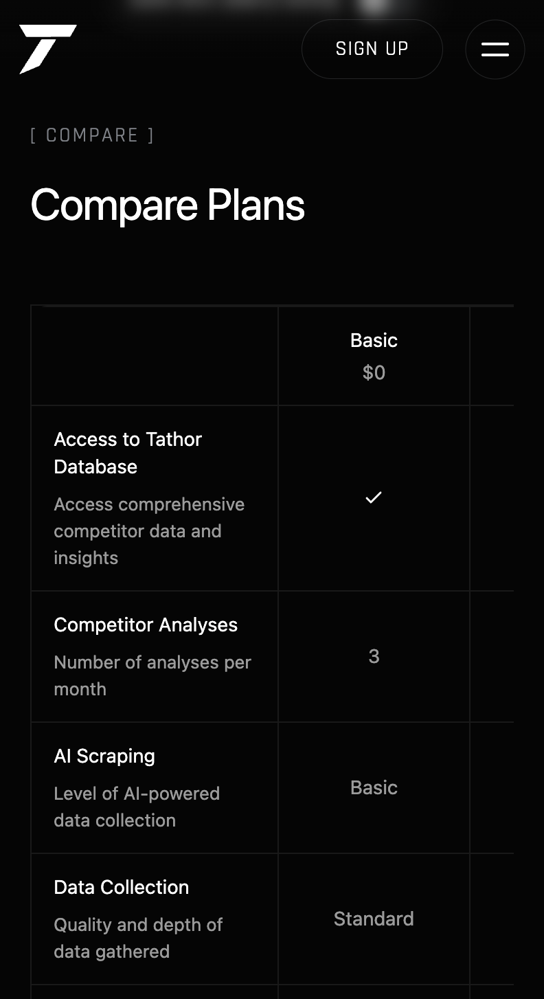
For anyone who wants more than the card summary, the Compare Plans table breaks every feature out row by row — database access, number of competitor analyses per month, AI scraping tier, data collection depth — so the difference between Basic, Business, and Agency is stated exactly, not implied.
Sign in & Sign up
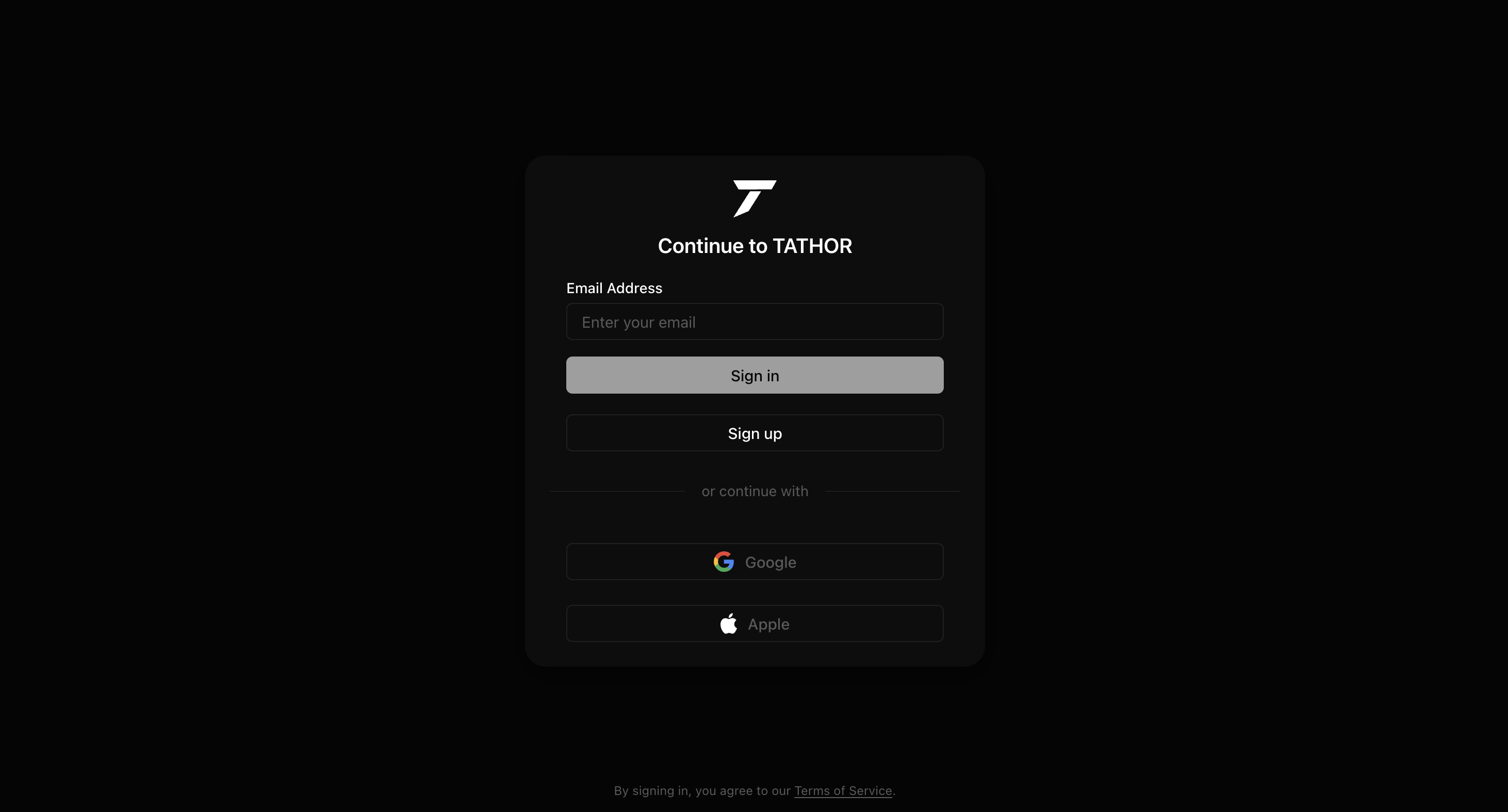
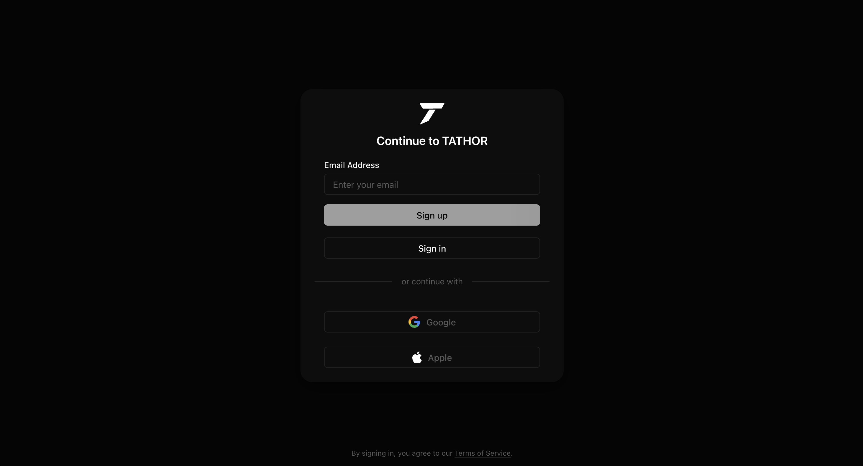
Sign in and Sign up are the same card, same type, same Google and Apple options — only the primary button swaps. That keeps auth from feeling like two products, and Firebase handles the actual Google sign-in behind it.
Privacy & Terms
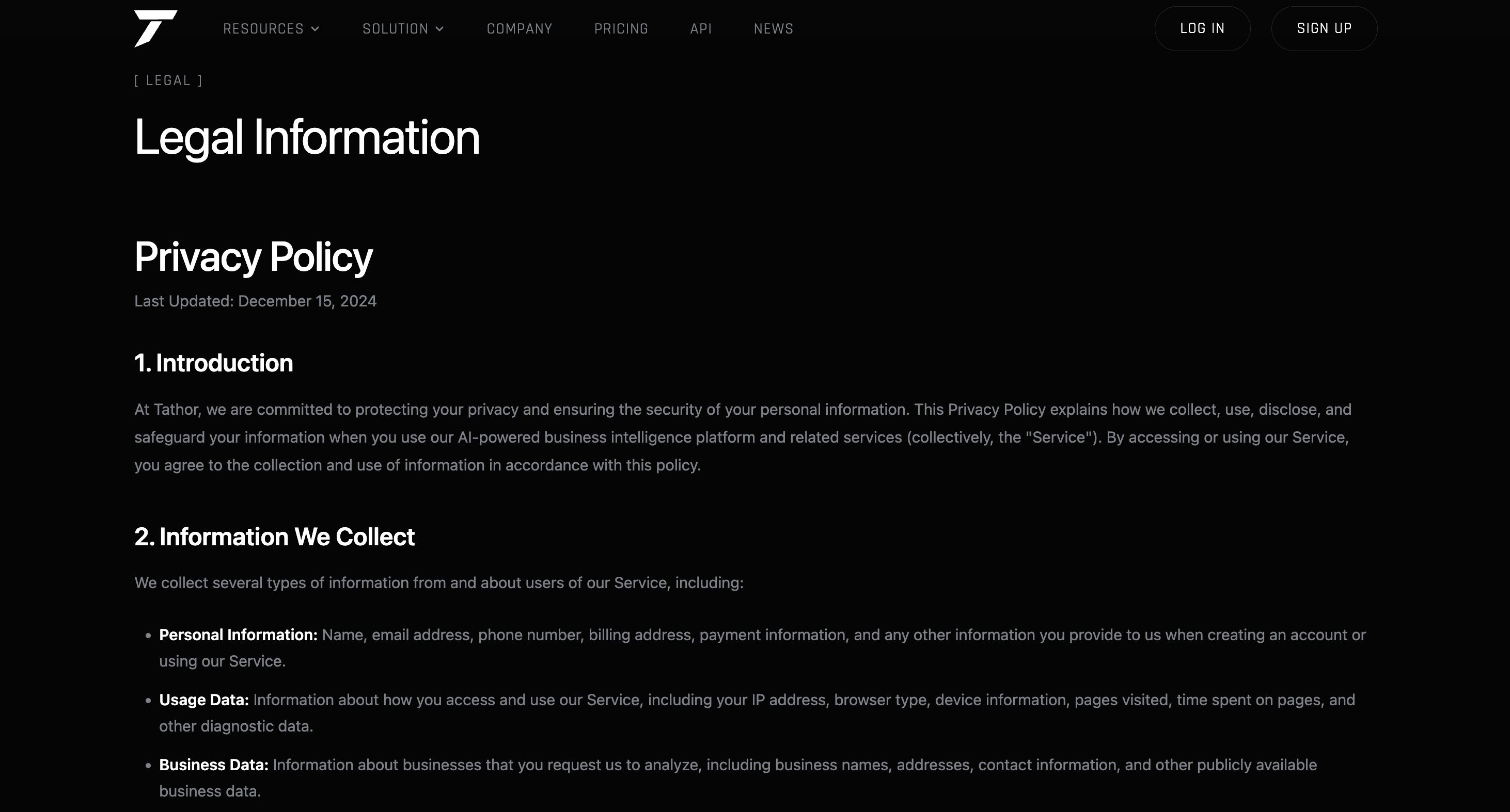
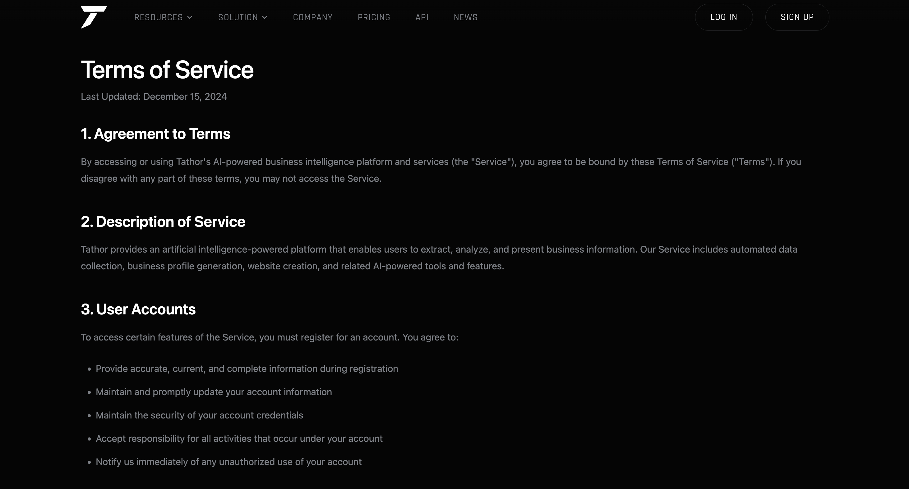
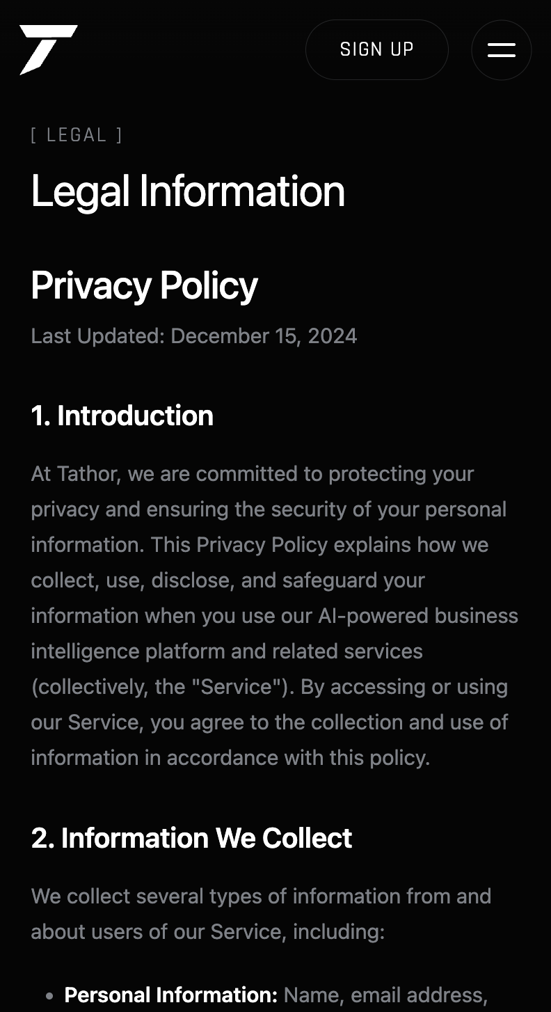
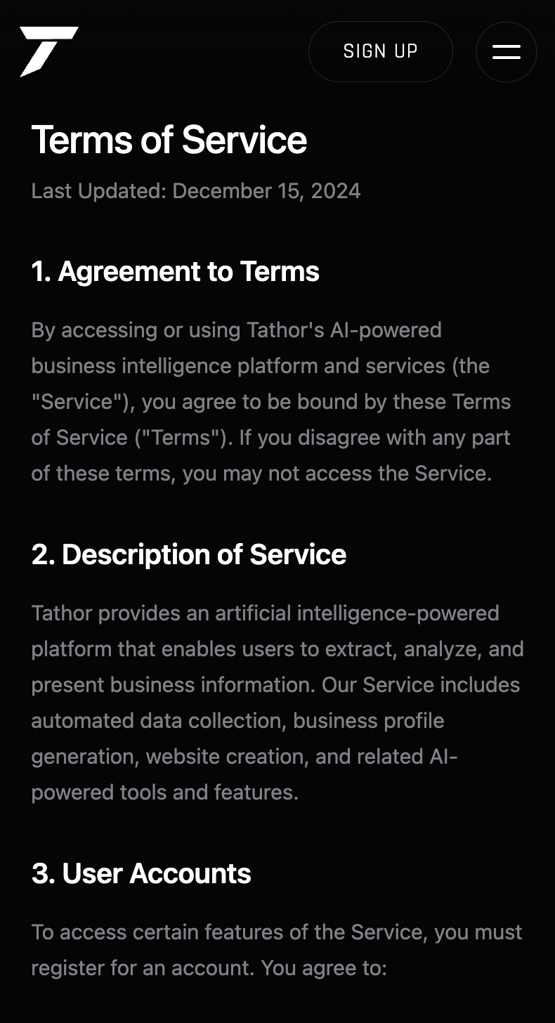
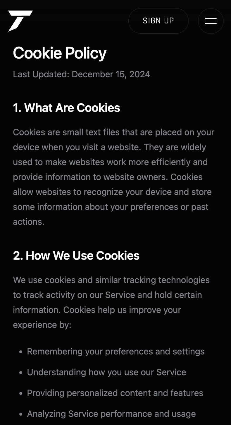
Privacy and Terms sit in the same legal layout as the rest of the marketing site — same type, same black field — so they read as part of the product instead of a generic template dropped in at the end.
Dashboard
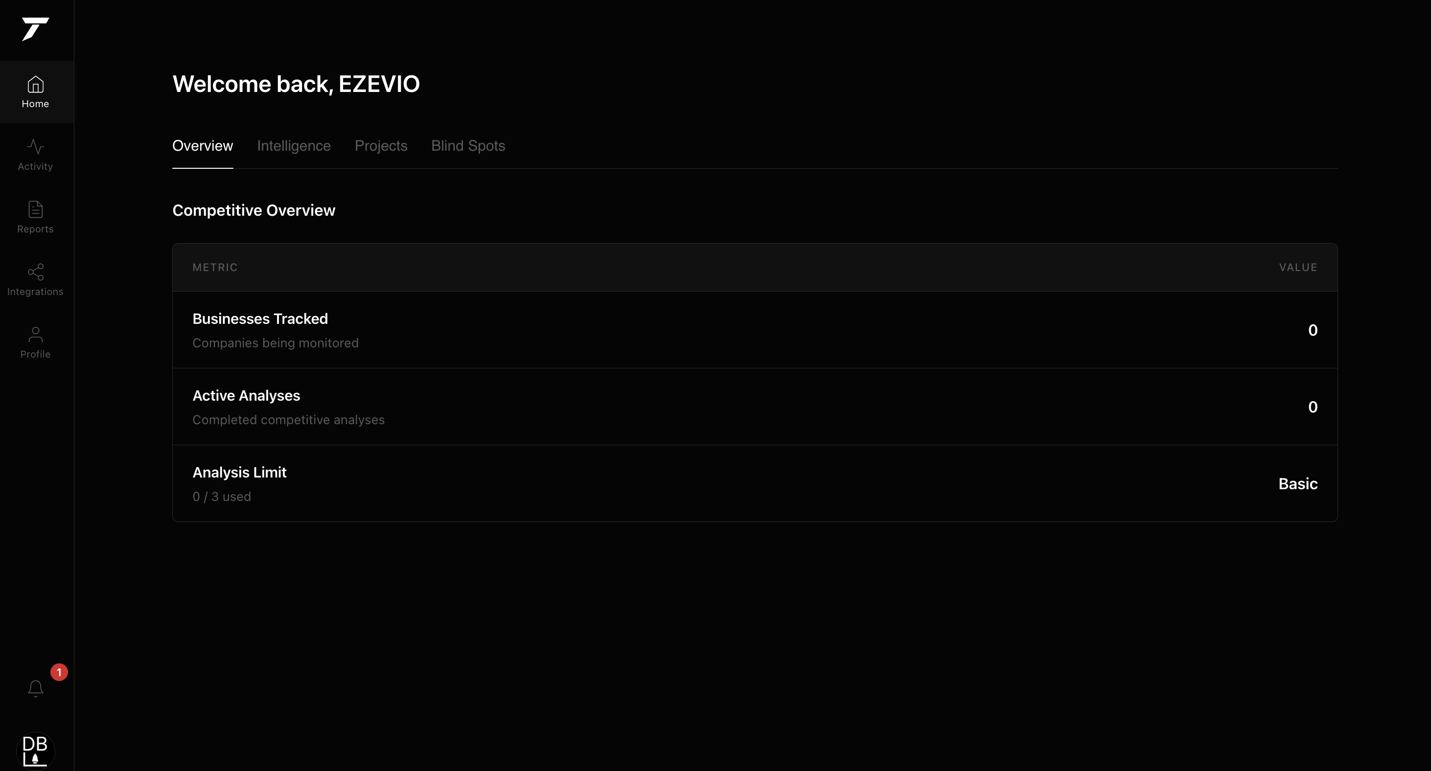
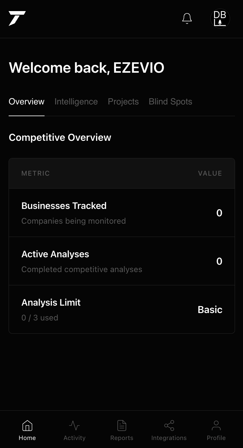
Logging in lands on Overview — "Welcome back" — with tabs for Overview, Intelligence, Projects, and Blind Spots. The Competitive Overview table tracks businesses, active analyses, and plan usage. Layout and spacing were built to feel closer to an internal analytics tool than a typical consumer dashboard.
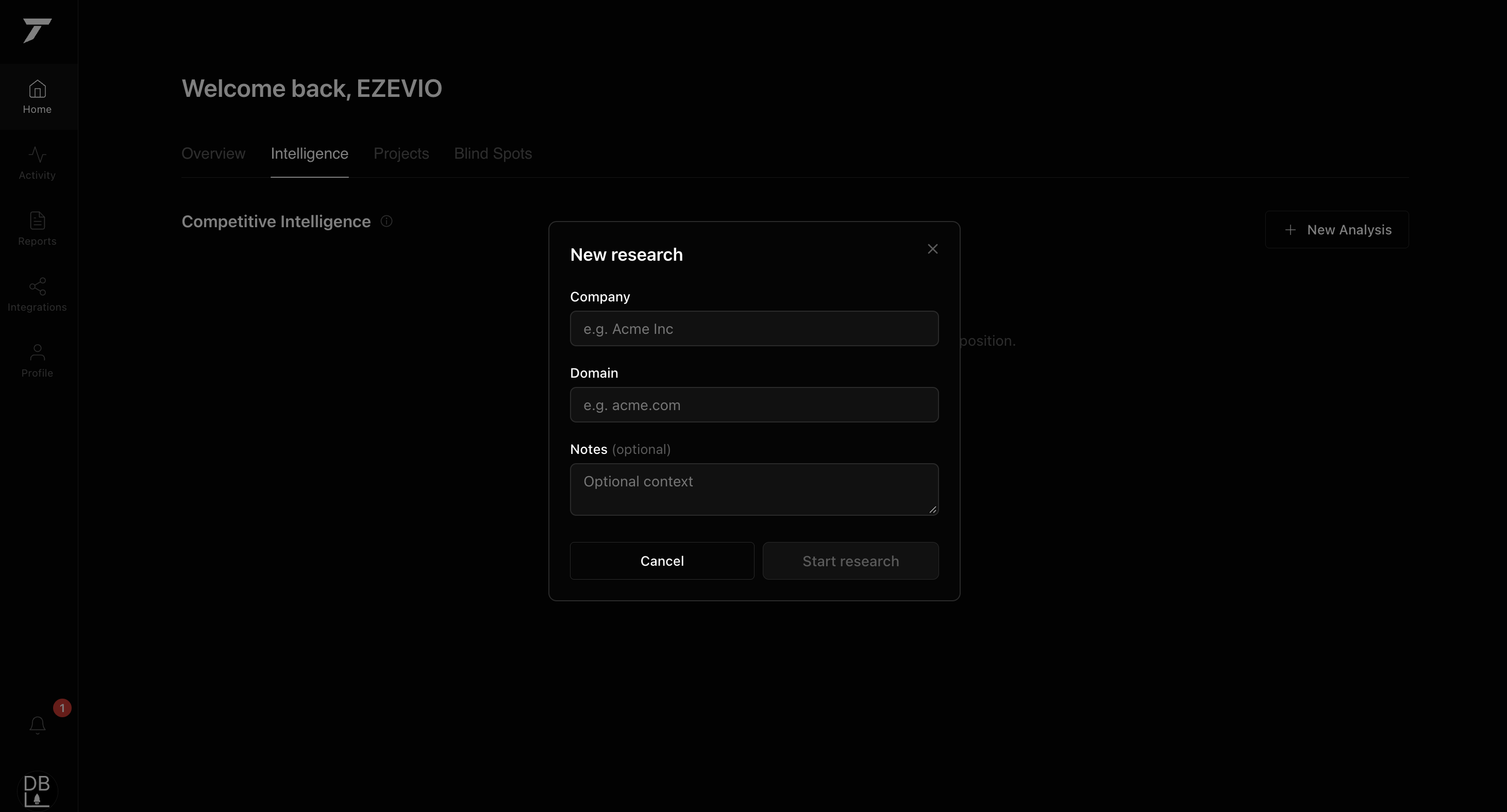
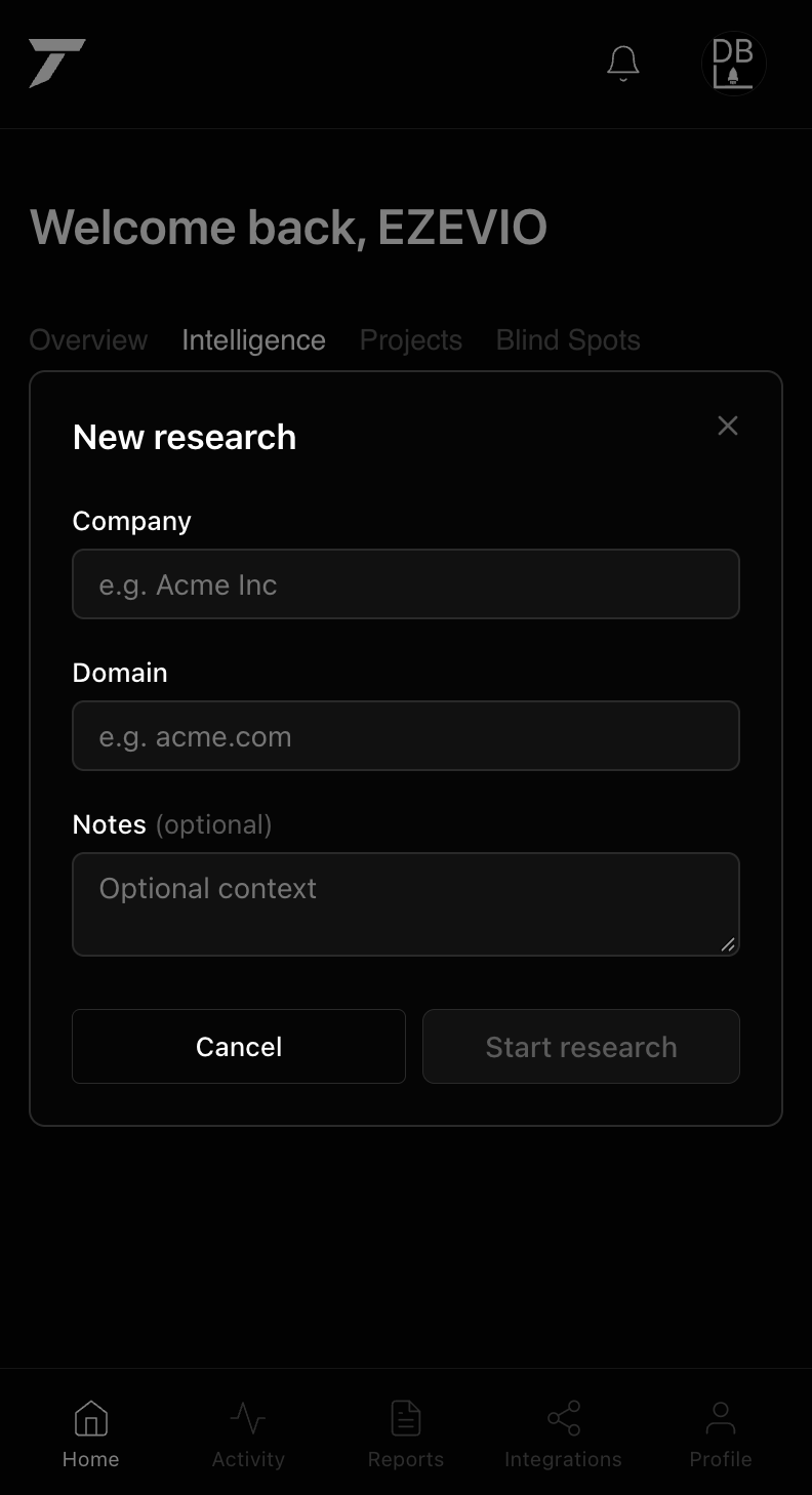
Intelligence opens the New research flow in place: company, domain, optional notes, then Start research. Same chrome, same density — starting an analysis doesn't send someone to a different product.
Integrations
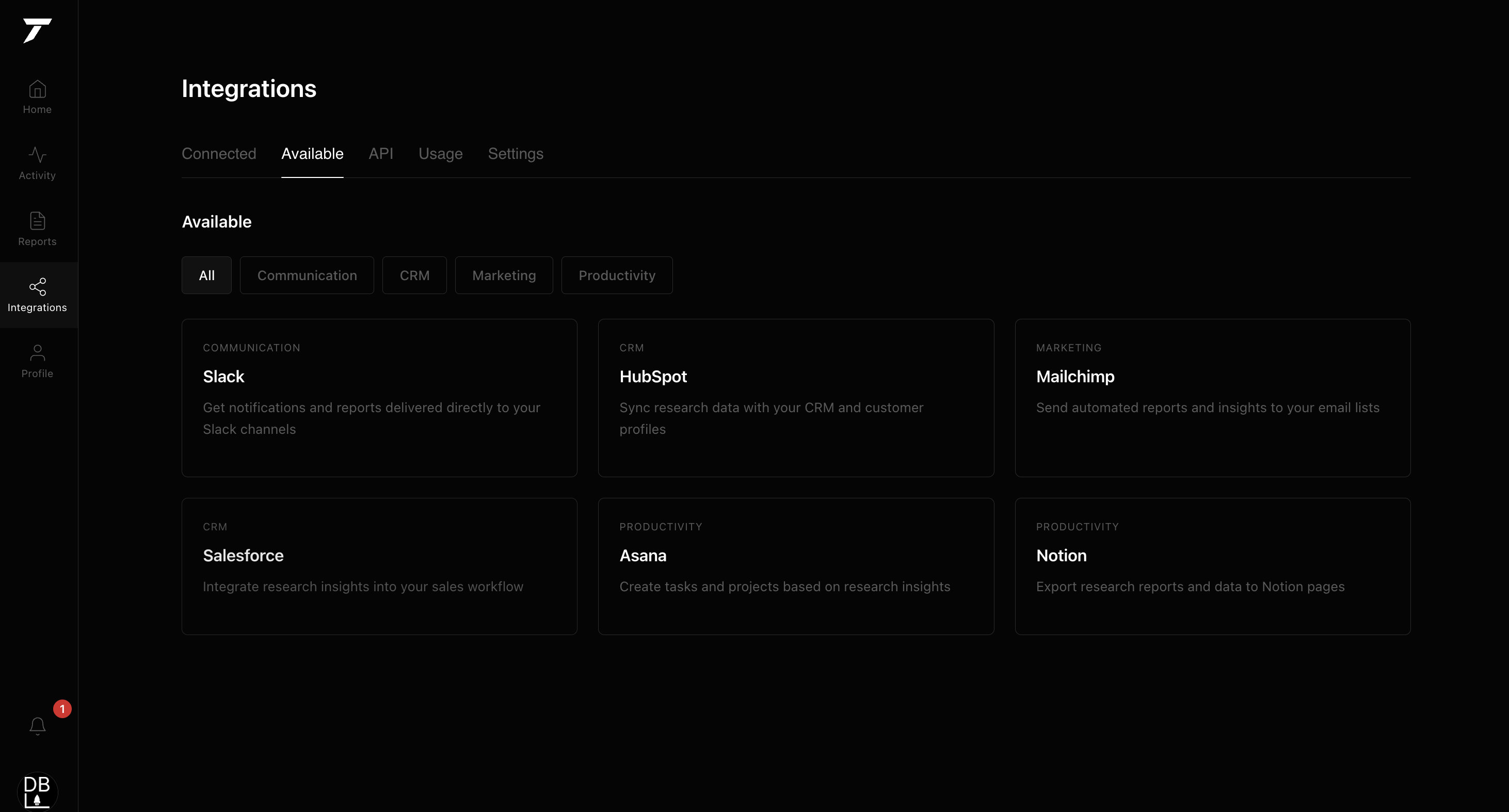
The Available tab lists the connectors — Slack, HubSpot, Mailchimp, Salesforce, Asana, Notion — grouped by Communication, CRM, Marketing, and Productivity, so someone can see what plugs in before they generate a key.
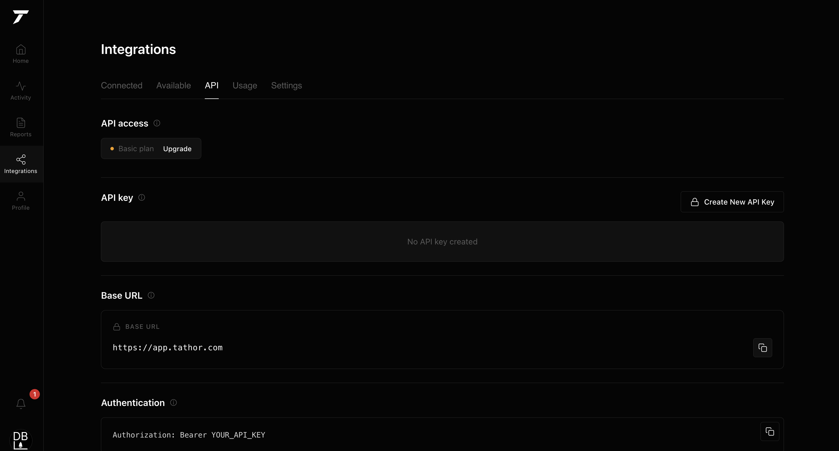
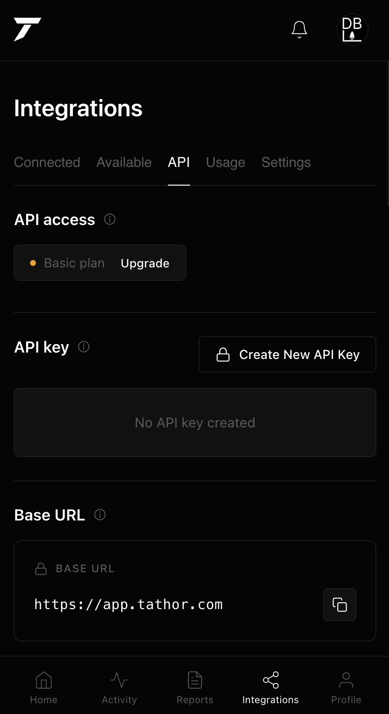
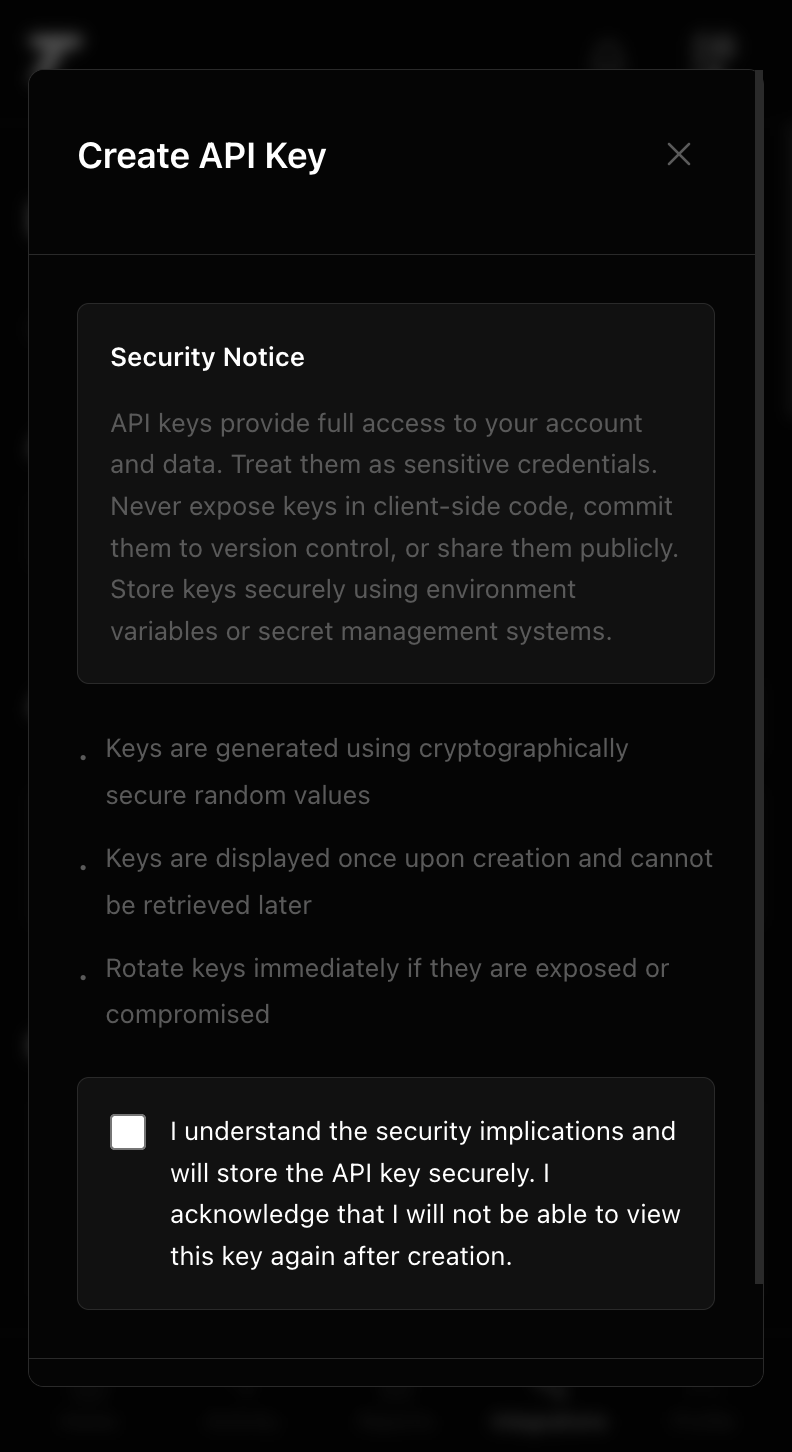
The API tab stays in the same Integrations page: plan badge, create a key, base URL, and the exact Authorization header. Nothing here is abstracted behind a separate developer portal.

Profile & Billing
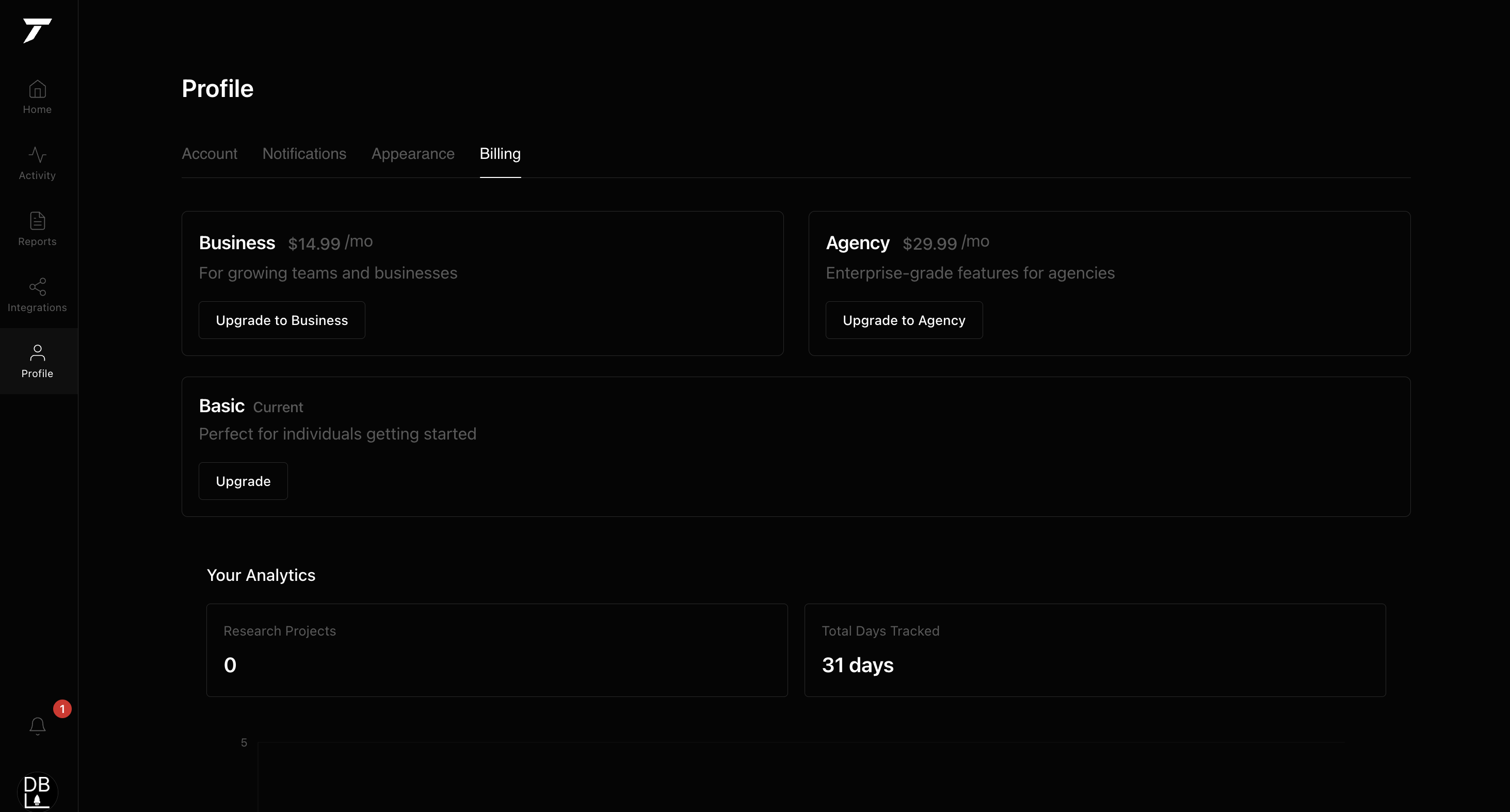
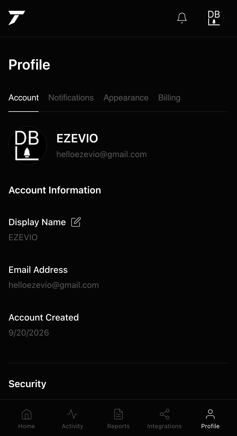
Account holds display name, email, and password under the same Profile chrome as Notifications, Appearance, and Billing — so account settings don't live on a different-looking page from the rest of the app.
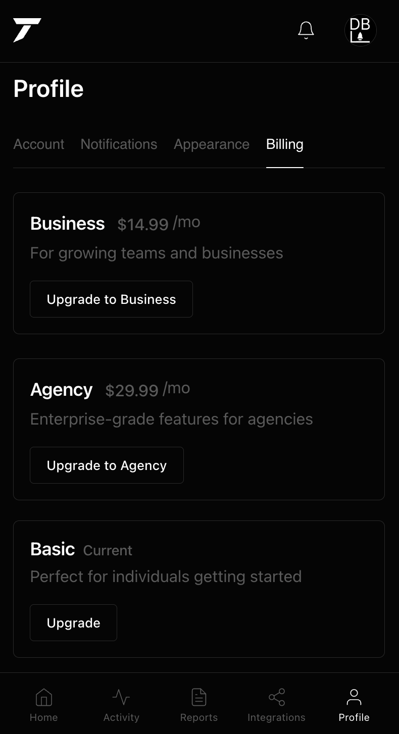
Billing shows the three plans as upgrade cards with the current plan marked, plus a small analytics strip for research projects and days tracked. Stripe handles the transaction itself; the dashboard only reflects the current state.
API docs
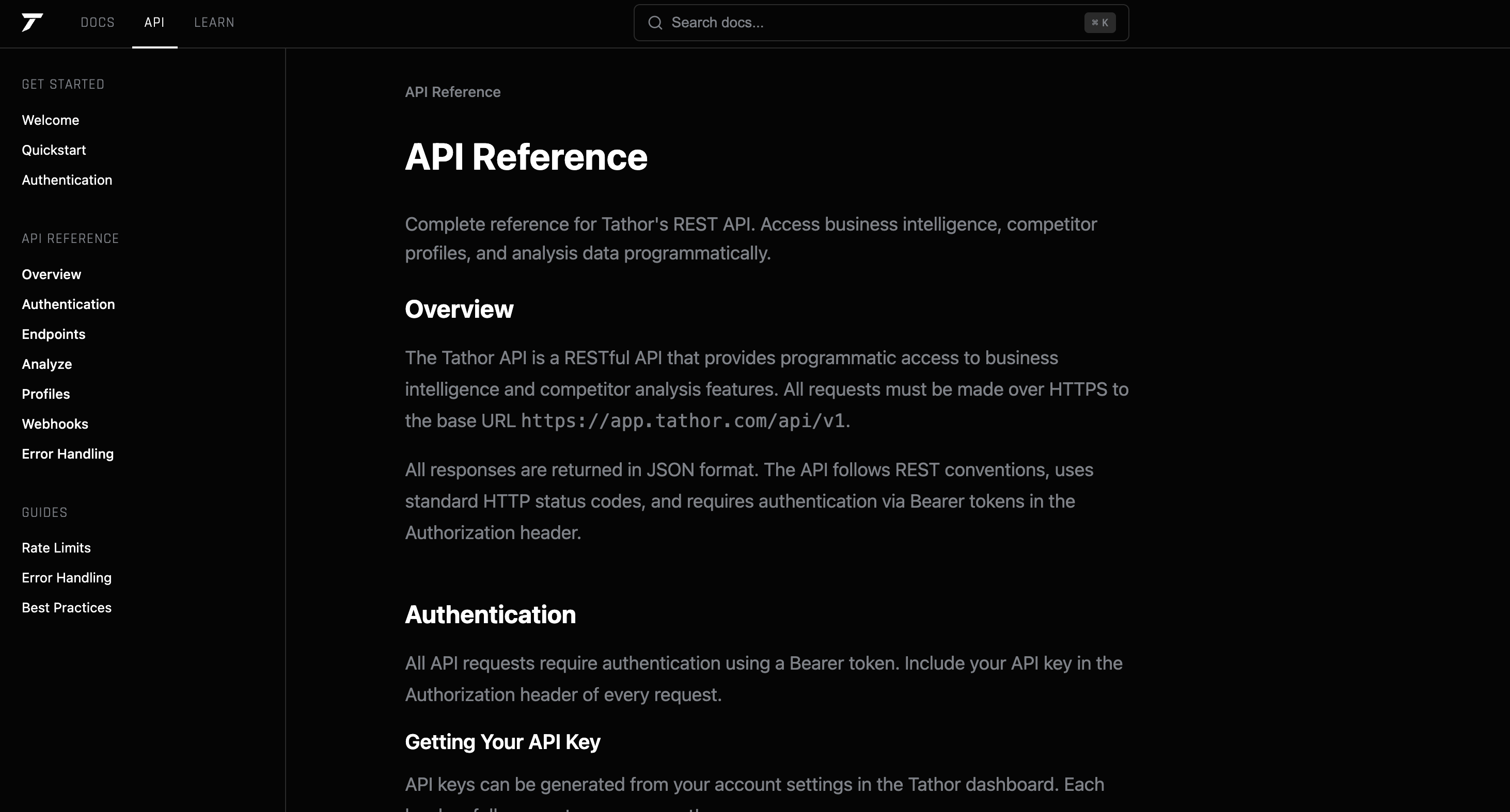
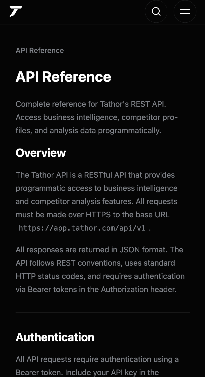
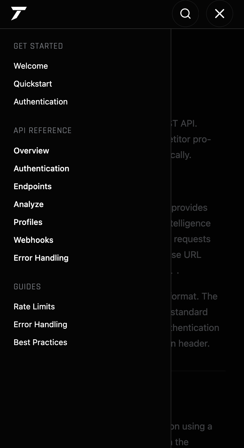
The API reference is a full docs site — overview, authentication, endpoints, webhooks, rate limits — with the analyze base URL shown in the body so a developer can start from the real host, not a placeholder.
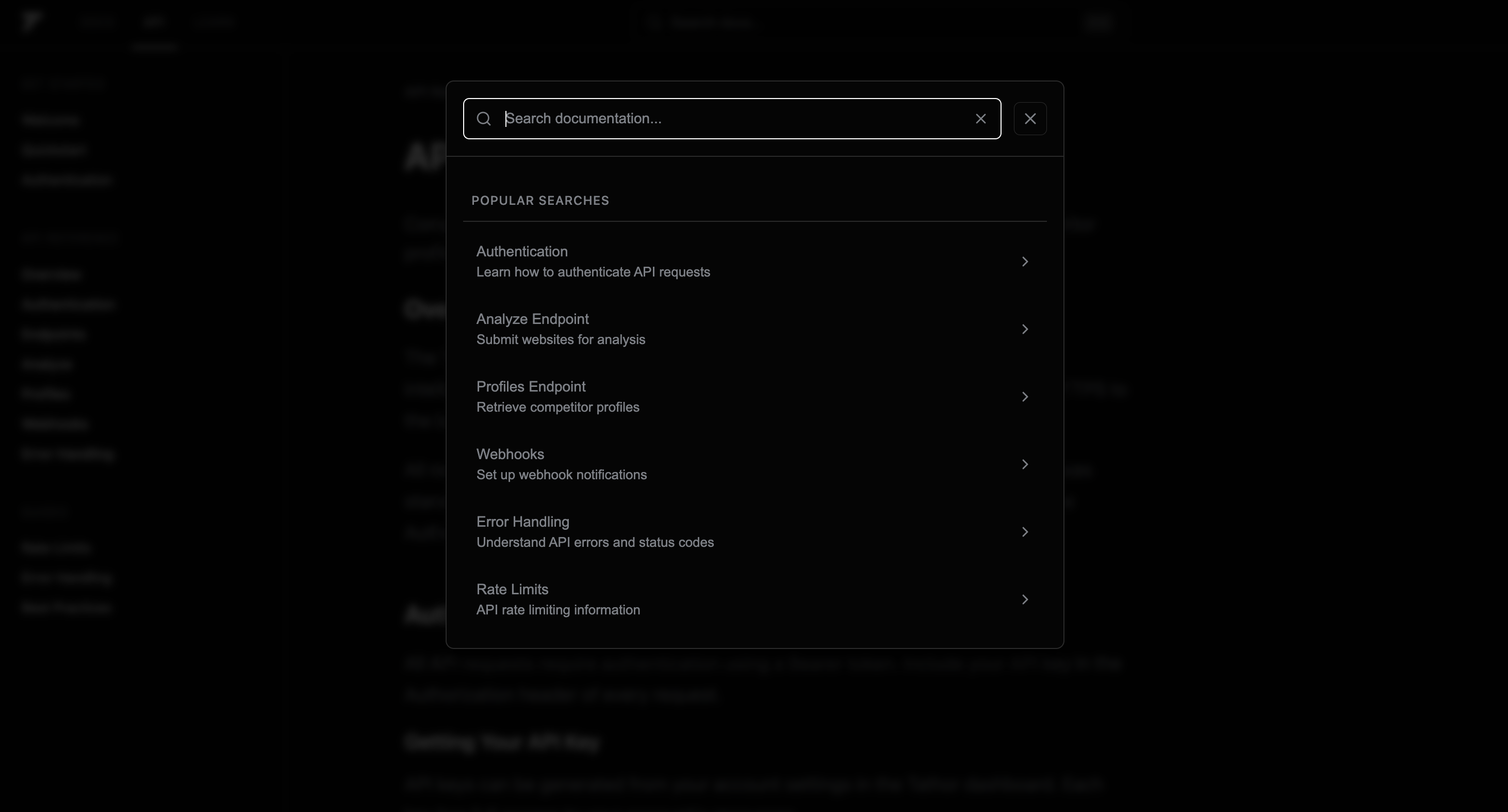
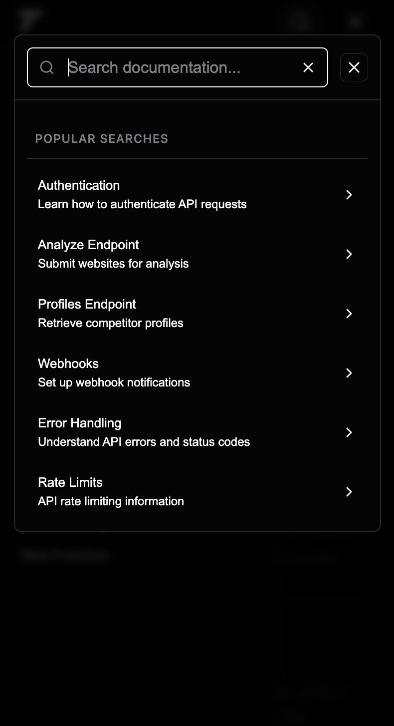
Search sits on top of those same docs: popular searches jump to Authentication, Analyze, Profiles, Webhooks, Error Handling, and Rate Limits, so the reference is usable without scrolling the sidebar first.



Mobile Optimization
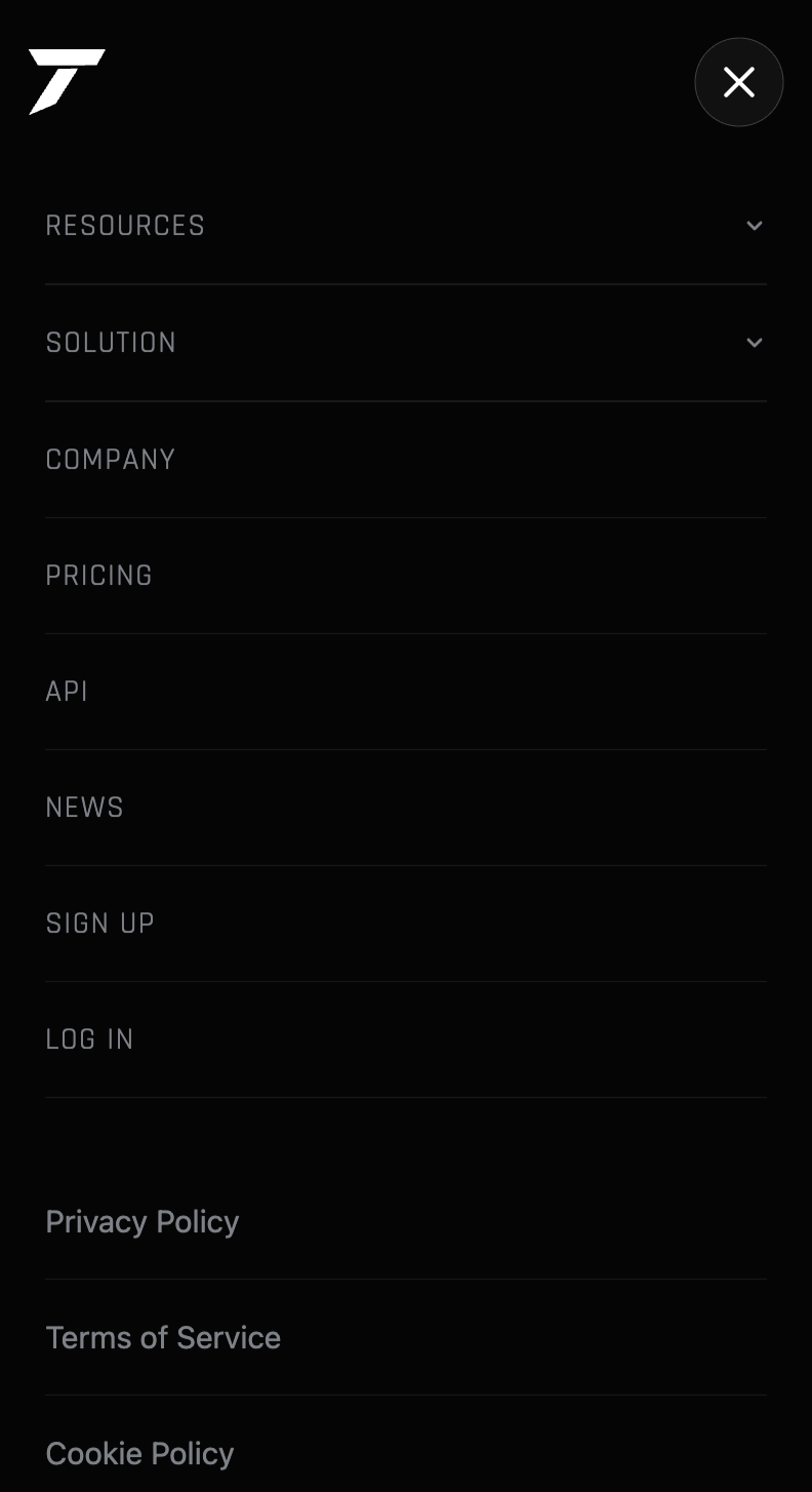
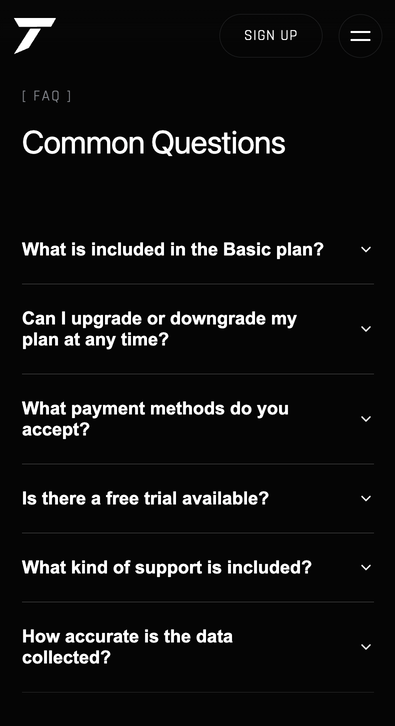
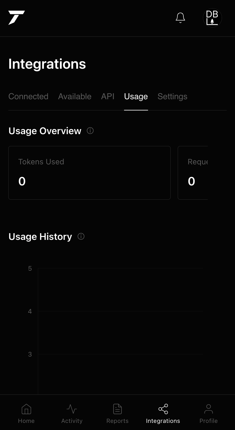
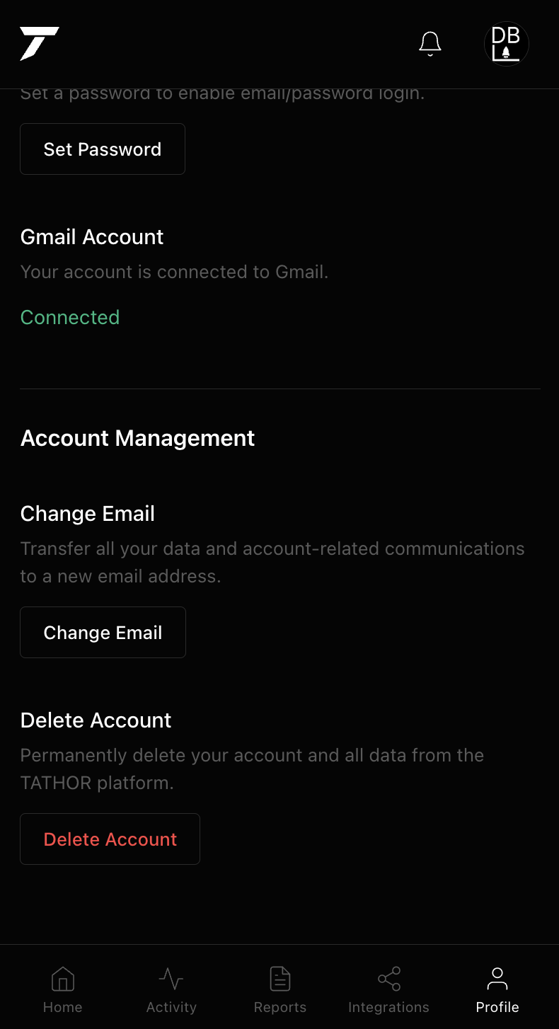
We treat the phone as the same product as the desktop — not a compressed leftover. The chrome wordmark, type, and black field hold at this width: sections stack, the nav becomes a menu, and every surface from the hero through pricing, API docs, legal, and the dashboard is designed for a thumb rather than squeezed in after. Someone opening tathor.com or the app on a phone gets the same brand and the same path as someone on a laptop.



Website design
These three line drawings are the illustrations on the Product Suite cards, in the same order: the T mark for the core tool, the document for Complete Profiles, and the browser window for the API. They were drawn as a set so the marketing site stays in one visual language instead of mixing icon packs.

Hero logo design
The chrome TATHOR wordmark on the homepage went through several rounds before this version. Early passes were too flat, too heavy, or too close to a generic metal effect — this one is the cut that holds up at hero scale: brushed edges, a real highlight, and enough contrast to read as an entrance without competing with the search field underneath it.

Ad creative
A banner built around the outlined TATHOR wordmark — same mark language as the product suite illustrations, quiet enough to run as a brand unit without extra campaign copy on top of it.
Backend & AI
The free tier doesn't call out to a third-party model. We built our own AI engine for it, hosted on Railway, so Basic-plan analysis runs on infrastructure we control end to end. Paid plans — Business and Agency — route through OpenAI, giving those tiers the more advanced scraping and reasoning the pricing table promises. Firebase handles both the database and authentication, including Google sign-in, so a user's account, saved research, and analysis history all live in one place. The site is split across two domains: tathor.com is the marketing site, and app.tathor.com is the authenticated product — dashboard, integrations, billing, all of it. Keeping them separate means the marketing pages stay fast and public, while the actual product sits behind its own domain and its own auth.
Strategy
The brand and every page were designed first in Figma, then built out — wordmark, type, spacing, and the wireframe-style illustration system used across the product suite cards. Stripe was set up end to end for billing, so plan changes and payment state are handled by Stripe directly rather than tracked separately in the app. On the backend, we built a custom AI engine for the free tier, hosted on Railway, and connected OpenAI for the paid tiers — so the product isn't just a wrapper around one model, it's tiered by what each plan actually needs.
Design
The whole product — marketing site, dashboard, docs — stays in the same black-and-white, high-contrast palette, with almost no color used anywhere except where it's functional (status indicators, plan highlights). That restraint is deliberate: for a tool that tracks other companies' data, the dashboard needed to read as precise and professional rather than playful.
Results
Tathor runs as a full product: a marketing site on its own domain, an authenticated app on a separate subdomain, a documented REST API, Firebase for data and Google auth, a custom AI engine on Railway for the free tier, OpenAI for paid tiers, and Stripe-based billing — all sharing one visual system from the homepage down to the API docs.