NUERLO
Services
Web, Web app, Logo design, Brand design
Hero
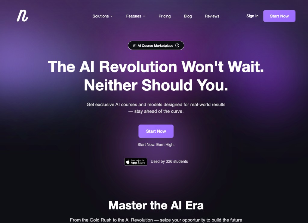
The hero sits on a dark purple gradient background with a badge above the headline — "#1 AI Course Marketplace" — followed by a large two-line statement: "The AI Revolution Won't Wait. Neither Should You." One button, one line of supporting copy underneath it ("Start Now. Earn High."), and a small App Store badge with a live student count. The gradient is the only real color on the page at this point — everything else is white text on near-black.
Master the AI Era
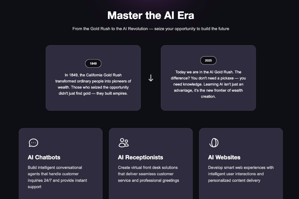
This section opens with a side-by-side comparison: 1849, the California Gold Rush, next to 2025, the AI Gold Rush — same structure, same card style, different era. It's a direct analogy, not a metaphor buried in copy: the cards literally sit next to each other so the comparison reads at a glance. Below that, three feature cards — AI Chatbots, AI Receptionists, AI Websites — each with a simple line icon and a couple of sentences on what it does.

Turn Skills Into Income
A large centered headline, "Turn Skills Into Income," followed by a photo of people working together and a "Learn at Your Pace" text block next to it. The photo isn't stock-generic corporate — it's people at a table with laptops and notebooks, closer to a study group than an office. The copy underneath explains that the platform has no fixed schedule: start, stop, and pick back up whenever.
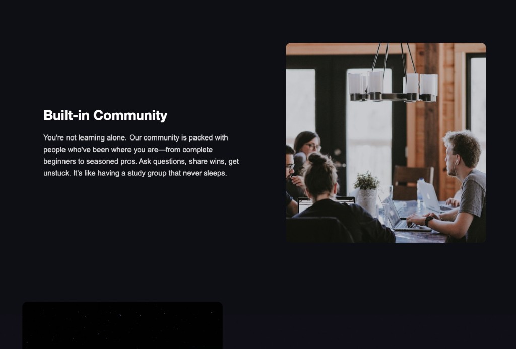
The same layout pattern continues with "Built-in Community" — another photo of people working together, paired with a short paragraph about the platform's community being available for questions and support at any stage, from beginner to experienced.
FAQ
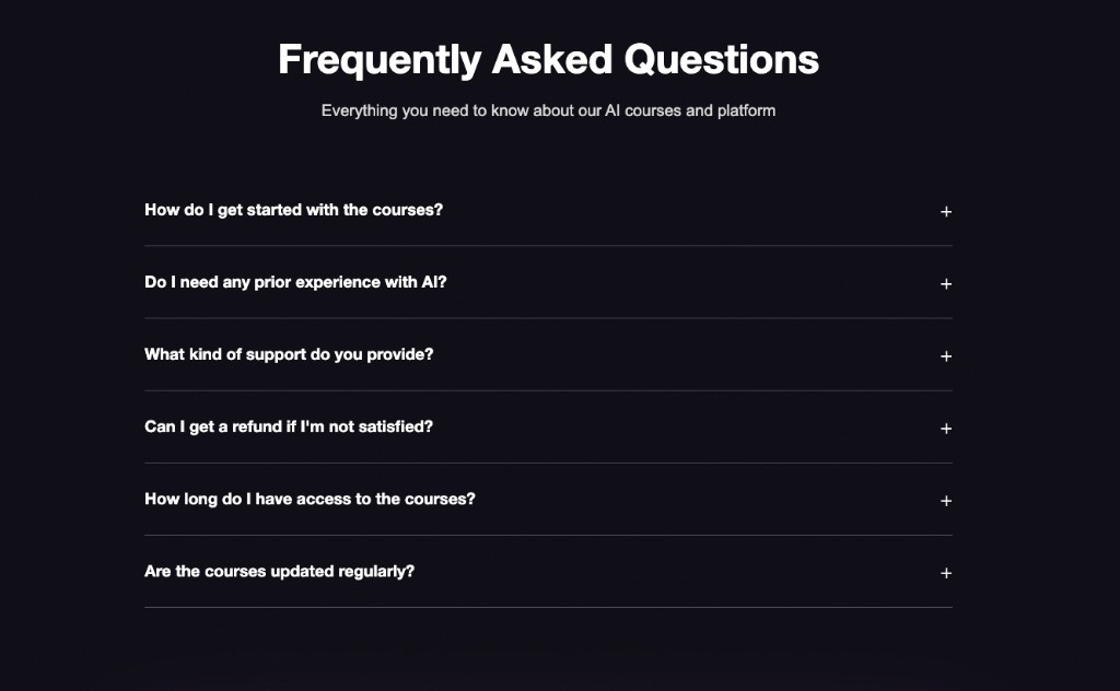
A plain accordion list, six questions, expand-on-click. Questions cover getting started, prior experience needed, support, refunds, access duration, and how often courses get updated — the kind of things someone would actually want answered before paying.

Blog
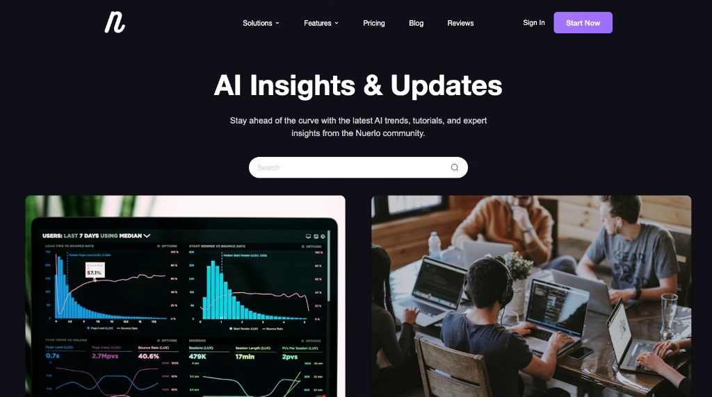
The blog page opens with "AI Insights & Updates" and a search bar, followed by two large featured cards — one showing usage analytics on a dashboard, one showing people working around a table. This top section functions as a visual introduction to the blog before the actual post grid starts.
Below that, the actual post grid: two posts per row, each with a large image, headline, publish date, and a "Read more" link. Numbered pagination sits at the bottom for browsing older posts.
Sign Up / Sign In
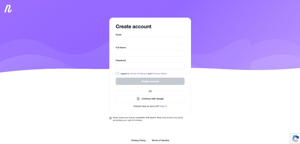
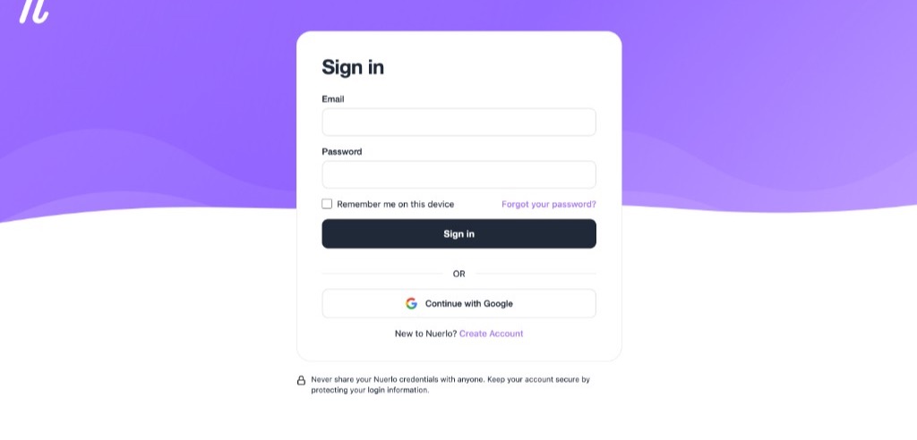
Create Account and Sign In sit side by side as matching auth screens: the same wavy purple field, the same white form card, and the same Continue with Google option. Create Account adds name alongside email and password; Sign In keeps it to email and password, with remember-me and forgot-password under the fields. A lock line under both reminds people not to share their login — same brand system on both sides of the wall, so signing up and signing back in feel like one product.
Dashboard Home
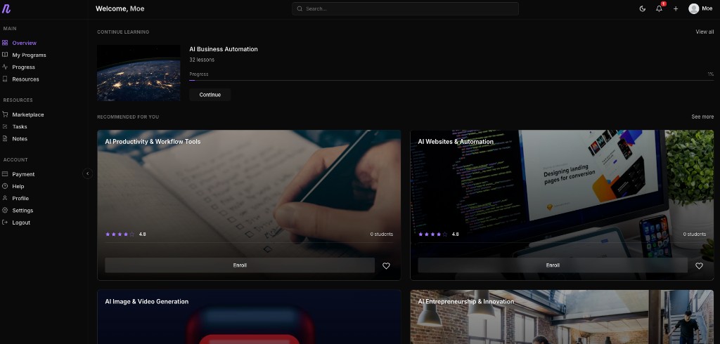
Logging in lands on "Welcome, [name]" with a Continue Learning card showing the current course and progress percentage, followed by a Recommended for You grid of other courses with ratings and enrollment counts. The layout is dark, dense, and course-thumbnail-driven — closer to a media platform than a typical SaaS dashboard.
My Programs & Billing
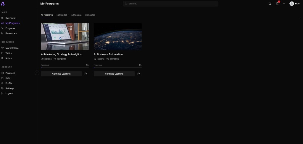
The My Programs page lists every course a user is enrolled in as a card with a thumbnail, lesson count, and progress bar, with filter tabs at the top (All, Not Started, In Progress, Completed) so the list can be narrowed down without hunting through everything.
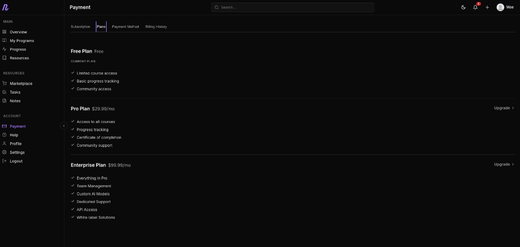
Payment settings show three plans stacked vertically — Free, Pro at $29.99/mo, and Enterprise at $99.99/mo — each with its own feature checklist and the current plan marked clearly. Enterprise includes things like custom AI models and white-label solutions, so the tiers scale from "just learning" up to "running this for a team."
Help & Profile
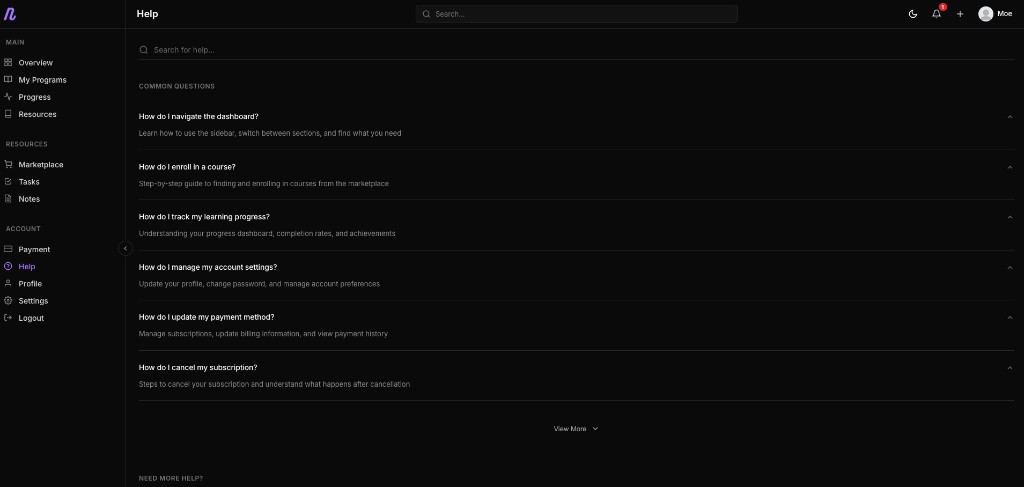
The Help page is a searchable list of common questions, each with a one-line description underneath — how to navigate the dashboard, enroll in a course, track progress, manage account settings, update payment, or cancel a subscription. It's set up so someone can self-serve most account questions without needing to contact support directly.
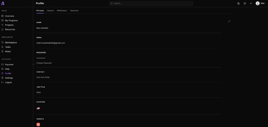
The Profile page holds personal details — name, email, password, contact number, job title, location, and a website field — split into tabs (Personal, Account, Preferences, Advanced) so the page doesn't turn into one long form.
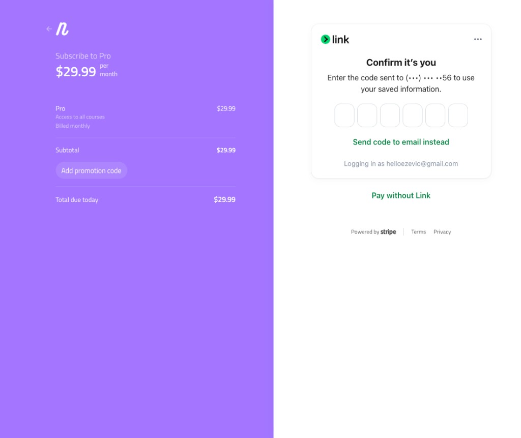
Stripe Payment Wall
Checkout is a split screen: plan and price on the left in Nuerlo's purple, and Stripe's own payment form on the right, using Stripe's Link for saved payment details. This is Stripe's checkout experience, not a custom-built one — which means less code to maintain and a payment flow users may already recognize from other products.
Strategy
Design
The site leans into a dark, purple-accented palette throughout — marketing pages, dashboard, and course cards all share the same tone, so the transition from browsing courses to actually learning inside the dashboard doesn't feel like switching products.