PRIMAL
Services
Web, Mobile app, Logo design, Brand design, Social Media, Software
PRIMAL is a daily habit tracker: one daily score, habit tracking across categories like sleep, training, and nutrition, friend leaderboards, in-app messaging, on-device Smart Insights, achievements, and a Free/Pro tier. Brand and product design led by EZEVIO; social growth (Instagram, TikTok) run in parallel. Below is the work in the order a person actually experiences these surfaces: the landing page first, then the Figma design work behind it, then Instagram, then TikTok, then the app itself from onboarding through settings.

Landing page
We spent time on this — multiple layout and copy passes — until the marketing site felt like one page instead of a stack of sections. Type, color, and the bull mark stay consistent from the hero through pricing and the waitlist, so the brand message and voice don't drop off halfway down.
Section transitions and lazy-loaded stills ease each block in as you scroll, which keeps the page moving without fighting the design. What you see here is the full page; on the site itself, those transitions are part of how it reads.
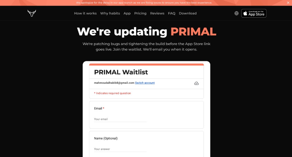
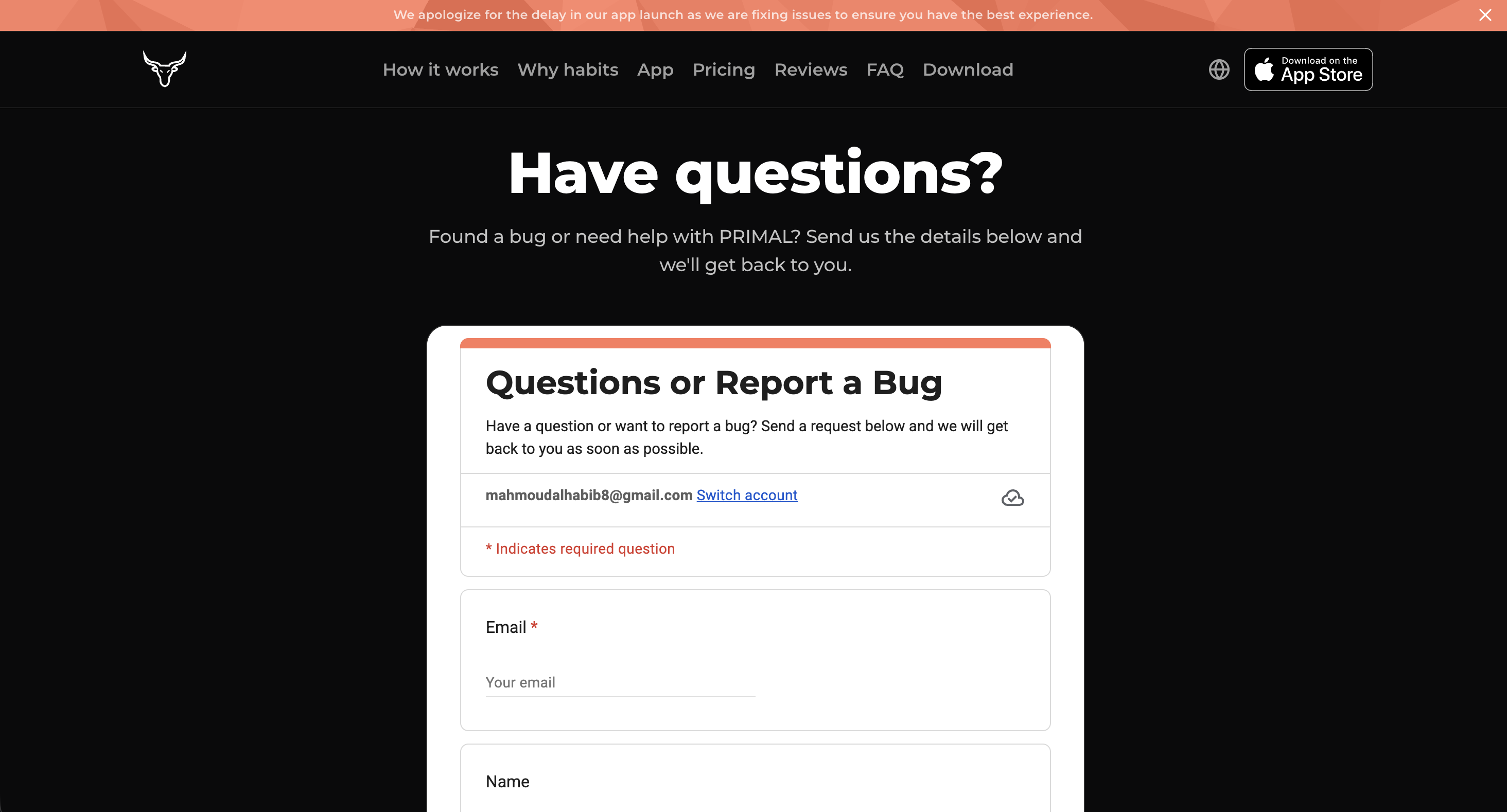
Waitlist & have questions
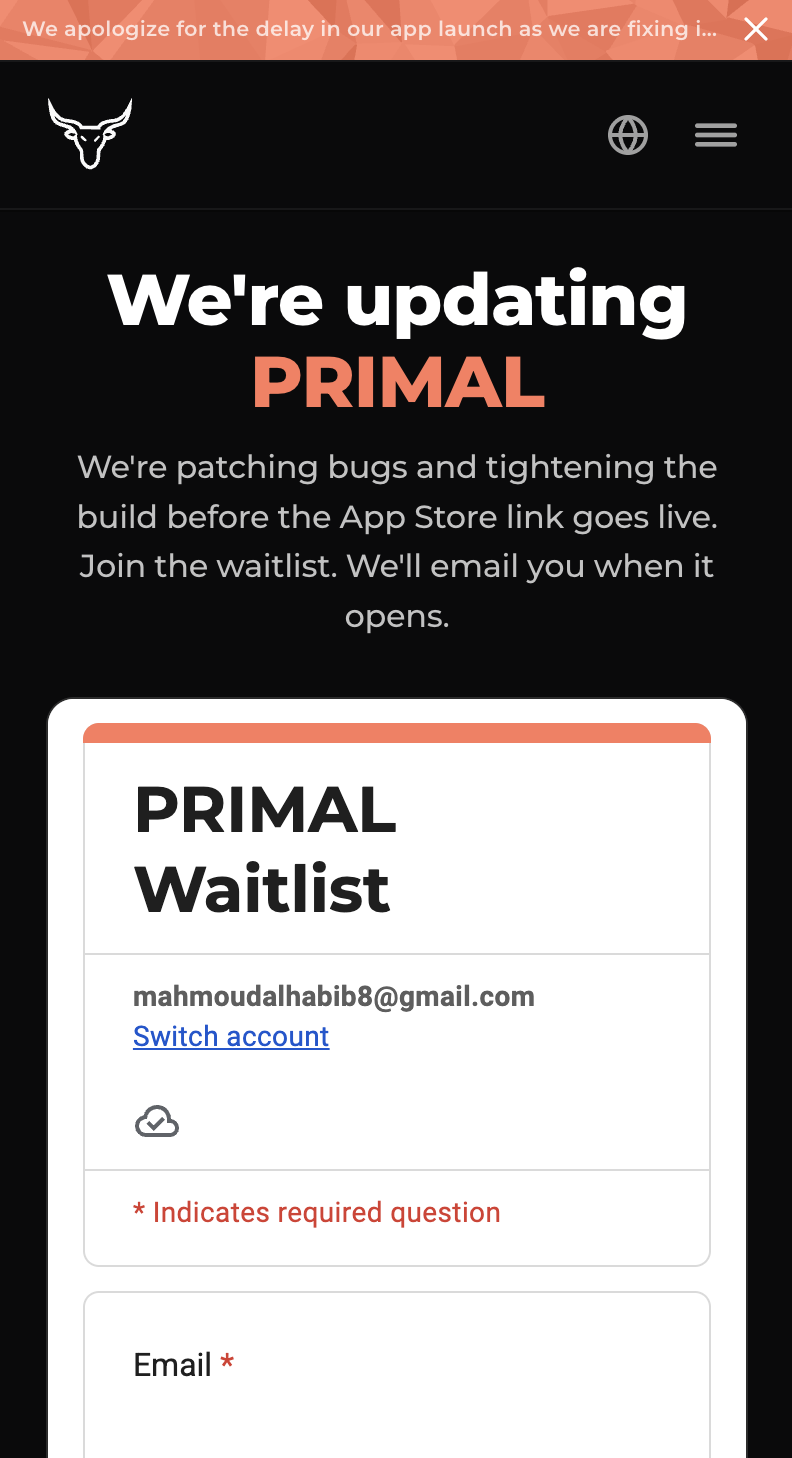
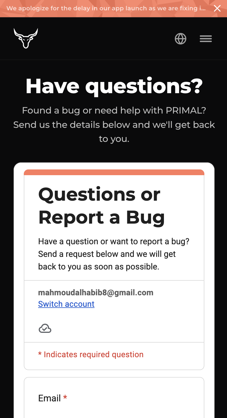
Both pages are Google Form embeds — join the waitlist before launch, or send a bug report or question — so those two intake flows didn't need a custom form stack. Same pattern, two jobs: collect emails, collect support.
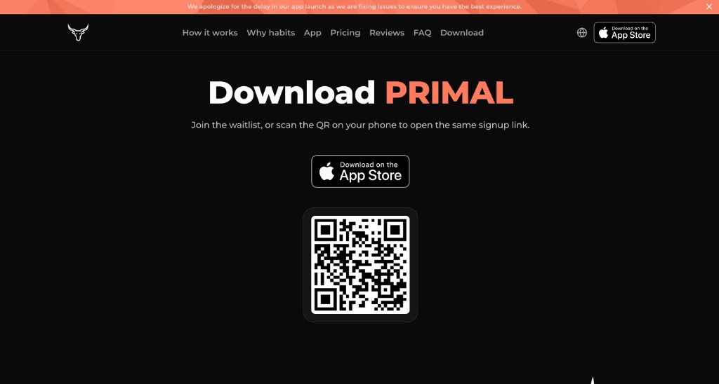
Download
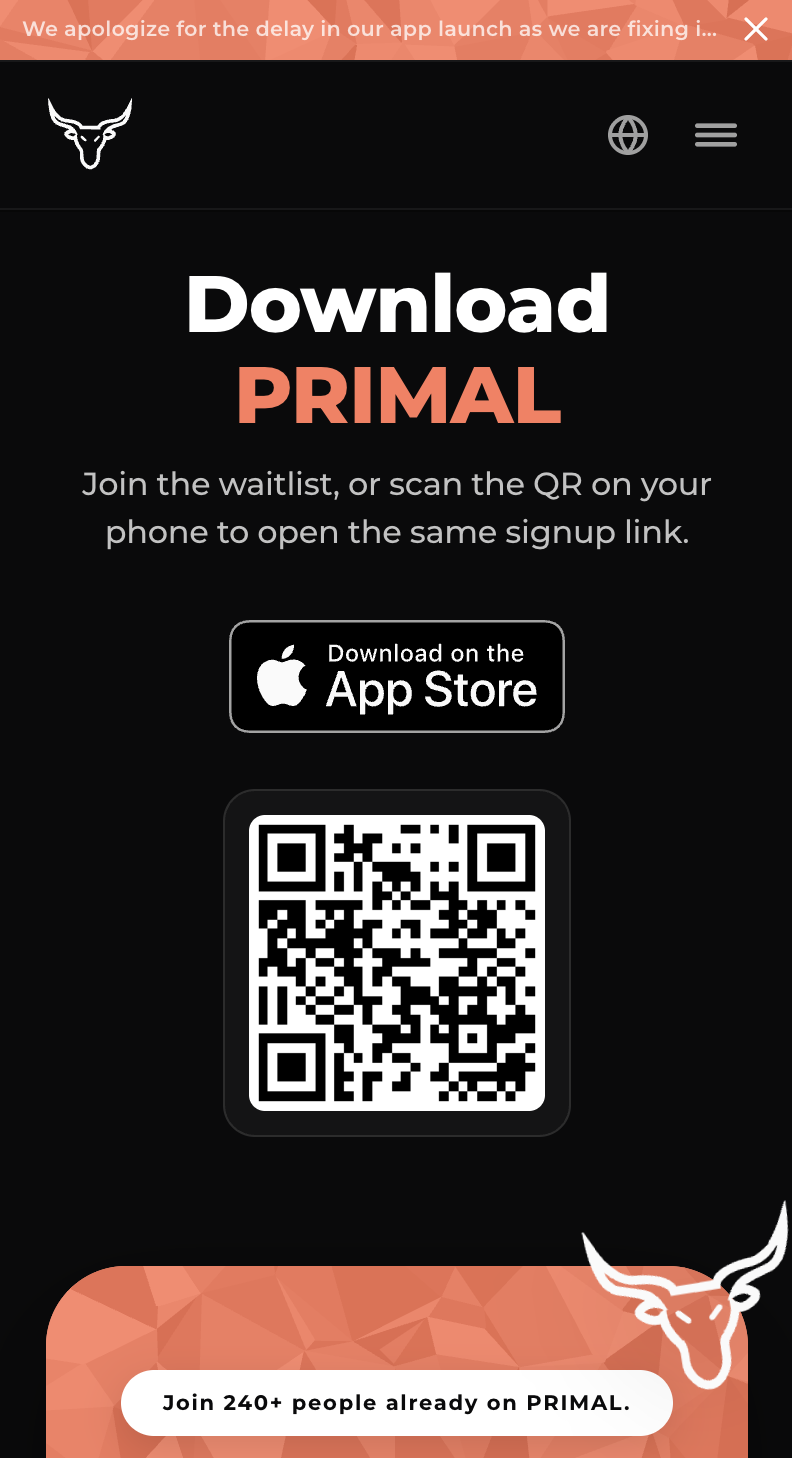
A dedicated download surface keeps the store path clear — jump to the App Store or scan the QR — without crowding that CTA into the waitlist or the main marketing scroll.
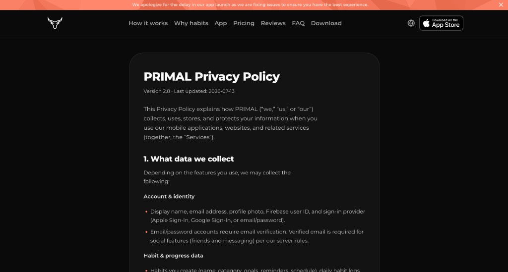
Privacy & terms
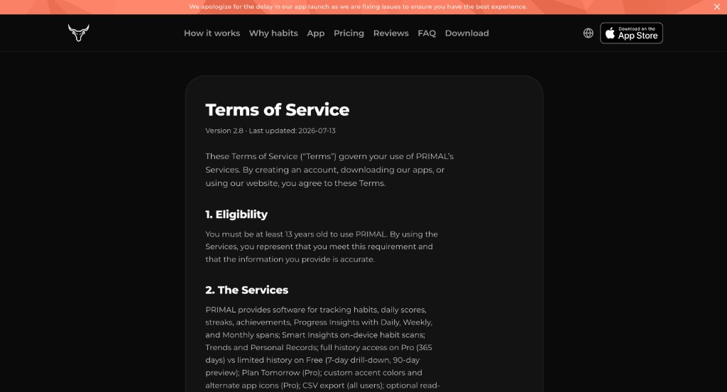
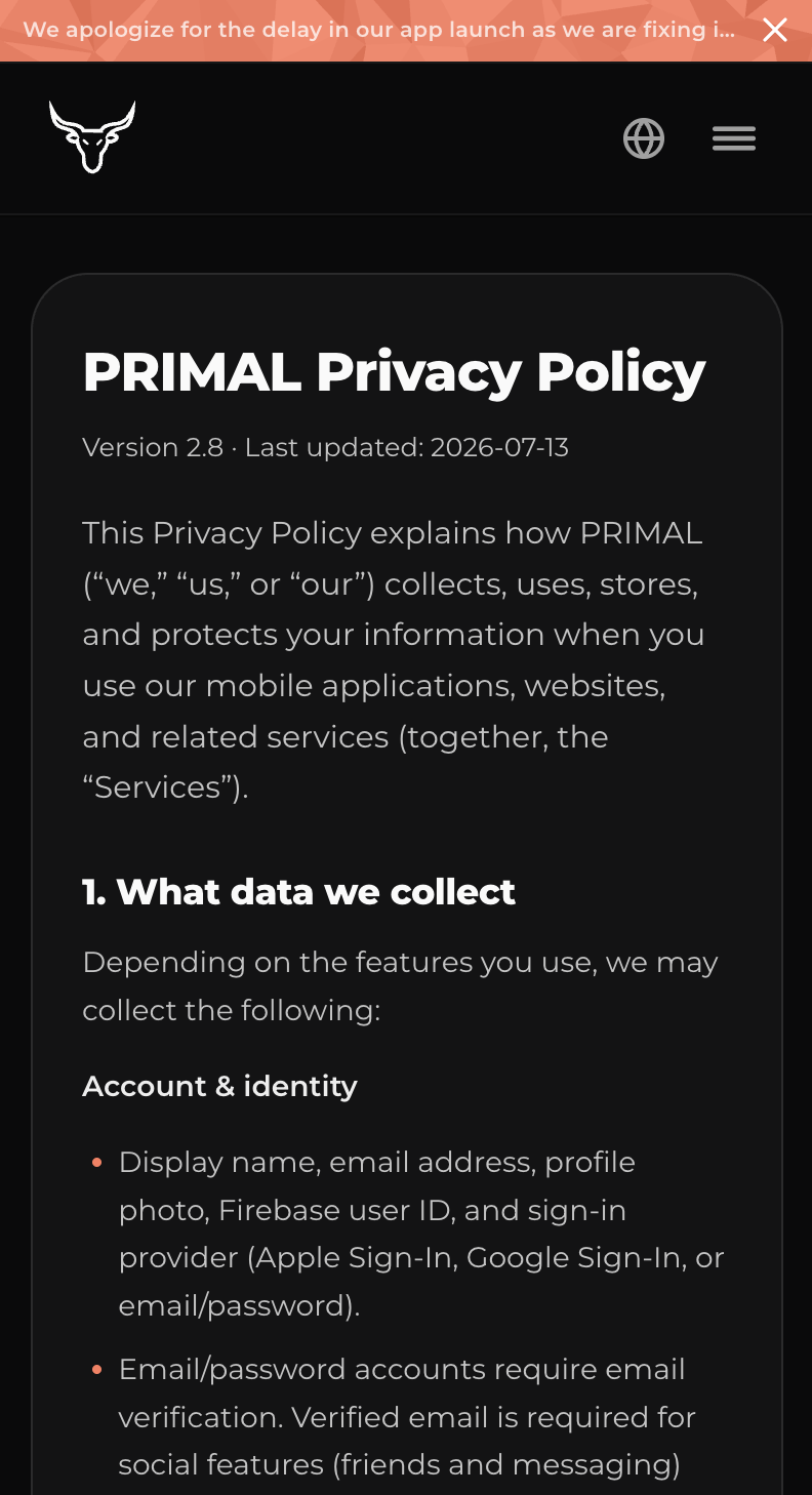
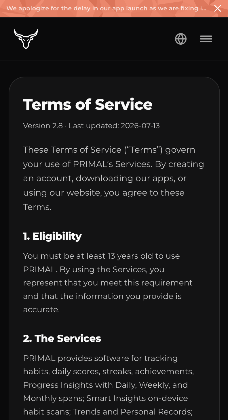
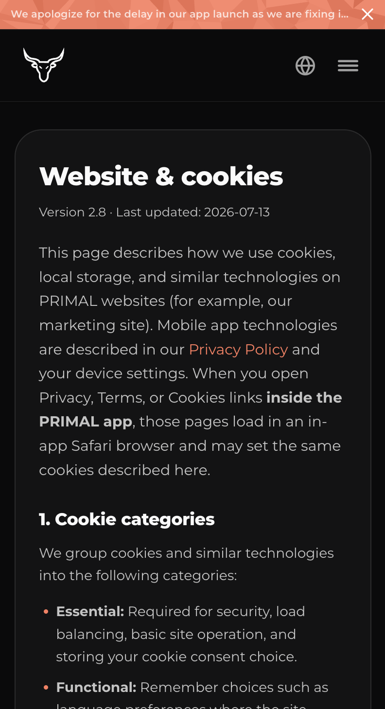
We went through several versions of Privacy and Terms while building the app — updating the language as features landed so the legal pages stay current and actually pair with what PRIMAL does, instead of drifting into generic boilerplate.
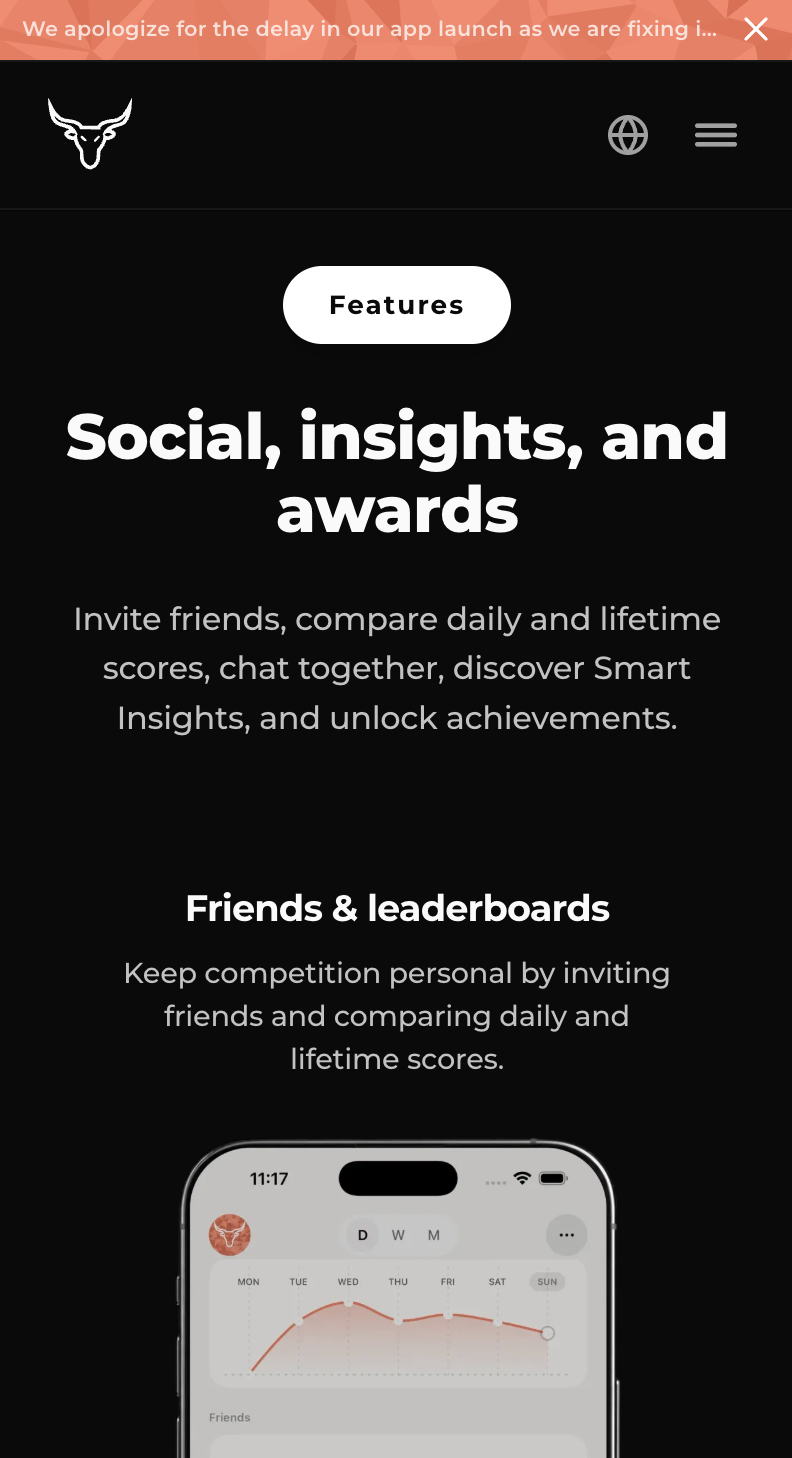
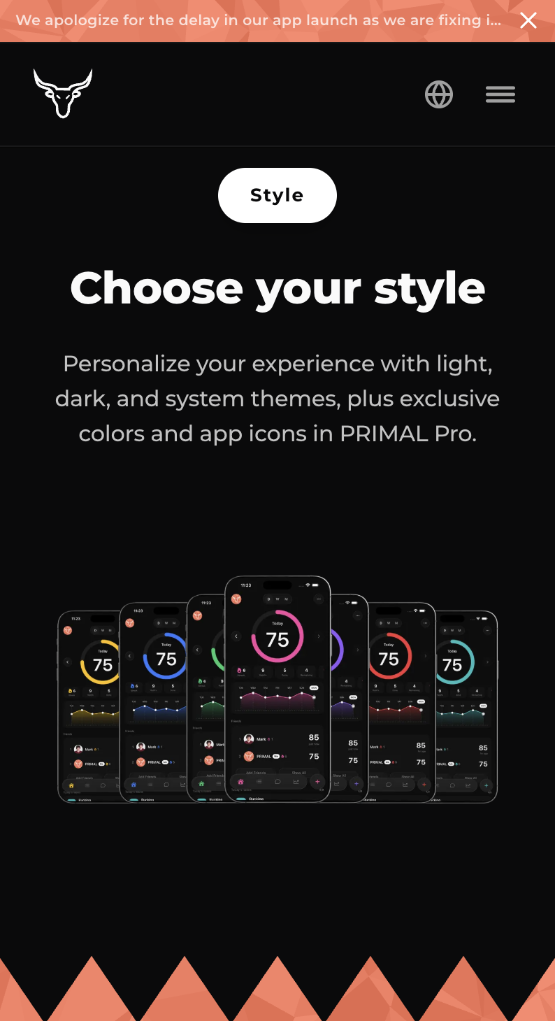
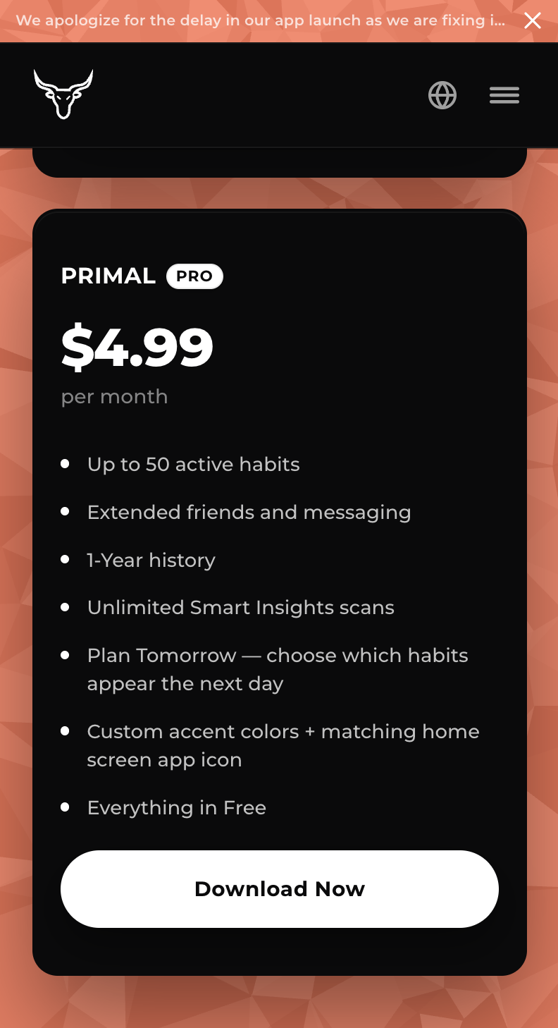
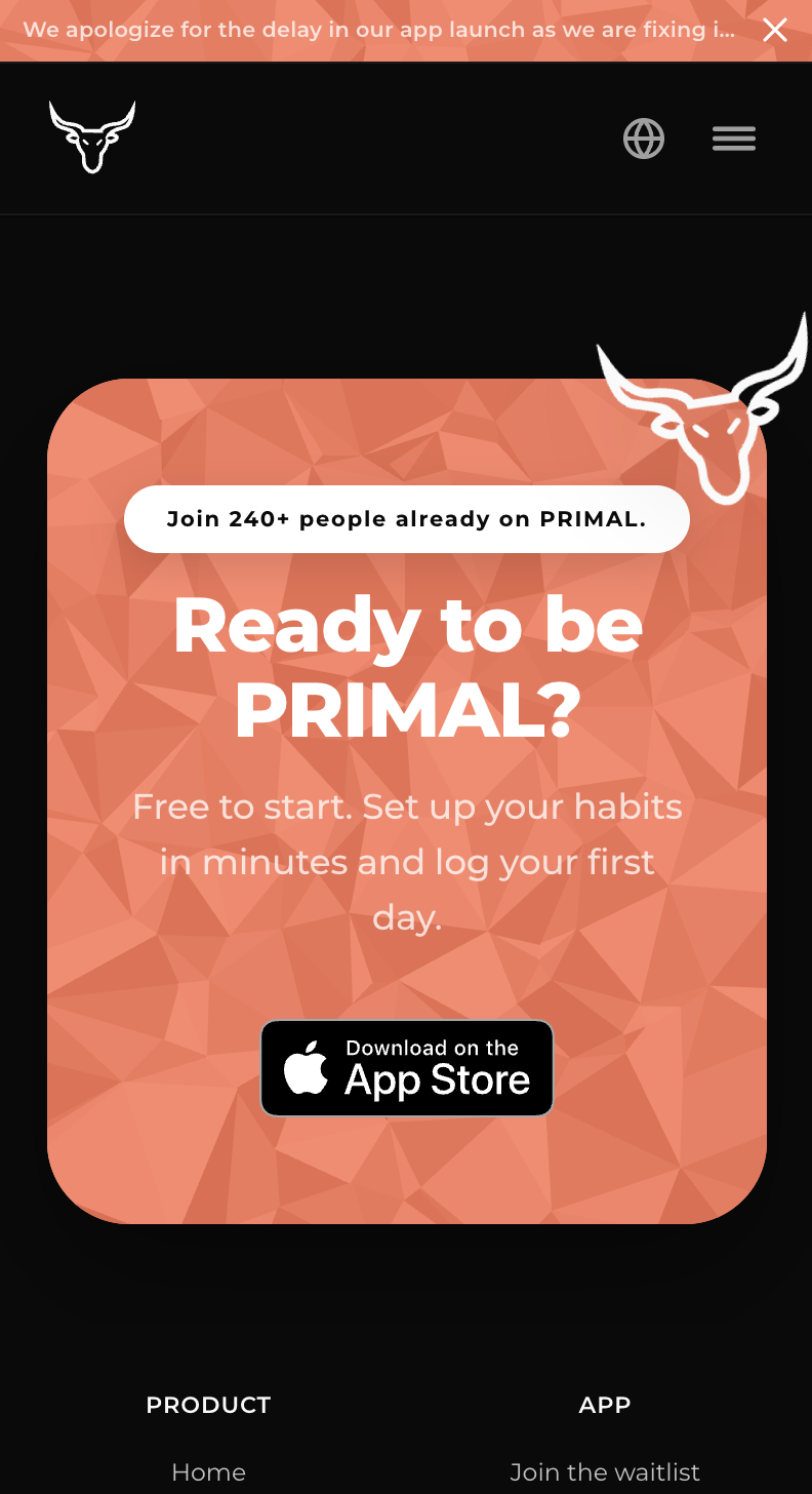
Mobile Optimization
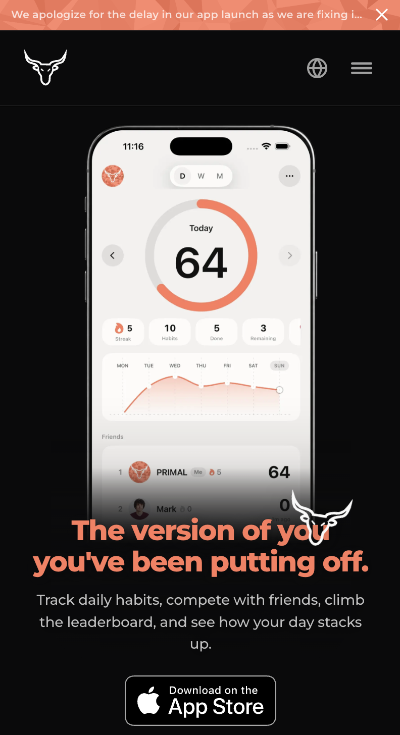
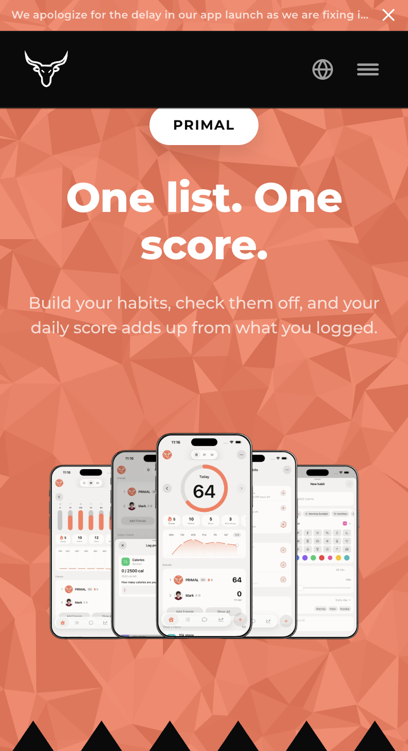
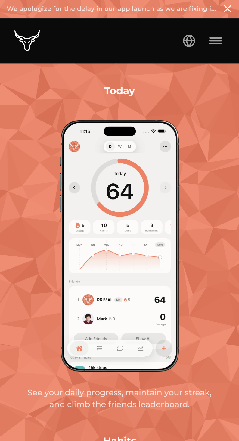
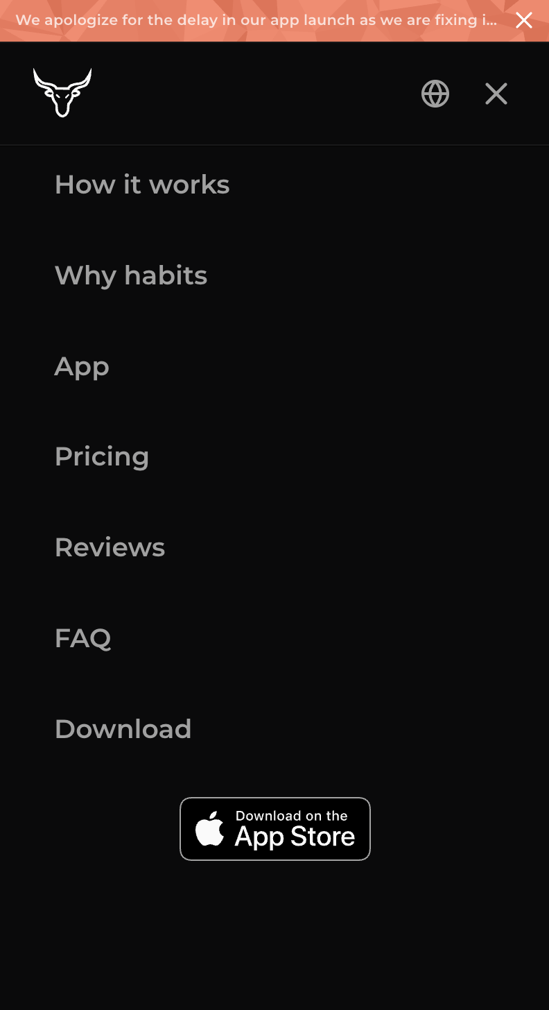
We treat the phone site as the same product as the desktop one — not a stripped-down leftover. Type, color, and the bull mark hold at this width: sections stack, the nav becomes a menu, and every page from the hero through waitlist, legal, and Have Questions is designed for a thumb rather than squeezed in after. Someone landing from Instagram or a text gets the same brand and the same path as someone on a laptop.
Ad creative
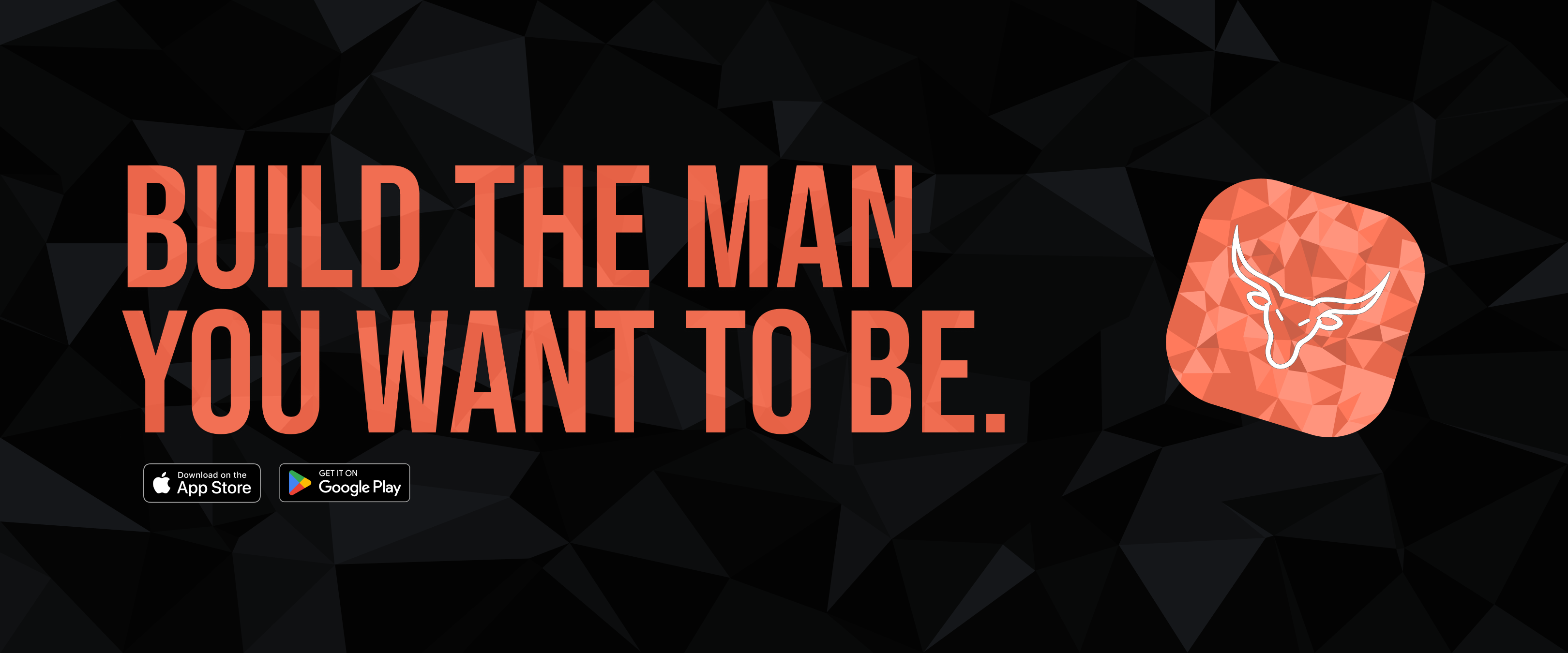
This is a banner built around a strong, bold line — "Build the Man You Want to Be" — designed for brand recognition across Instagram, Twitter, and the rest of the social stack. Coral type on a dark, faceted ground keeps it loud enough to stop a scroll while still matching the PRIMAL brand, so the same voice shows up wherever the campaign runs.
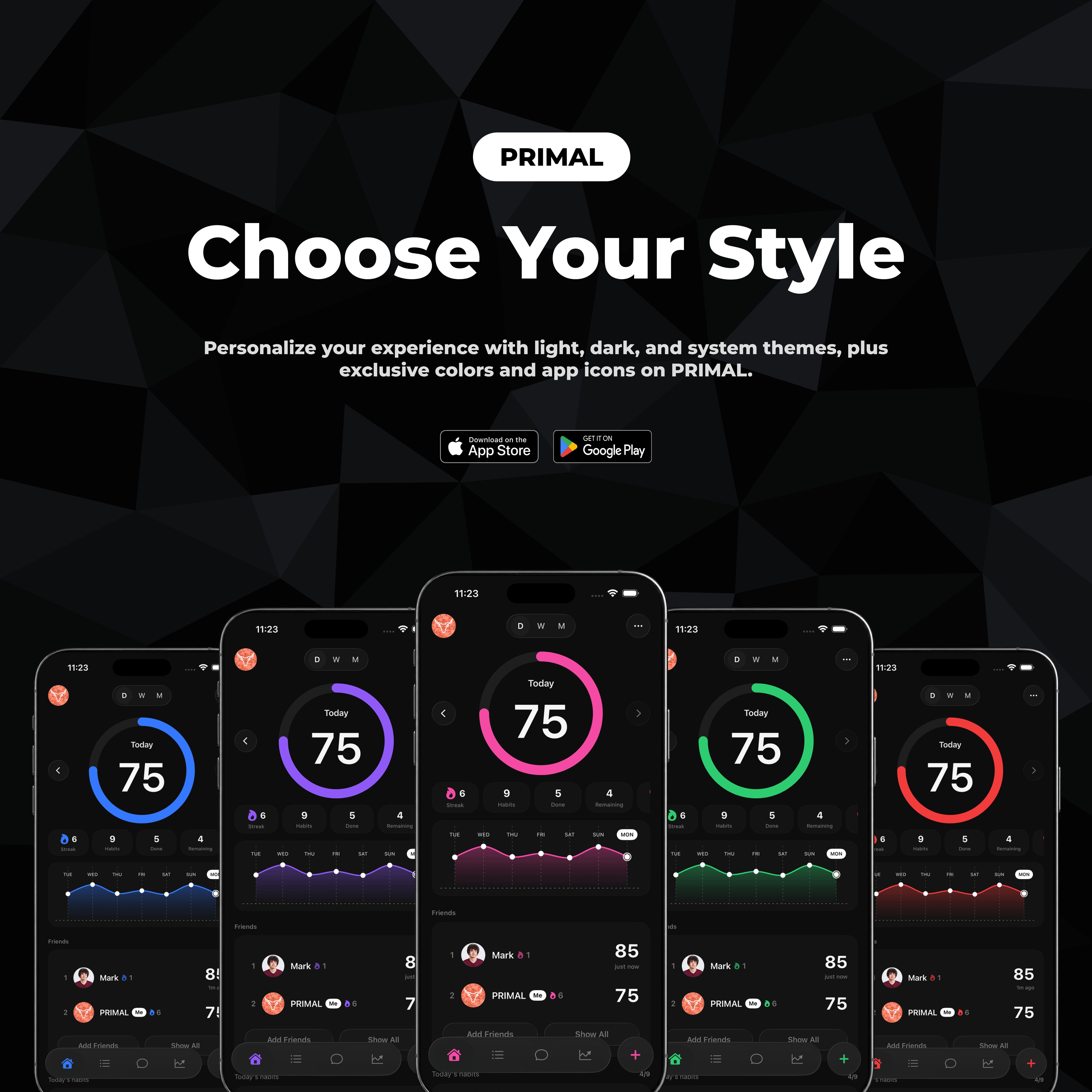
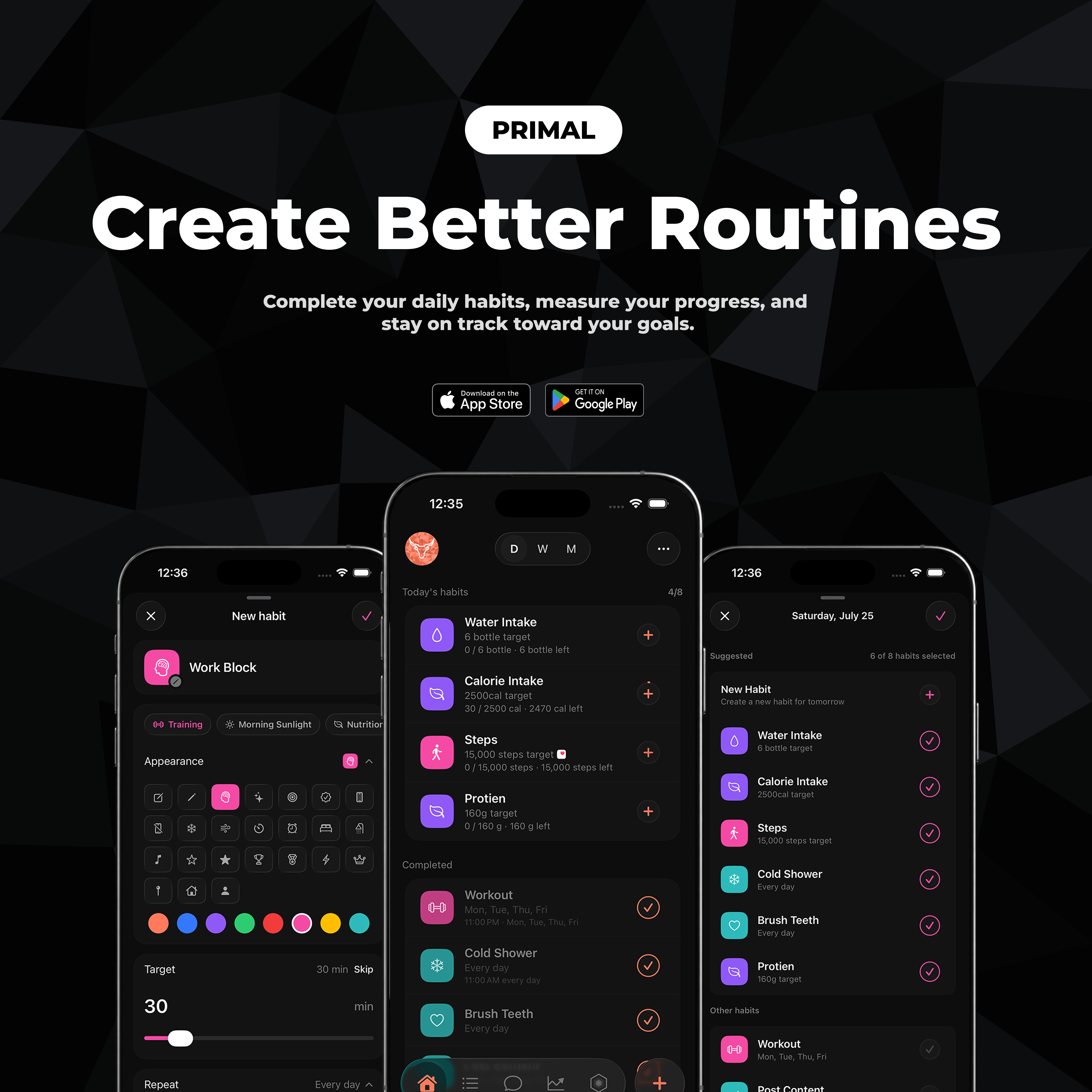
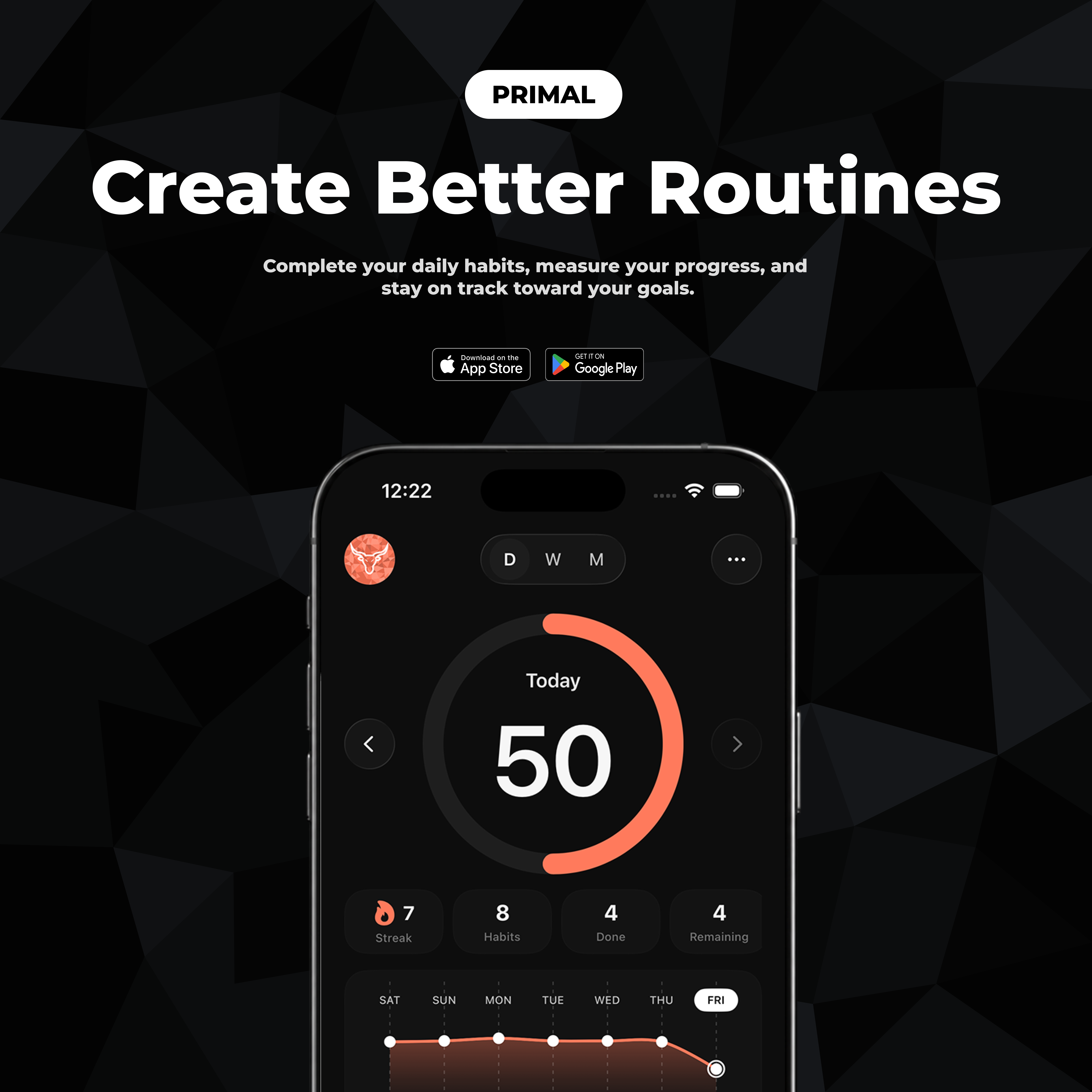
Ad creative
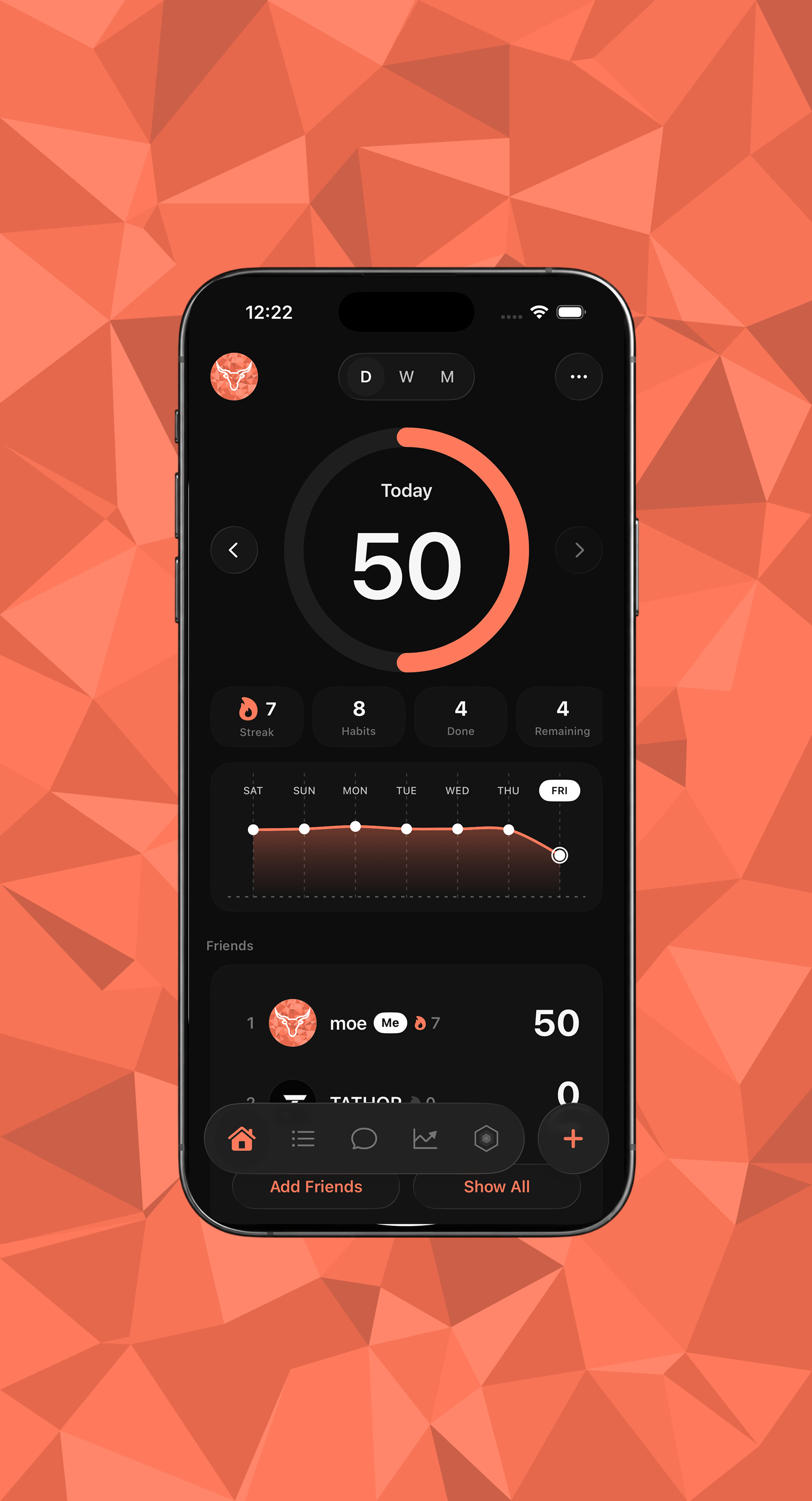
We constructed and redesigned multiple ad directions before landing on the final results shown here — artwork that carries the same brand voice and design language as the landing page, while also putting the app itself on screen. That overlap is intentional: the ads, the site, and the product all read as one system, so the campaign and the experience stay in harmony instead of feeling like separate pieces.
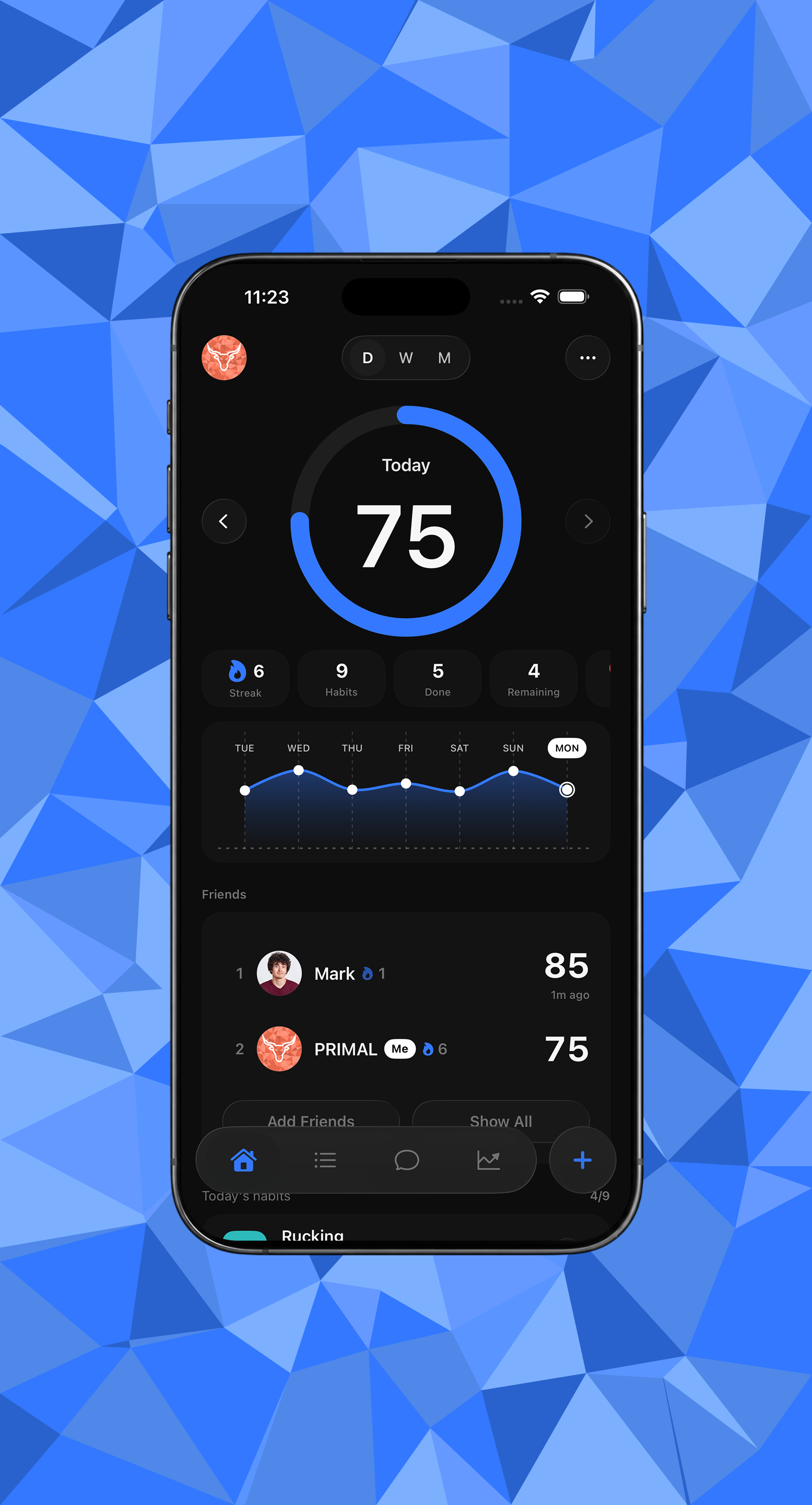
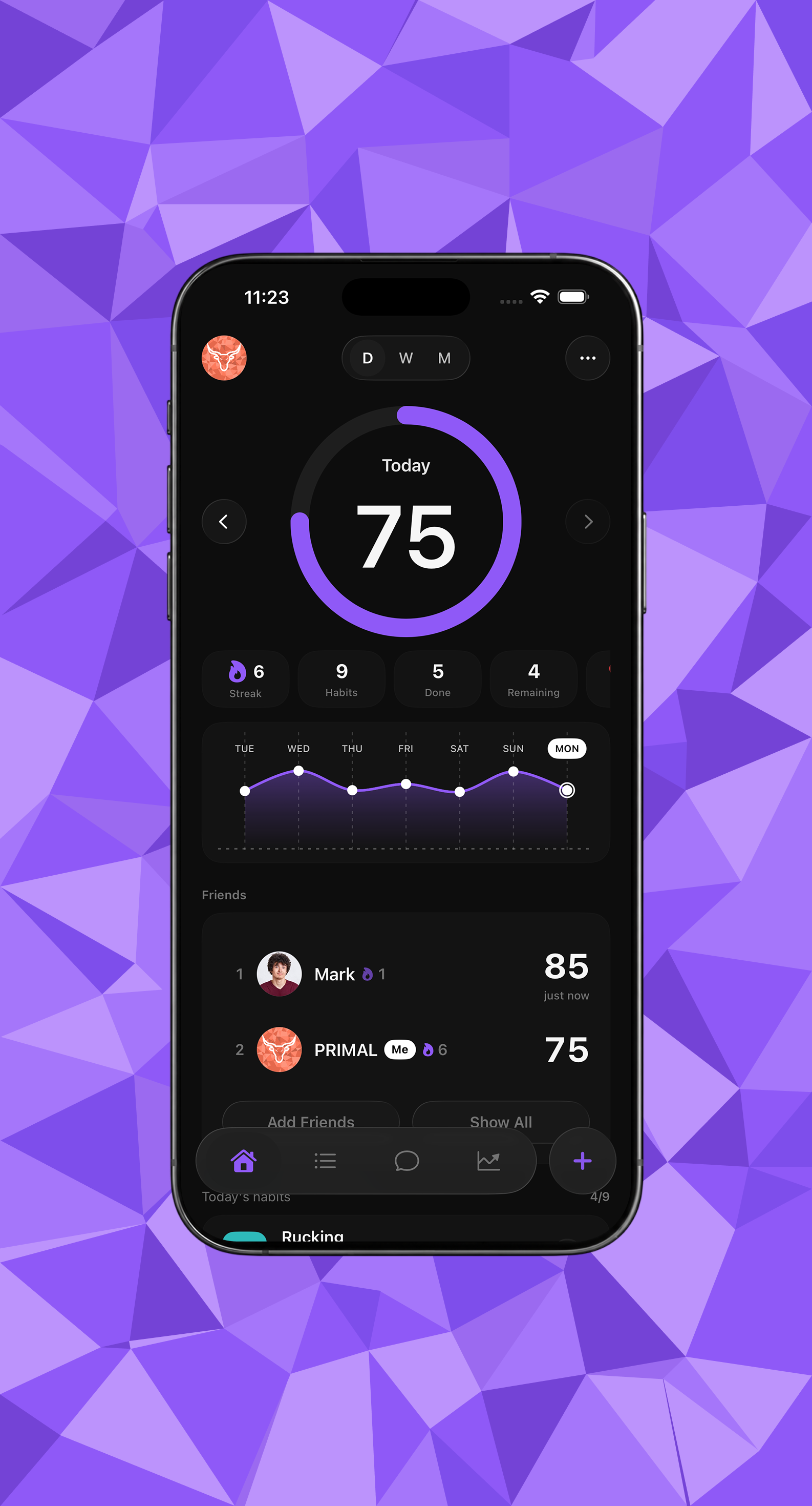
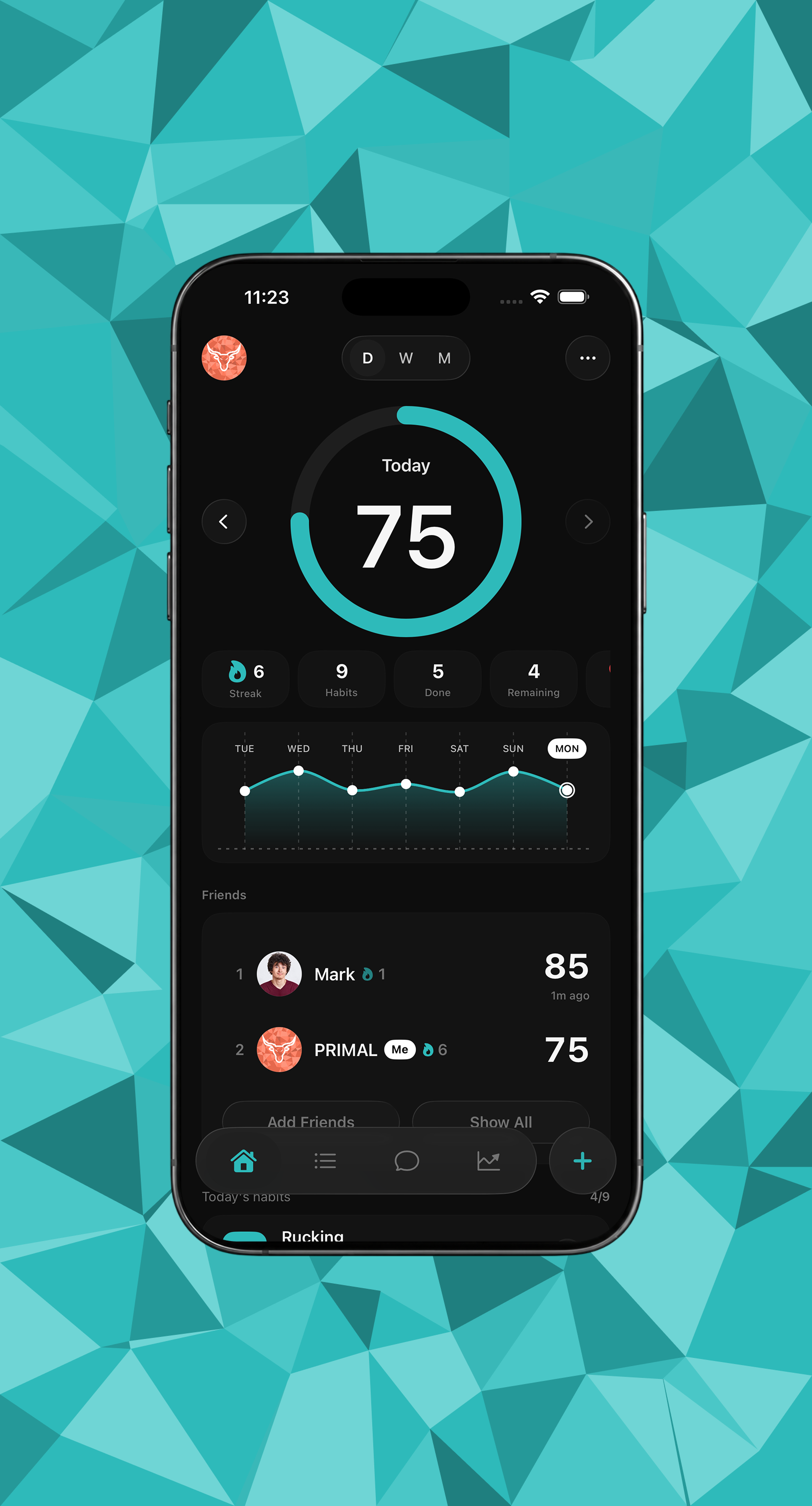
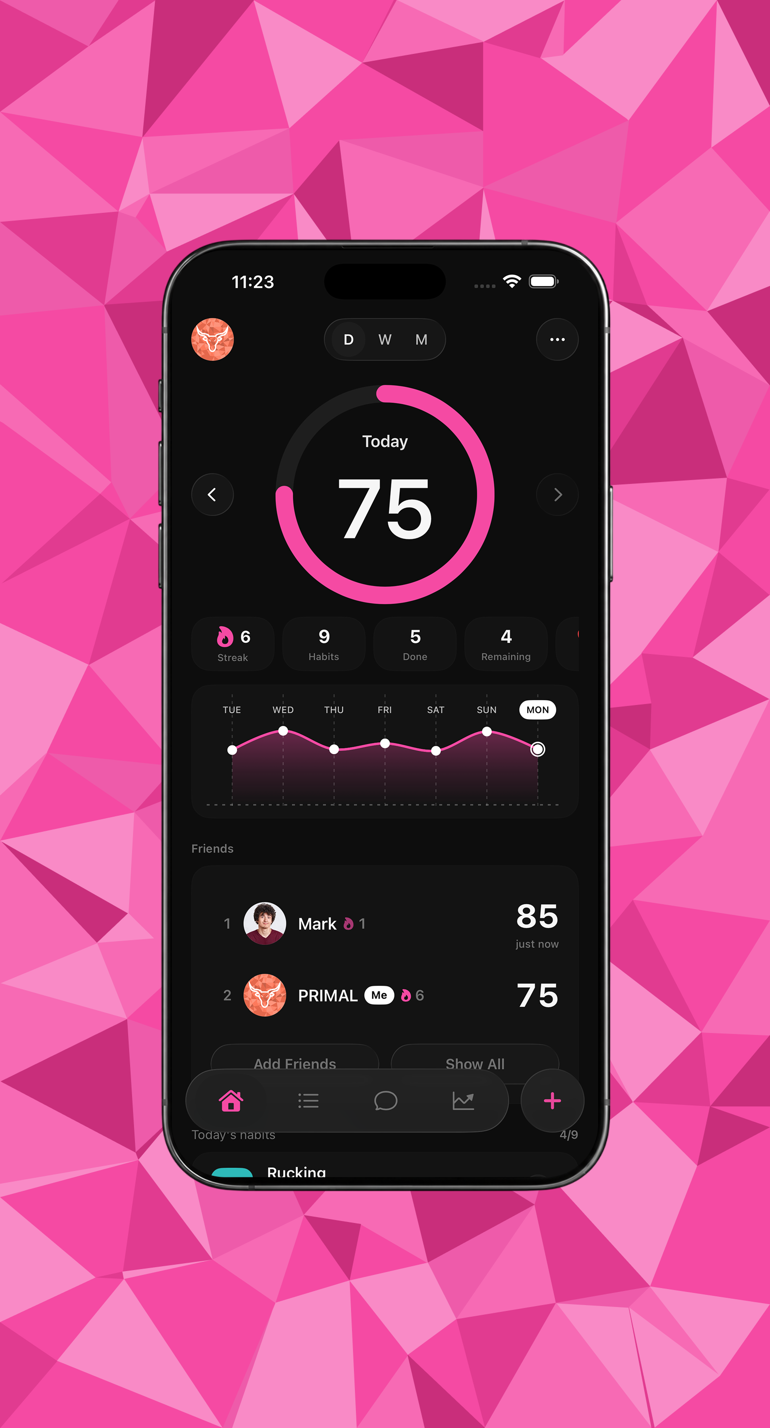
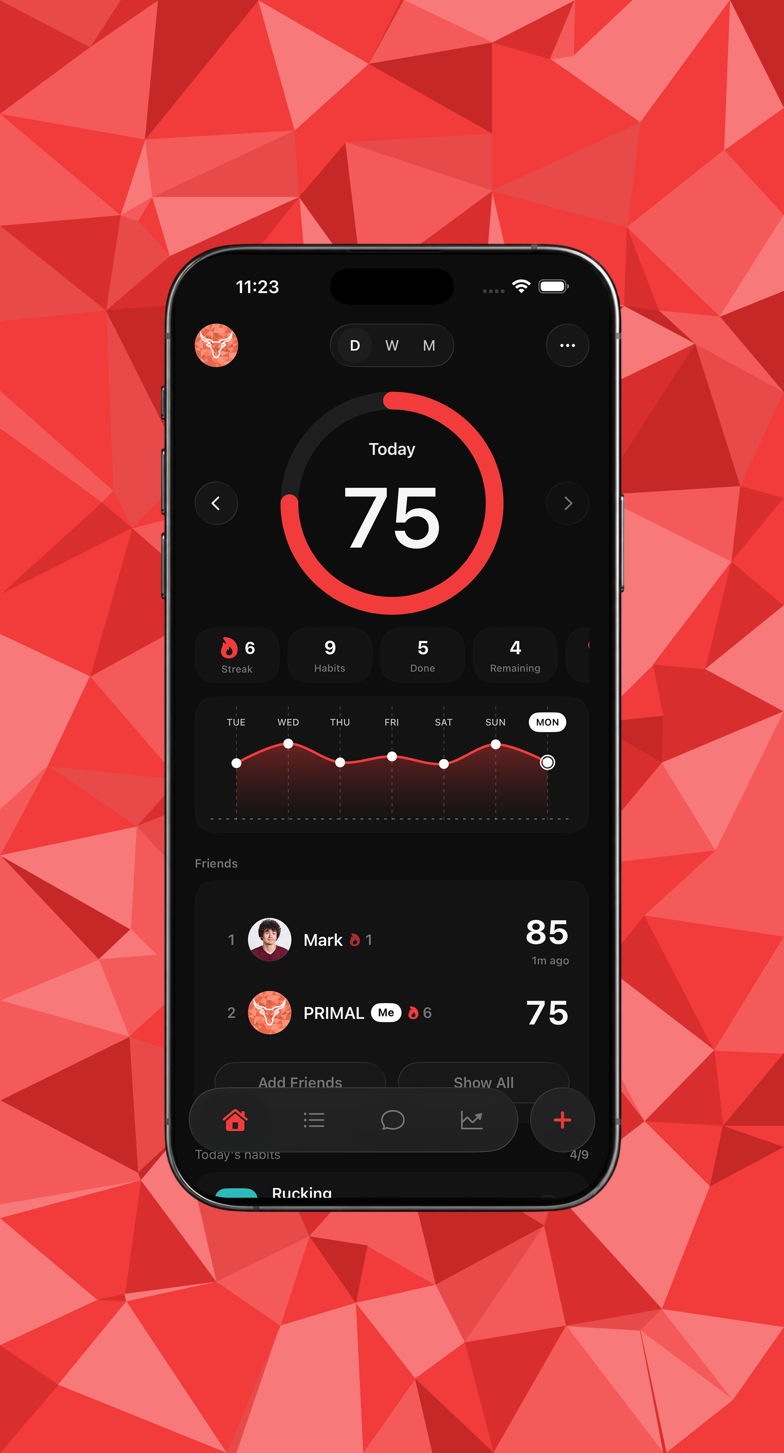
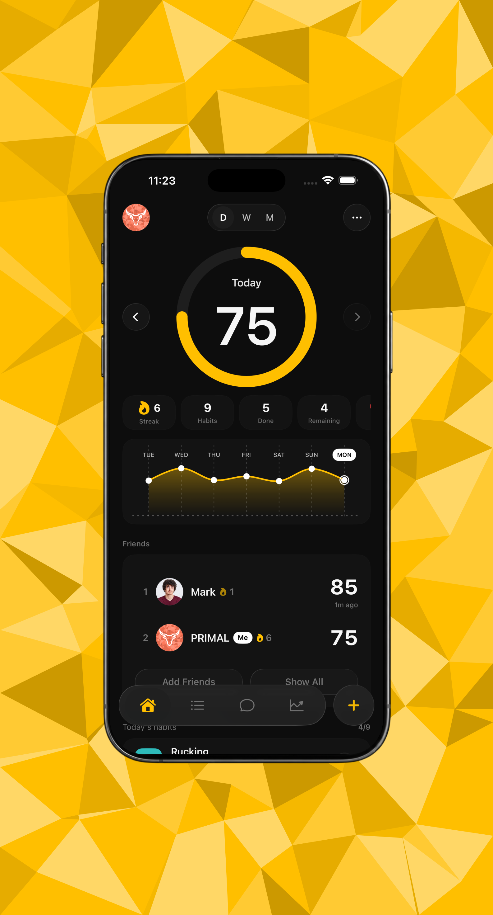
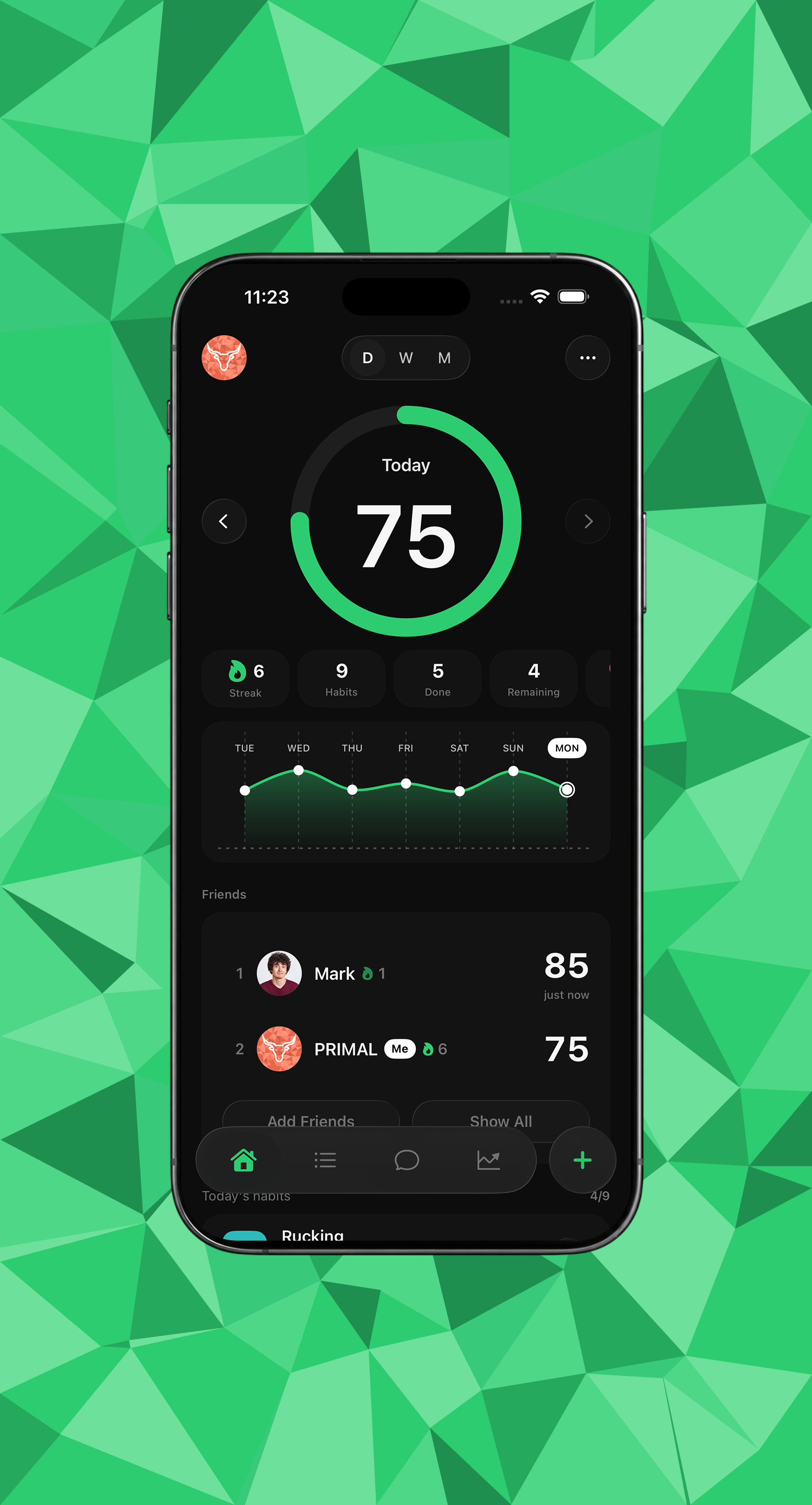
App Appearance
These are the app appearances available to Pro users — each accent color fully dressed as a launch screen so the product feels custom, not one-note. We laid them out together so the range is easy to see at a glance, and so the same set can be pulled into social ads when we want to show how personal the app can look.
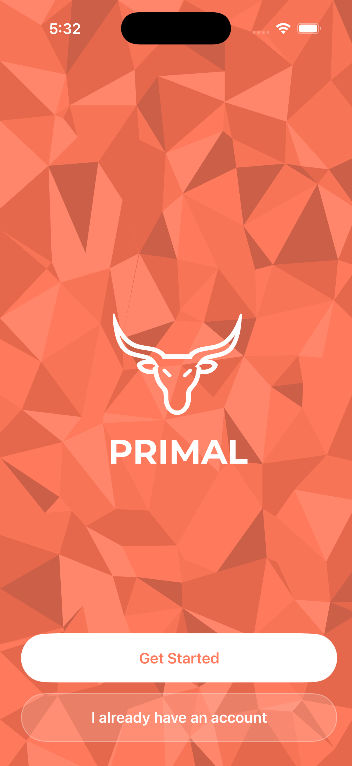
Launch & onboarding
The app opens on the same coral, low-poly background as the website, with the bull mark, the PRIMAL wordmark, and two options: Get Started, or sign in if you already have an account. The visual language carries over directly from the marketing site, so there's no jarring shift between "the ad" and "the actual app."
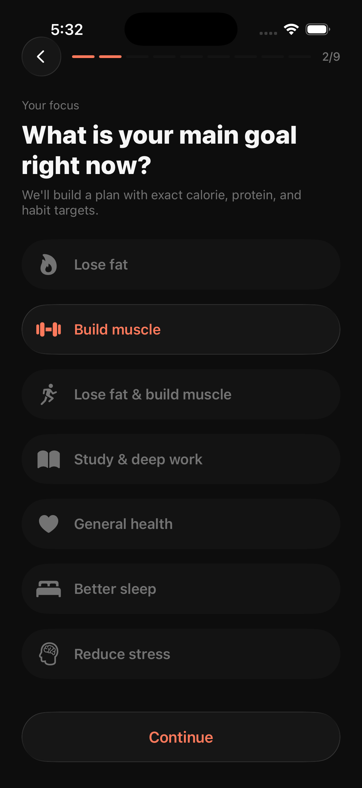
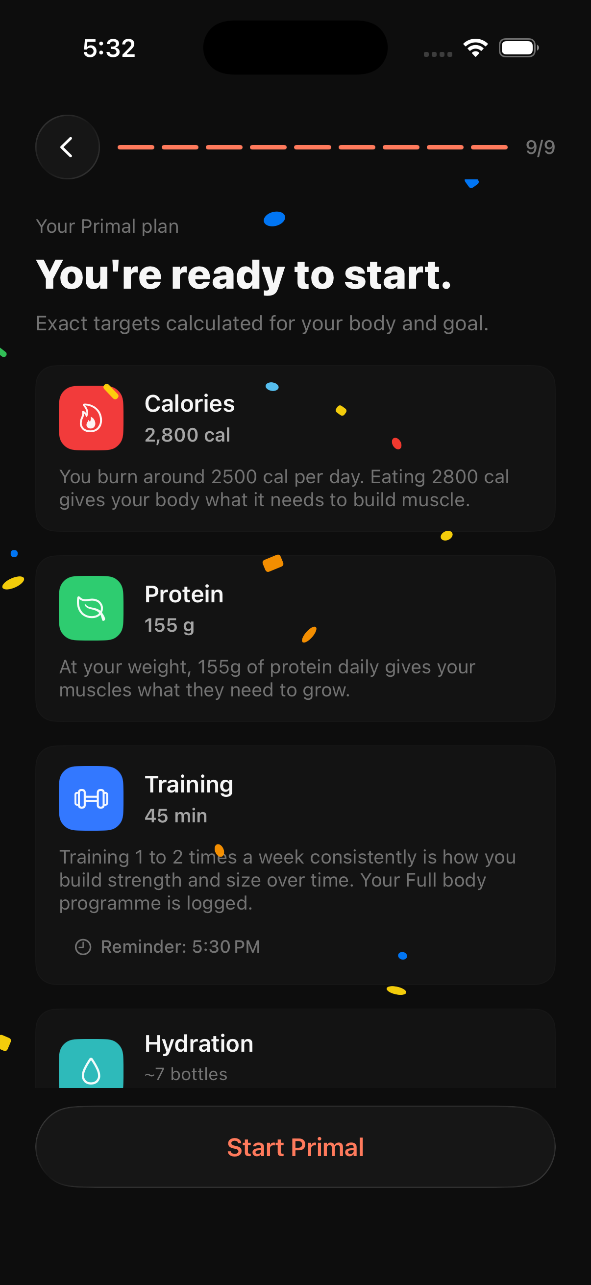
A nine-step onboarding quiz starts by asking the main goal — lose fat, build muscle, both, study and deep work, general health, better sleep, or reduce stress. At the end of the quiz, the app shows the actual numbers it calculated — calorie target, protein target, training minutes, hydration — each with a one-line explanation of why that number was chosen.
Sign-in & paywall
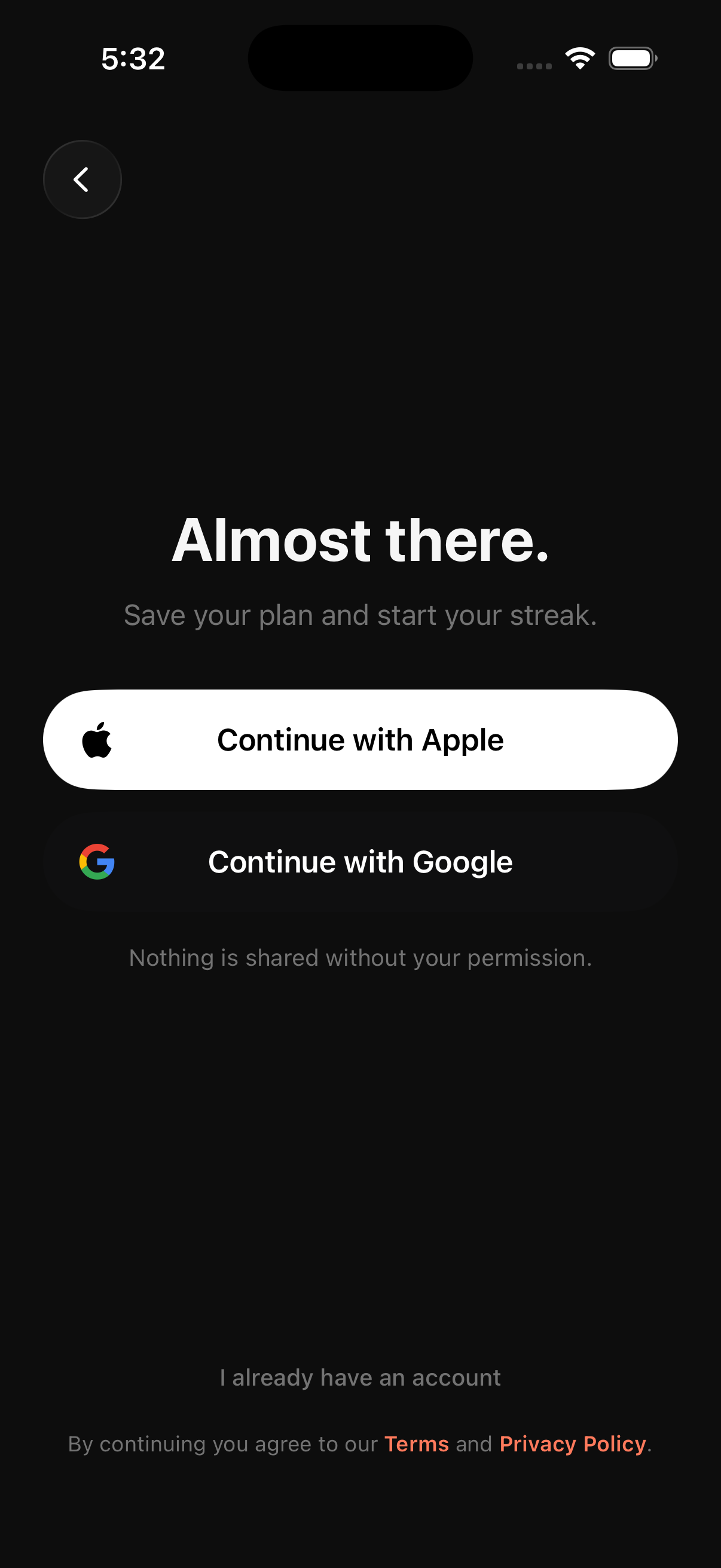
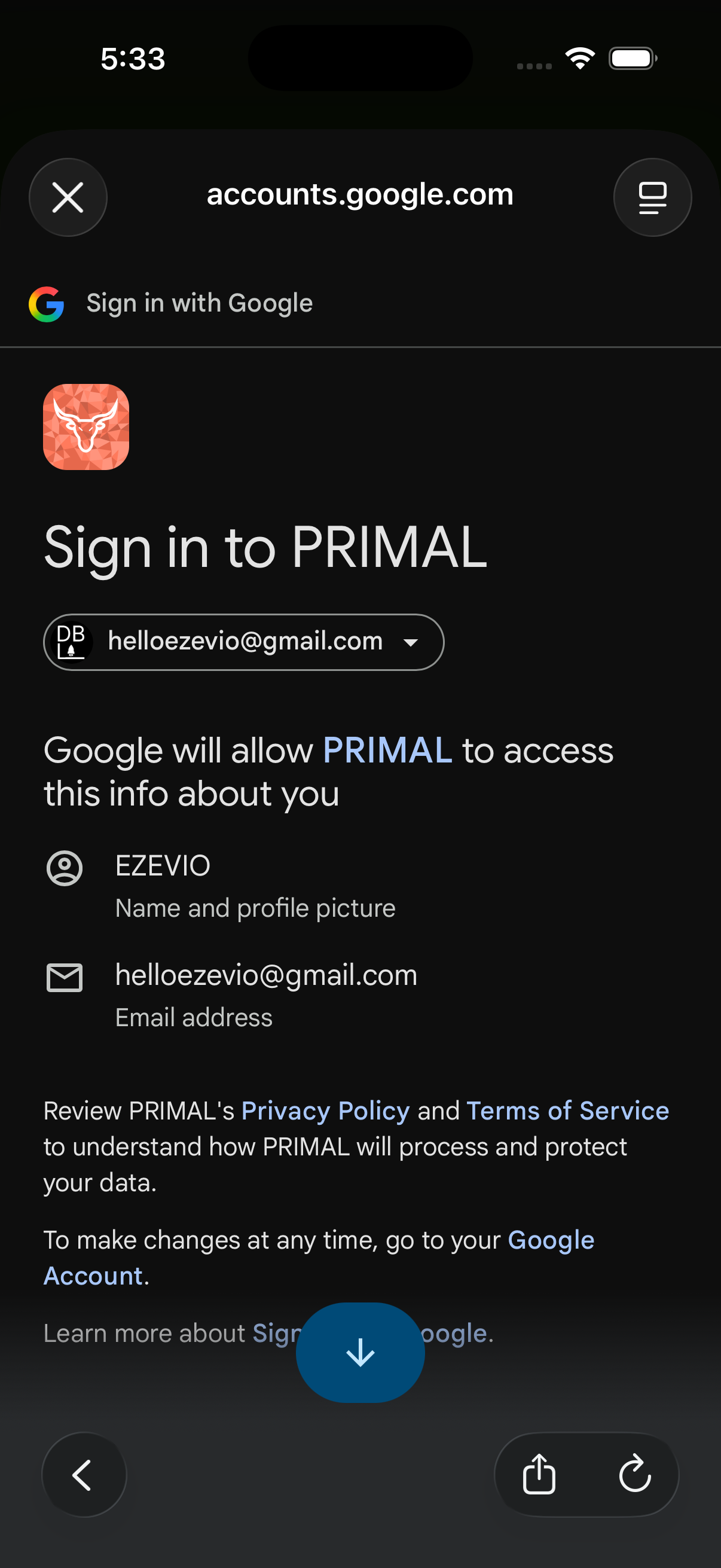
We stepped away from a create-your-own-account flow inside the app and leaned on Google and Apple as the sign-in and sign-up providers. That keeps users from forgetting another password, cuts the risk of a password breach on our side, and takes the stress out of getting in — so the path from plan to account stays smooth.
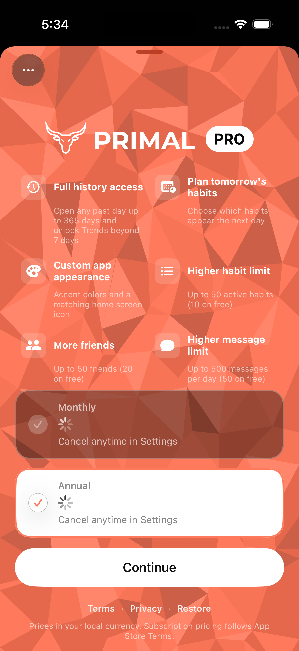
The paywall is a polished piece that still uses the same cohesive design language as the rest of the app, with App Store requirements built into the flow rather than bolted on after the fact.
First achievement, home & today's habits
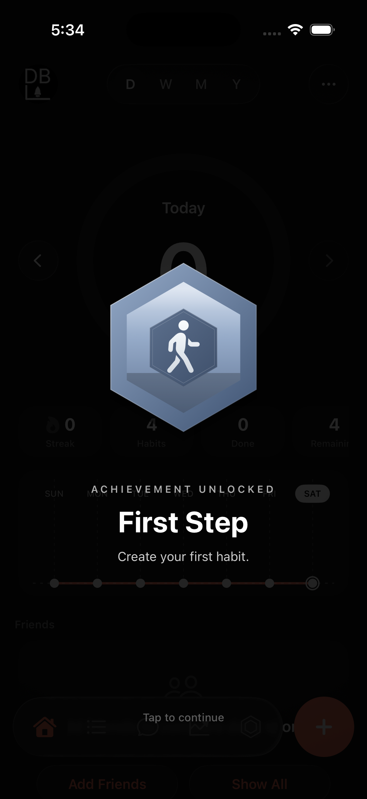
Award unlocks went through multiple iterations before we landed on the clean overlay shown in the first image — a full-screen badge that celebrates the "First Step" without cluttering the home screen underneath.
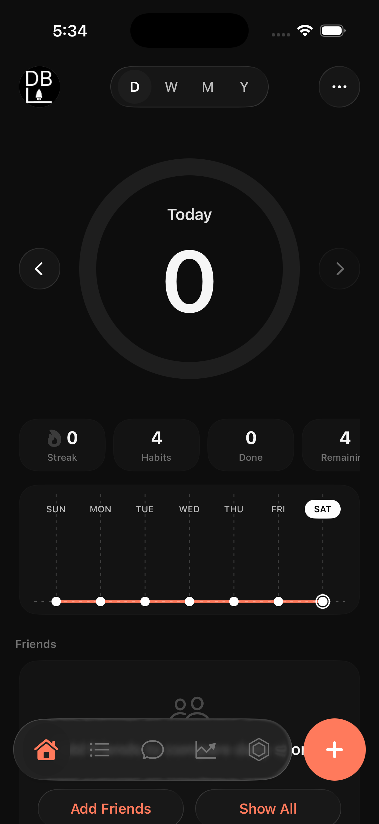
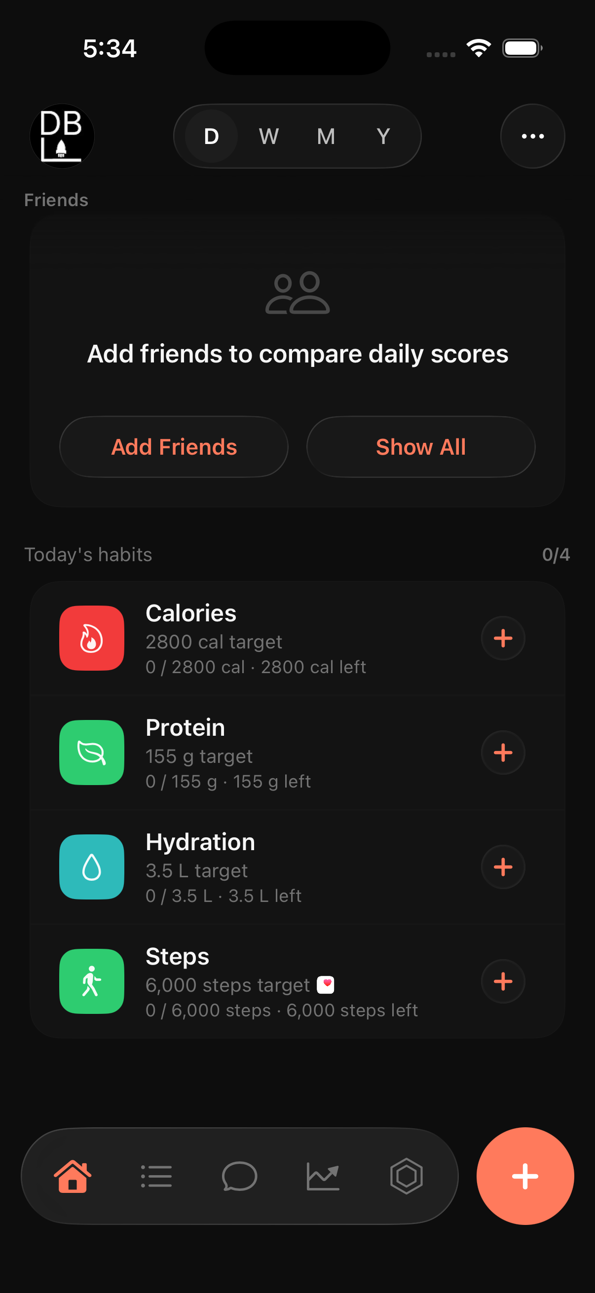
Home revolves around checking off the habits you've set and pushing the daily score as high as you can. The Today tab centers that score, with streak, habits, done, and remaining underneath so progress is obvious the moment you open the app.
Habits, messages & insights
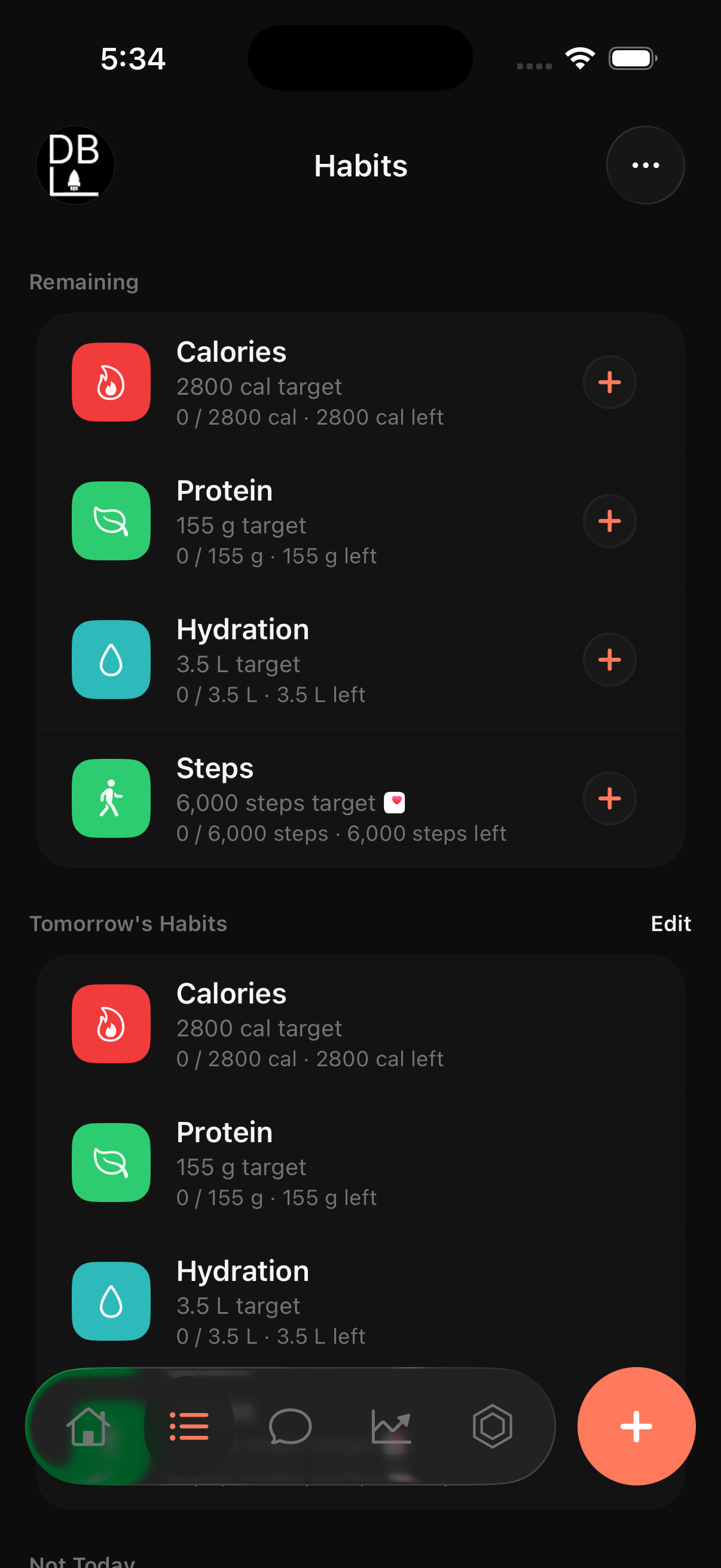
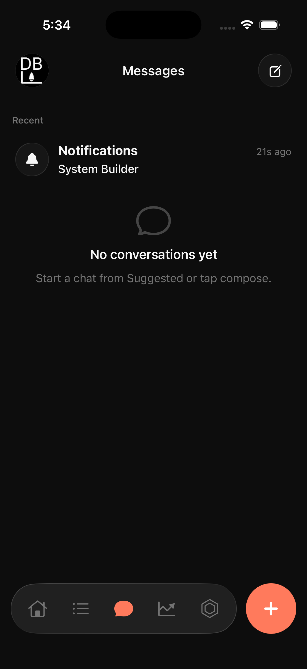
Habits are split into Remaining, Tomorrow's Habits, and Not Today, so a long list doesn't turn into a wall of identical rows. Tomorrow's Habits is editable directly from here — this is the Plan Tomorrow feature from the paywall. The Messages tab starts empty for a new user, with a Notifications entry showing system messages and a prompt to start a conversation from Suggested or the compose button.
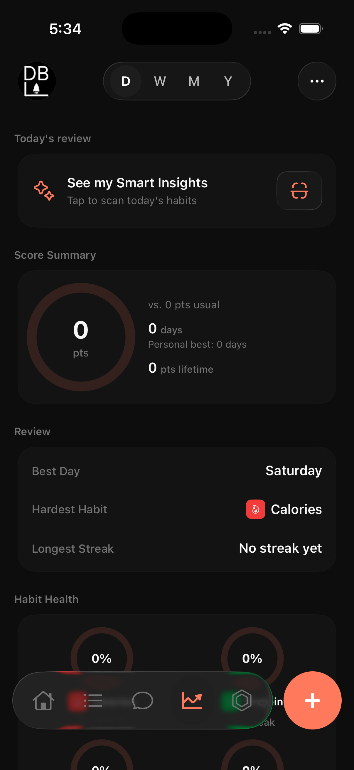
Insights opens with "See my Smart Insights — tap to scan today's habits," followed by a Score Summary, a Review section, and Habit Health percentages. Smart Insights runs on-device from actual habit data — it's explicitly not a chatbot or generative AI, just a computed summary of real logs.
Awards & settings
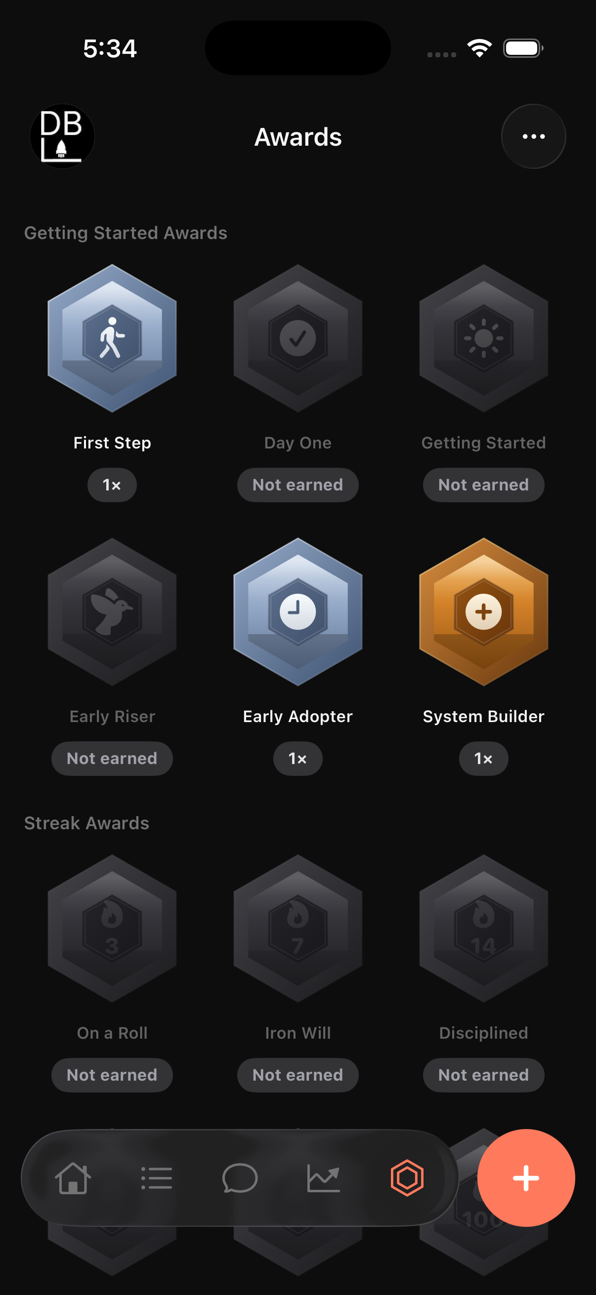
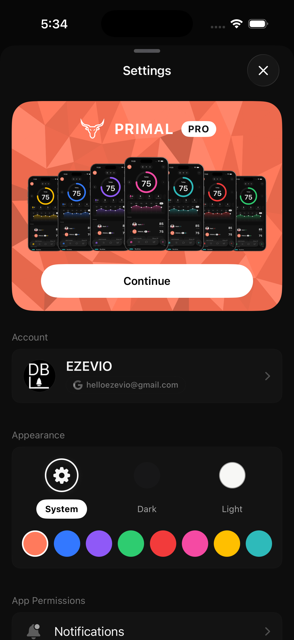
Achievements are grouped into sets — Getting Started Awards, Streak Awards — shown as hexagonal badges, earned ones in full color and unearned ones dimmed with a "Not earned" label. Settings opens with a Pro upgrade card showing the same seven-phone theme preview from the marketing site, followed by account info and the appearance picker — System/Dark/Light mode plus all eight accent colors.
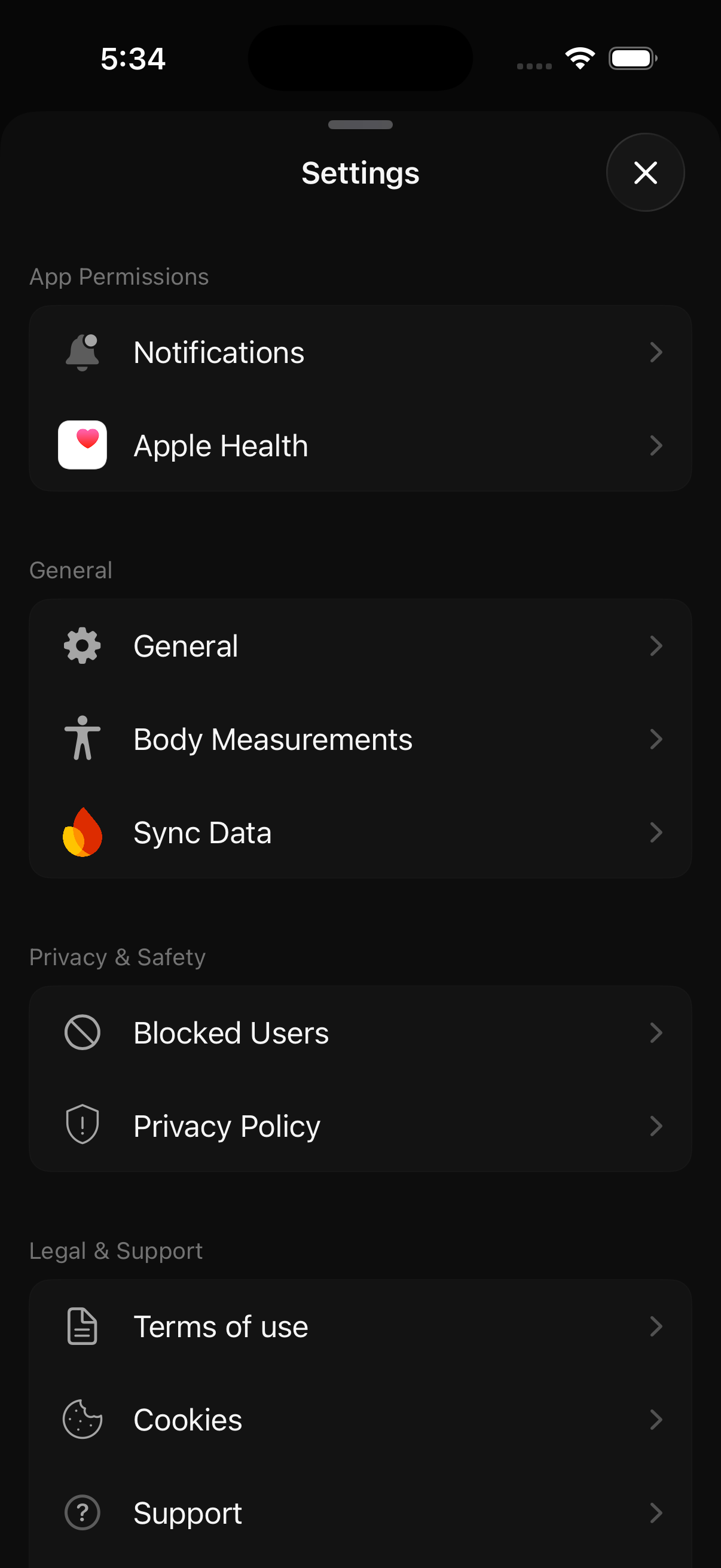
Further down: App Permissions (Notifications, Apple Health), General (Body Measurements, Sync Data), Privacy & Safety, and Legal & Support. Apple Health syncing means PRIMAL can pull in real step and activity data instead of relying only on manual logging.
Profile, calendar & new habit
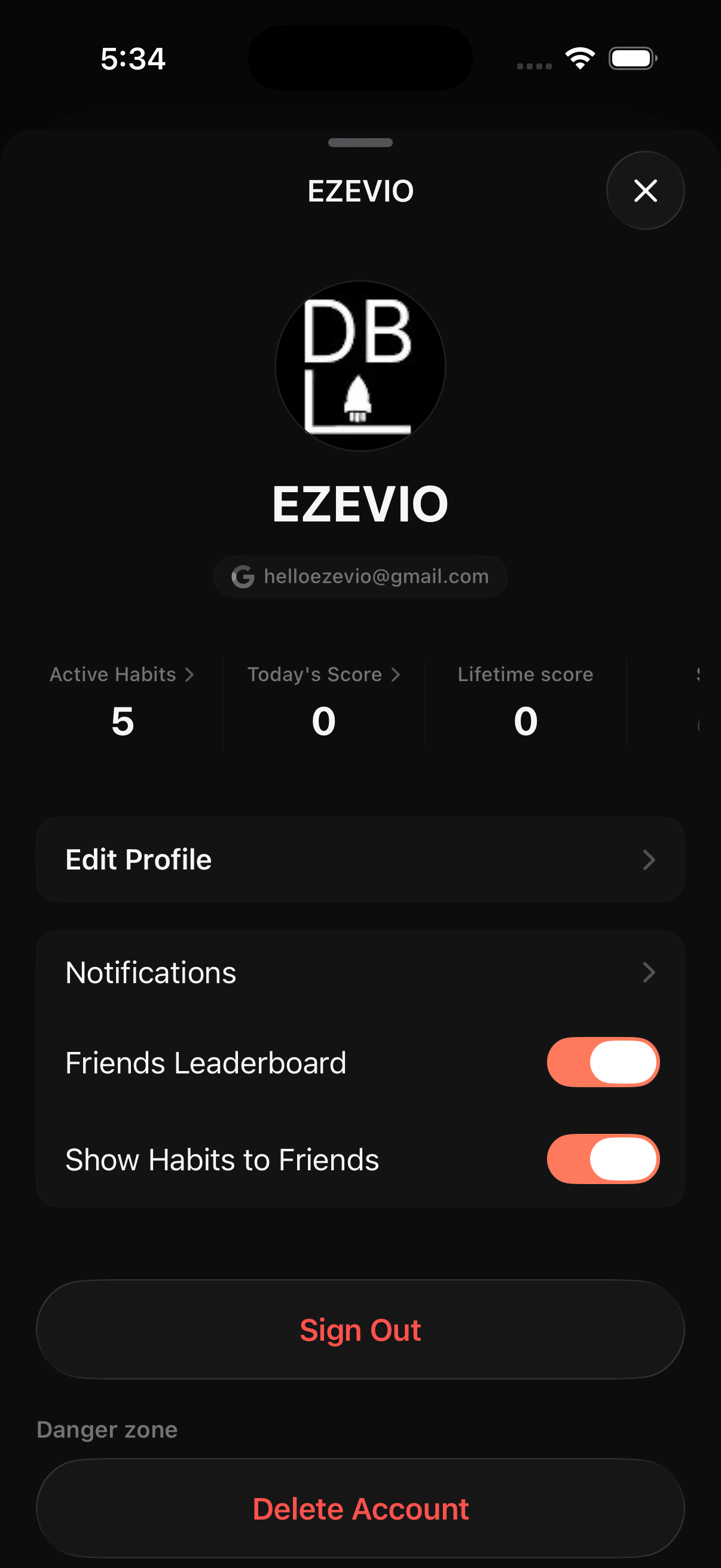
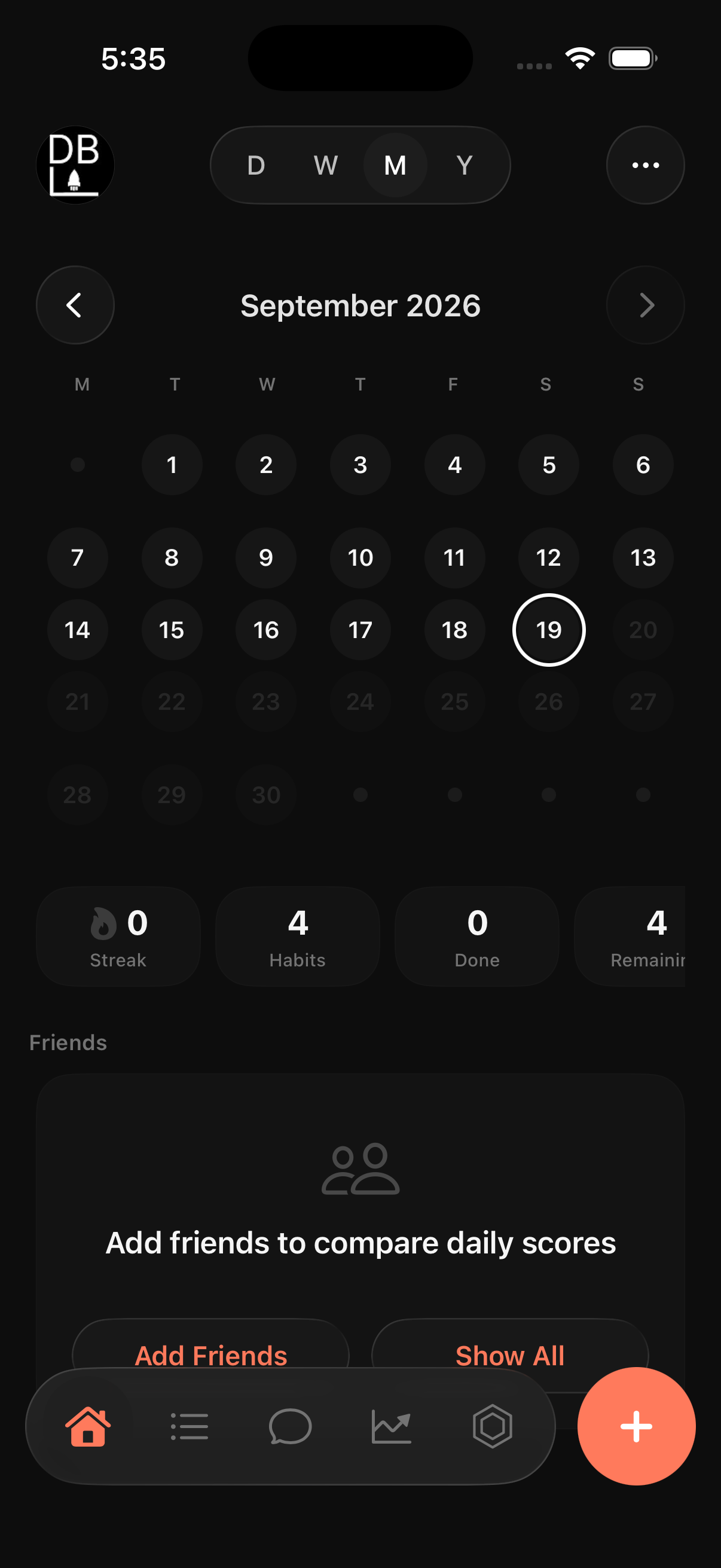
The profile sheet shows Active Habits, Today's Score, and Lifetime Score, plus two privacy toggles: Friends Leaderboard, and Show Habits to Friends. Sign Out and Delete Account sit clearly separated at the bottom, with Delete Account marked as a distinct danger zone. Switching to Month view on the Today tab shows a full calendar grid instead of just the current day, so someone can jump back and check any specific past day.
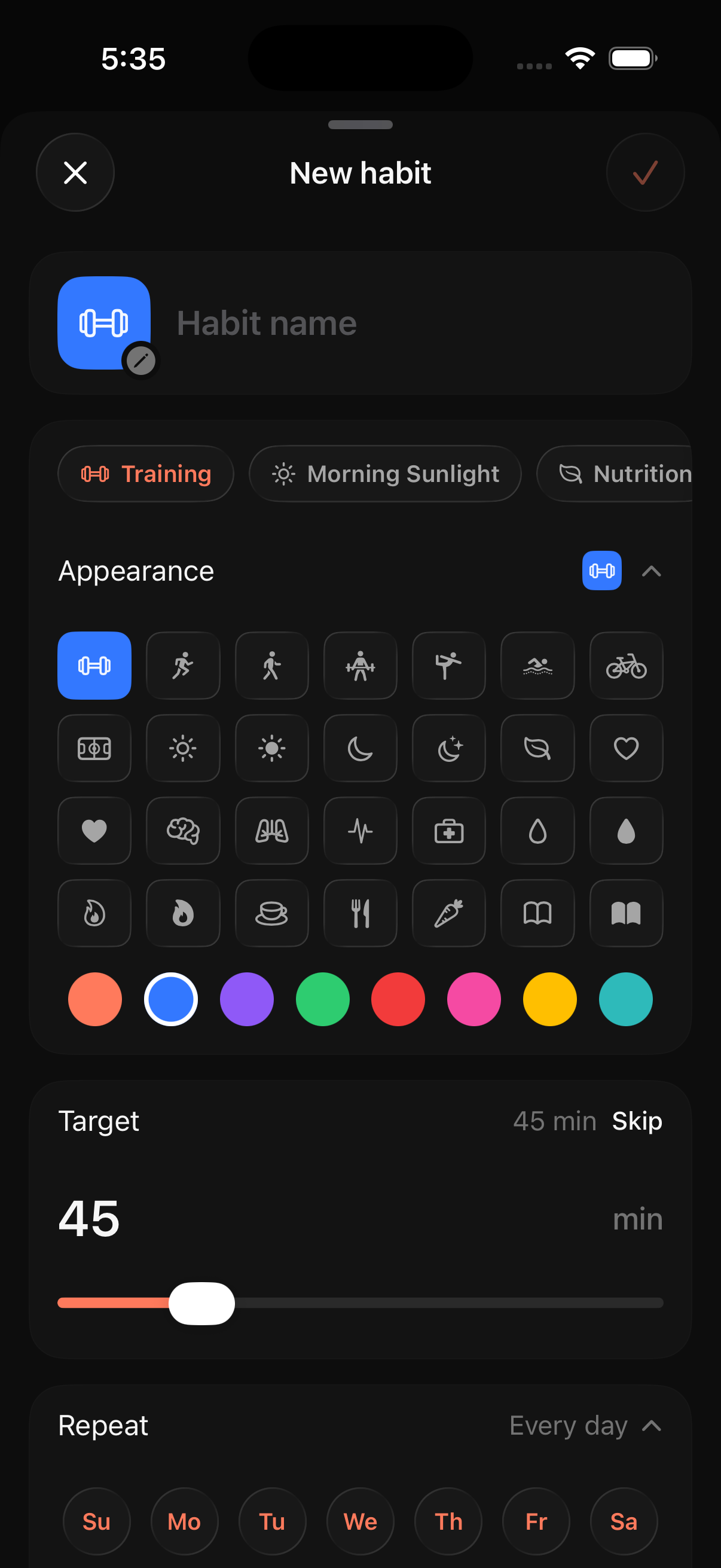
Creating a habit means naming it, tagging it to a category (Training, Morning Sunlight, Nutrition, and more), picking an icon and color from a full grid, setting a numeric or time-based target with a slider, and choosing which days it repeats on. Every part of a habit is fully editable, which is what makes the tracker flexible enough for something as specific as "Cold Shower, 3 min, 9:30 AM every day" instead of just a generic checklist.
Strategy
Design
Every part of the product uses the same coral-and-dark palette and the same bull mark, but the app itself goes further: the accent color a user picks in Settings changes the icon, the paywall, and key screens together, using the full theme system built out in Figma rather than swapping one color value.
Results
PRIMAL launched with a real marketing site, a nine-step onboarding flow that produces a personalized plan, a habit tracker with friends, leaderboards, in-app messaging, on-device Smart Insights, and 51 achievements, a Free/Pro paywall with specific limits at each tier, and a growing social presence — 3,935 Instagram followers and 676 on TikTok — built on a recurring character-driven content format rather than app screenshots alone.