GETACED —
Assignments without the scramble
Services
Logo design Branding UI/UX Creem.io payments Frontend Backend Cloudflare Domain Brand flow Security
GETACED is a full end-to-end SaaS for assignment and test prep—from logo and brand system through the marketing site, authenticated product, and Creem-powered billing. Below we walk it in ship order: the landing experience first, then the in-app dashboard, then how we wired Creem (products, branding, redirects, webhooks, and APIs) with tight security and infrastructure you can operate in production.
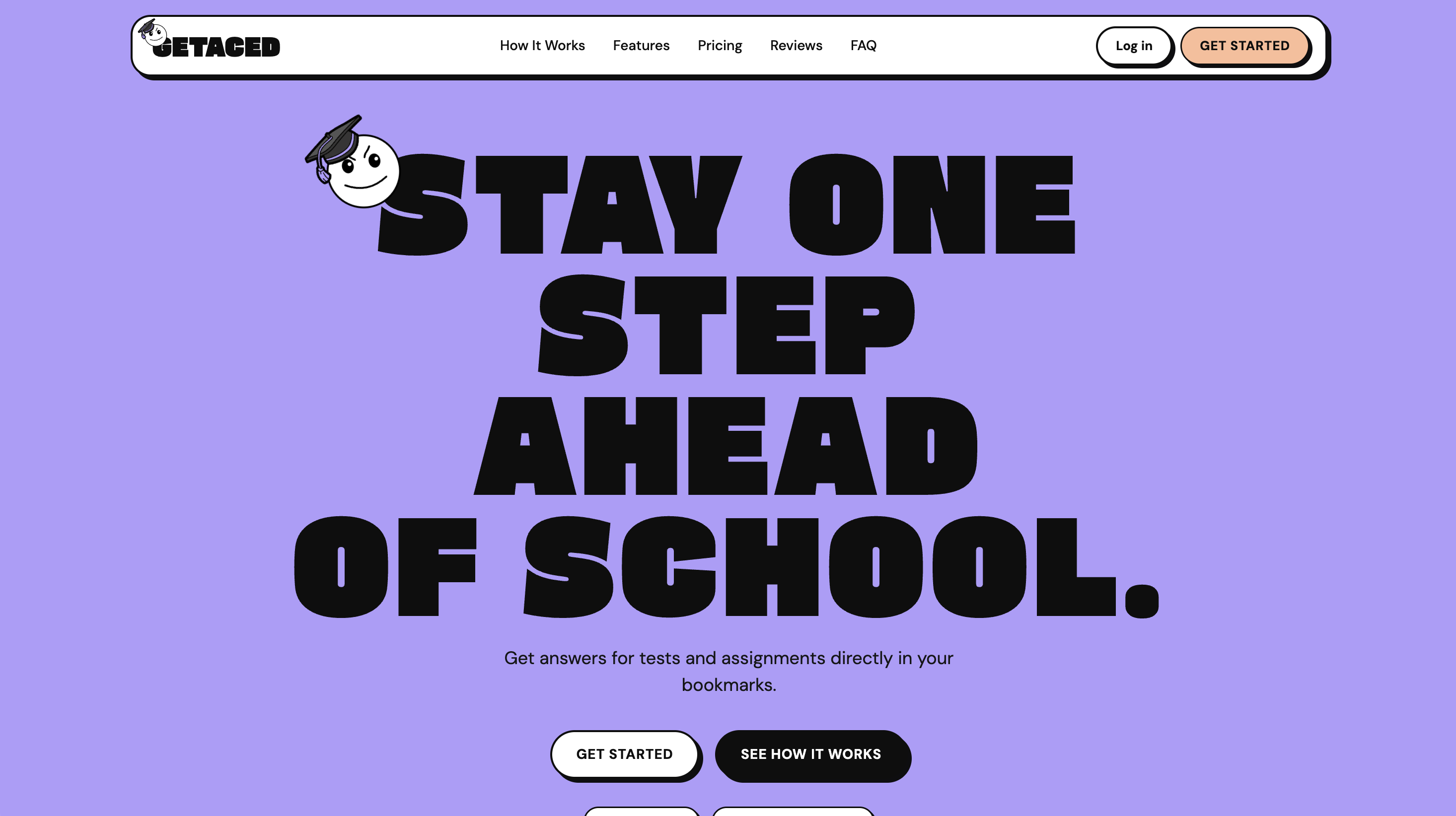
Marketing hero
We opened the story with a new logo lockup and a hero that reads in seconds on a phone: one clear promise, one primary CTA, and brand color used sparingly so stress-prone students get calm, not hype.
That decision set the visual language for every section that follows—type scale, spacing rhythm, and how color signals urgency only when it should.
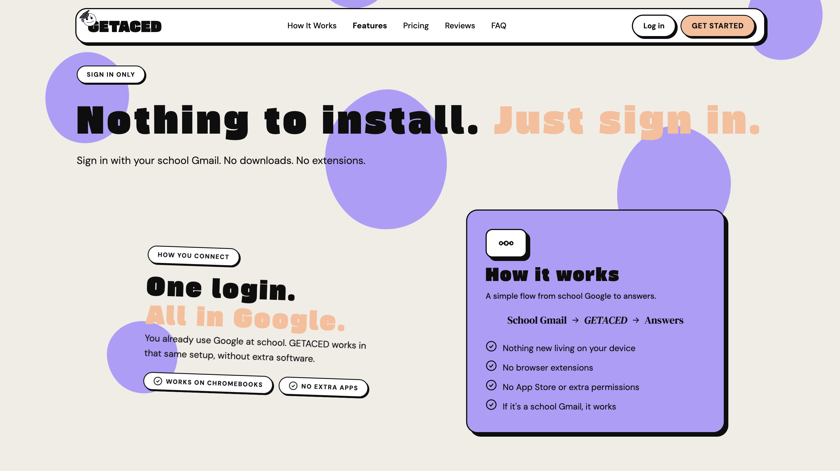
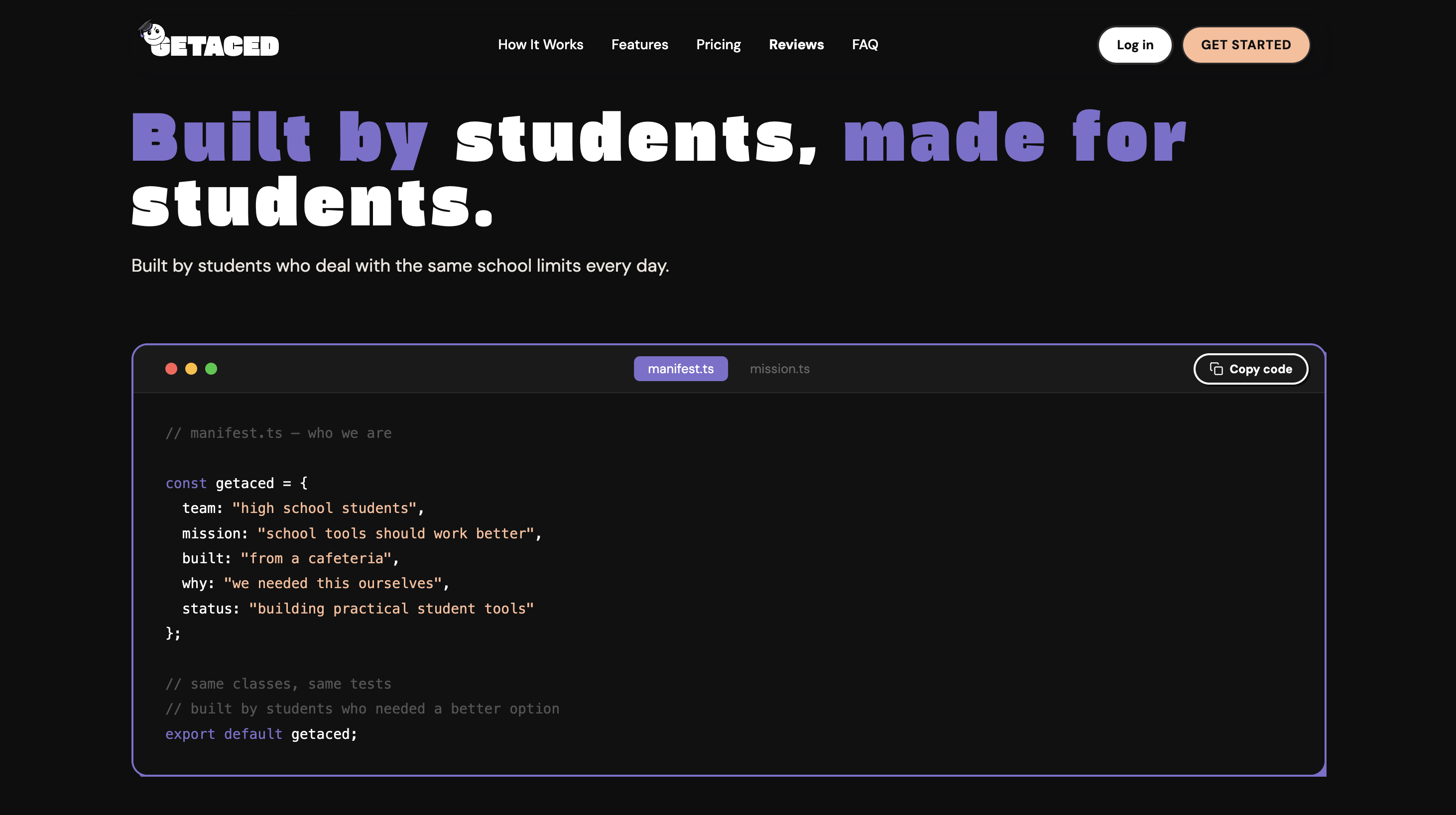
Story & proof bands
Two mid-page blocks run side by side on desktop: the first grounds what GETACED does day to day; the second carries proof points and language from how students actually work between classes.
Typography and section rhythm follow one brand flow so the page feels authored, not templated—and the layout still stacks cleanly on narrow screens.
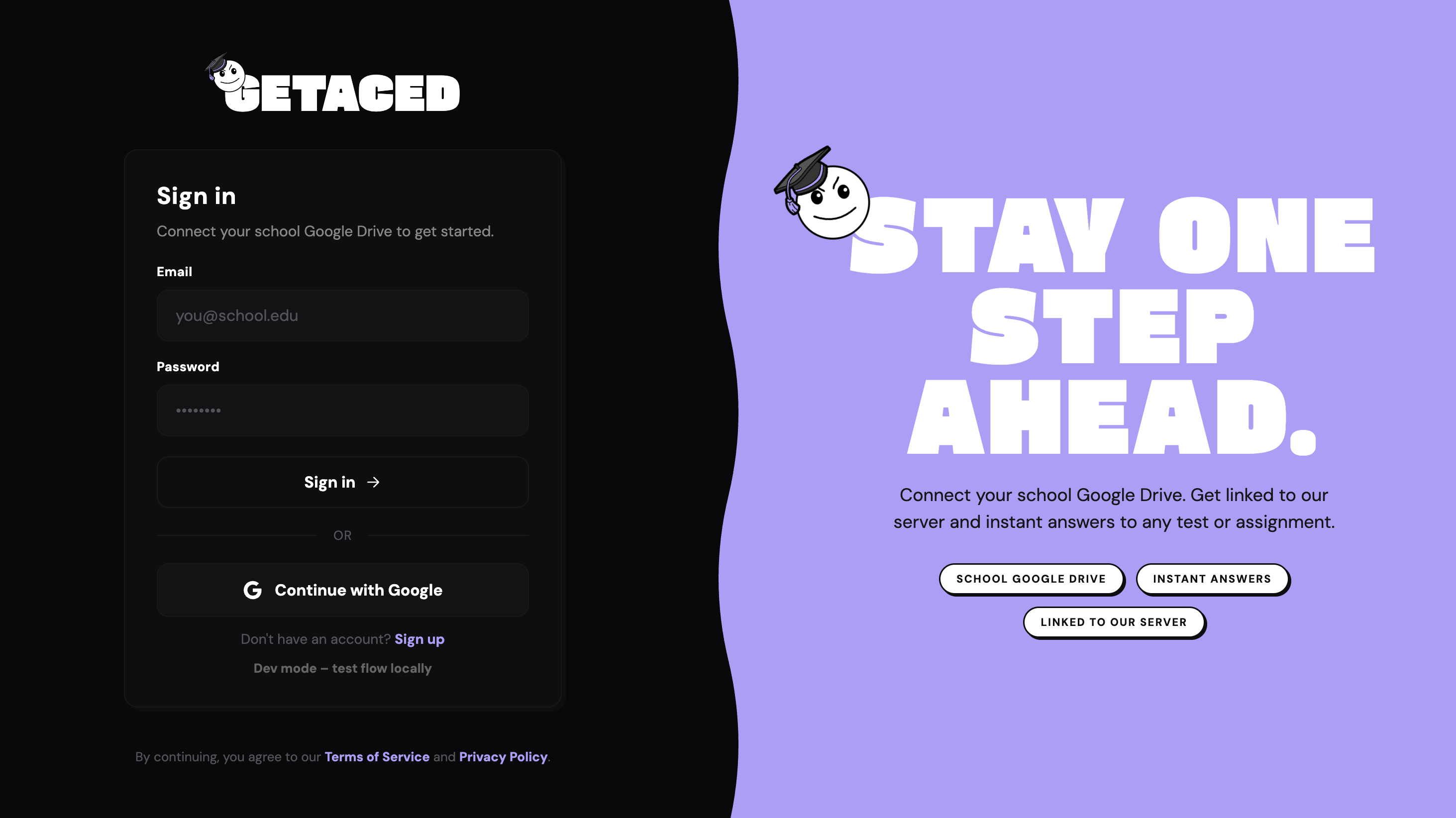
Auth & trust
Register and sign-in share one quiet layout: obvious errors, no dark patterns, and fields ordered the way people expect when they are already stressed about deadlines.
We aligned labels and validation copy with what the backend enforces so the form does not lie—fewer dead ends once traffic hits support.
Plans & commercial story
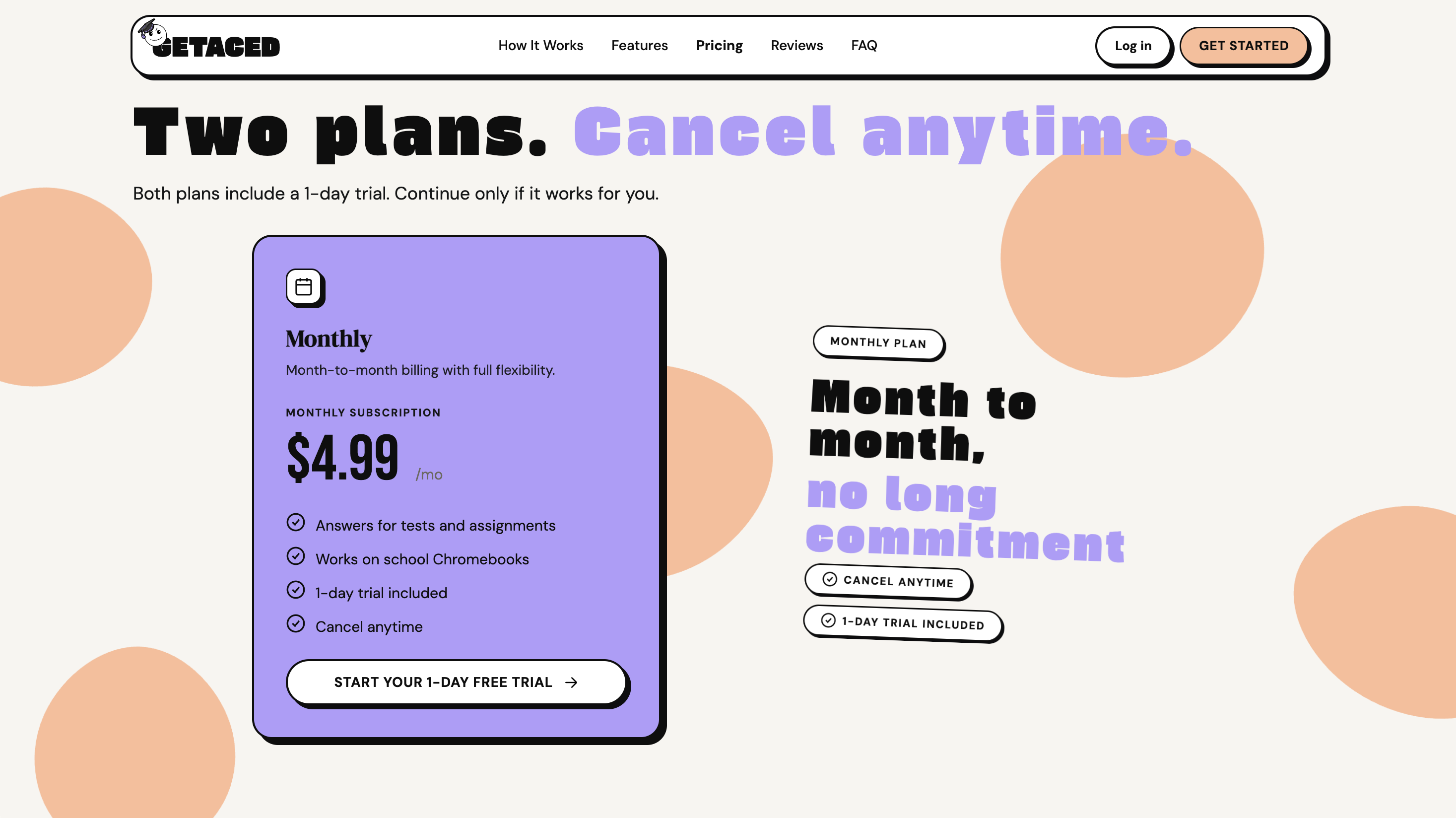
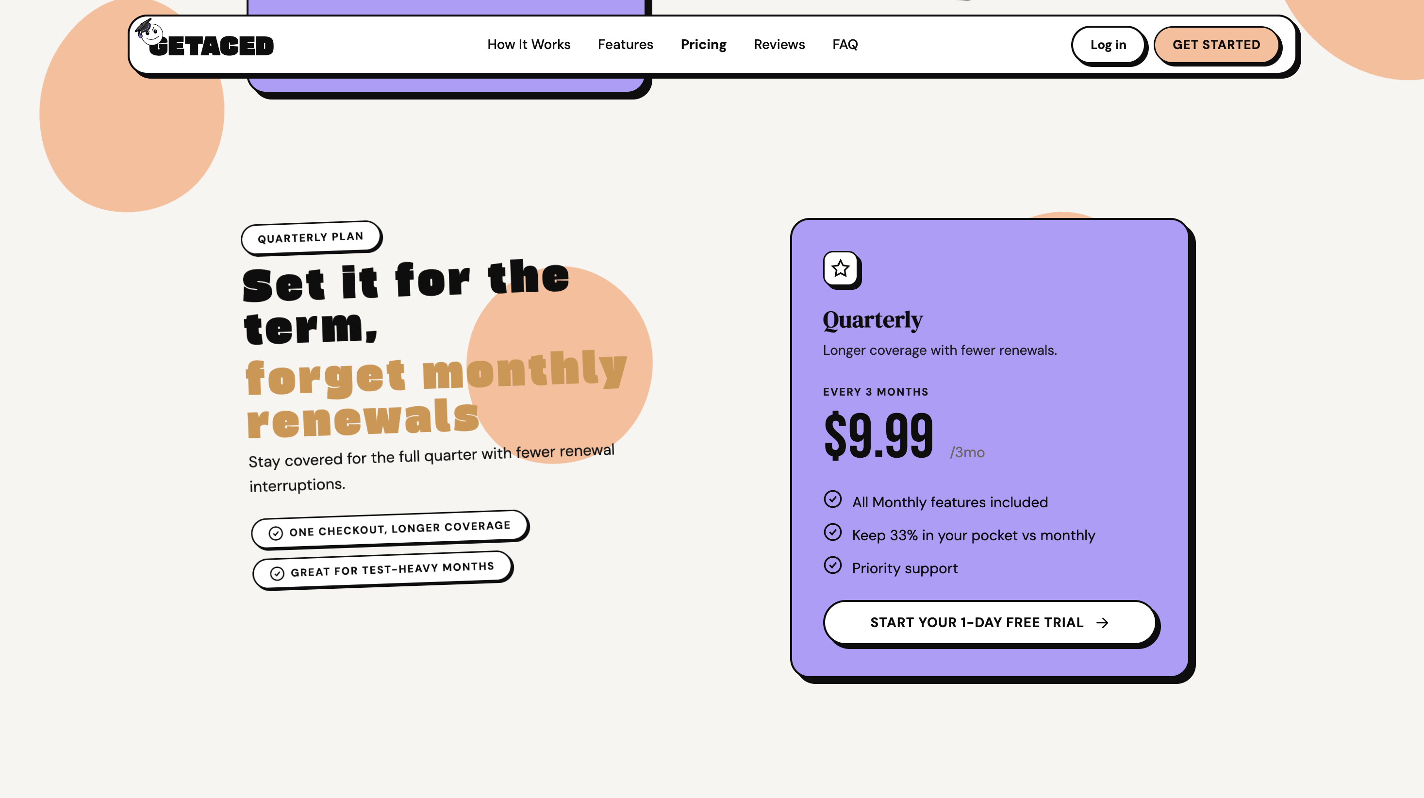
Pricing spans two composed widths so we could show comparison and fine print without an endless vertical scroll on desktop.
Each tier maps to real Creem products we configured later—what you read here is the same commercial story the app and checkout honor at runtime.
Social proof
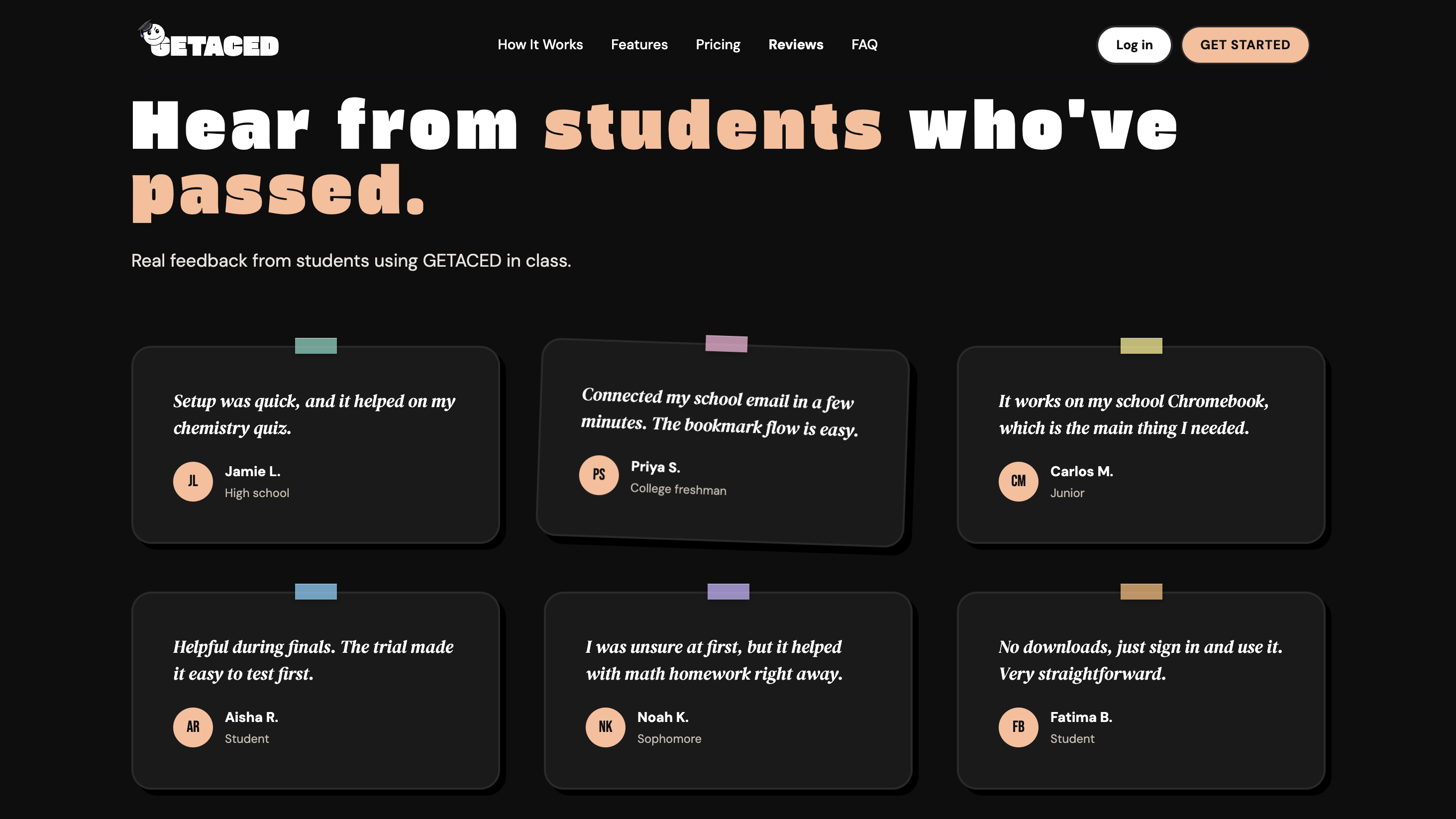
Reviews sit in a dedicated band tuned for skimming quotes, names, and star signals without turning the page into a wall of testimonials.
Branding stays minimal so peer proof reads authentic—especially for students (and parents) comparing tools in one tab while homework waits in another.
FAQ & objections
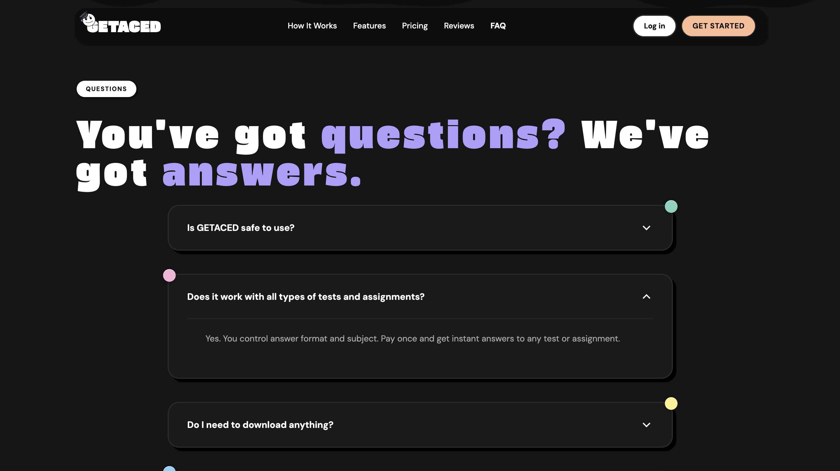
We grouped questions the way they show up in real chat: billing, privacy, what happens after cancel, and how fast someone gets a human if they are stuck.
Short answers and clear next steps reduce pre-sale friction and keep post-signup expectations aligned with how the product actually behaves.
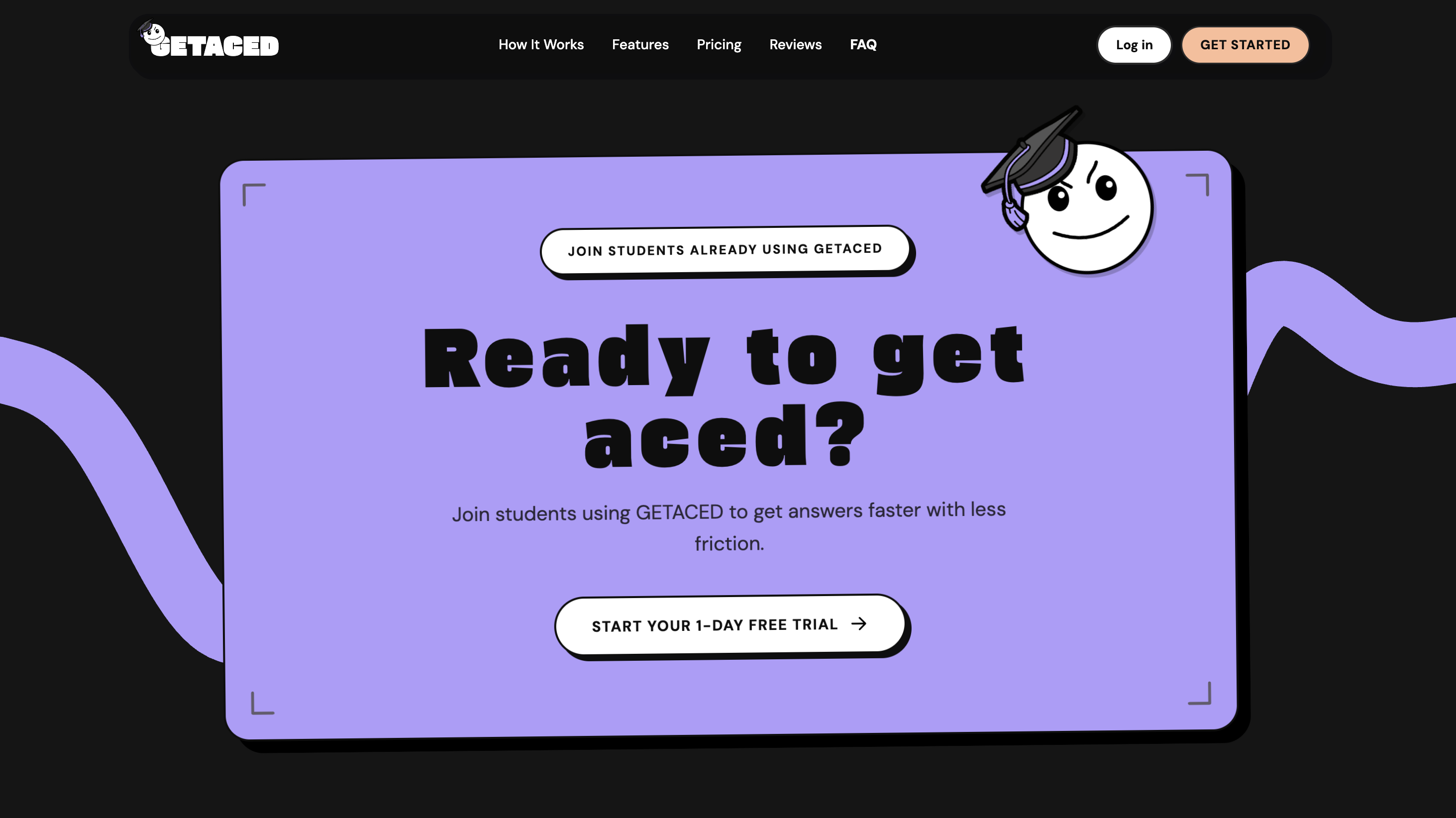
Closing conversion
The final CTA repeats the promise with less chrome: one decision, one button, and enough context to click with confidence instead of hesitation.
Copy and hierarchy mirror the in-app upgrade moments so marketing language and product language stay one continuous story.
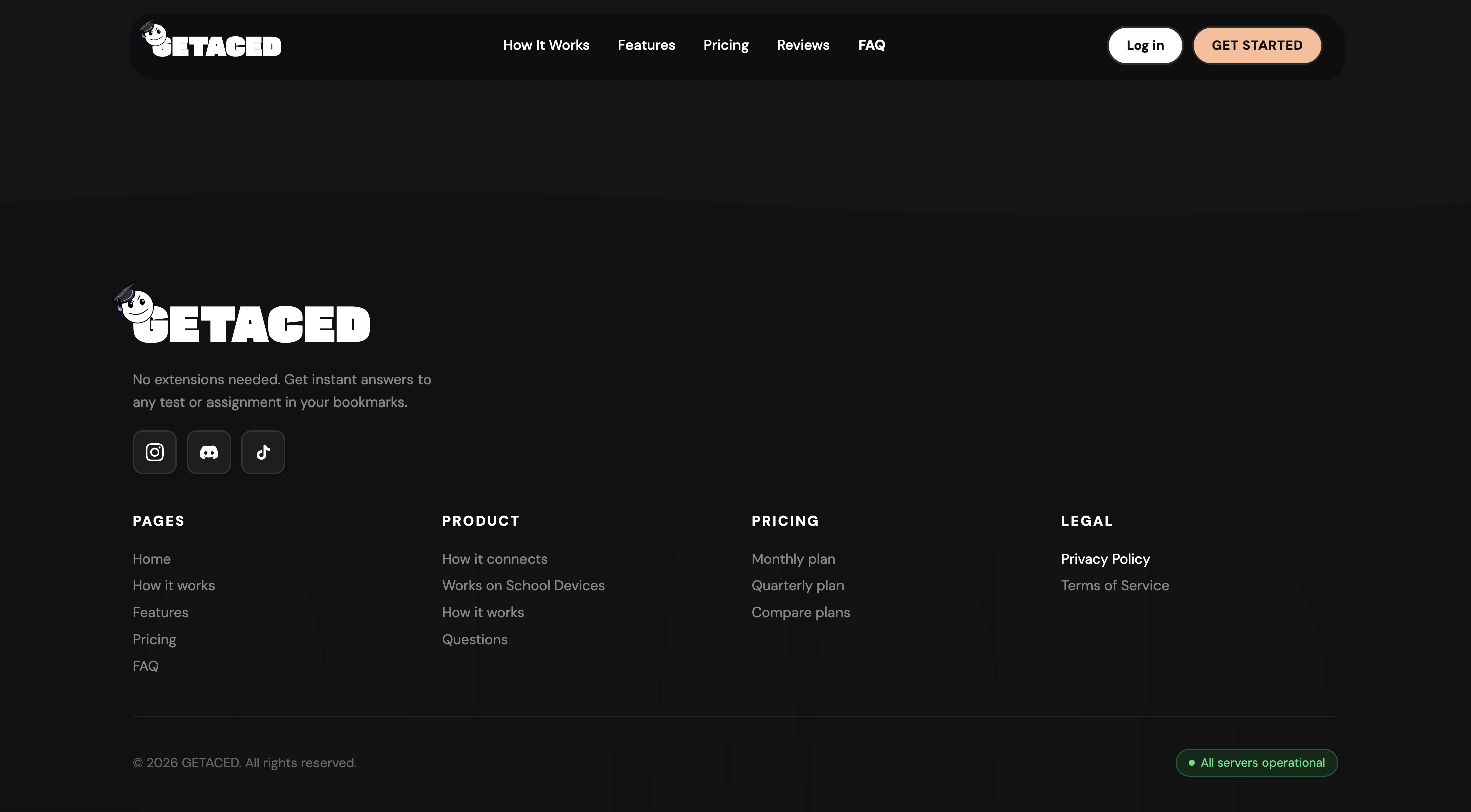
Footer & infrastructure
The footer carries navigation, the mark, and the boring-but-critical links—privacy, terms, contact—so trust and compliance are always one click away.
Behind the scenes, domain and DNS plus Cloudflare keep TLS and caching consistent with how we ship the authenticated app—not two different worlds.
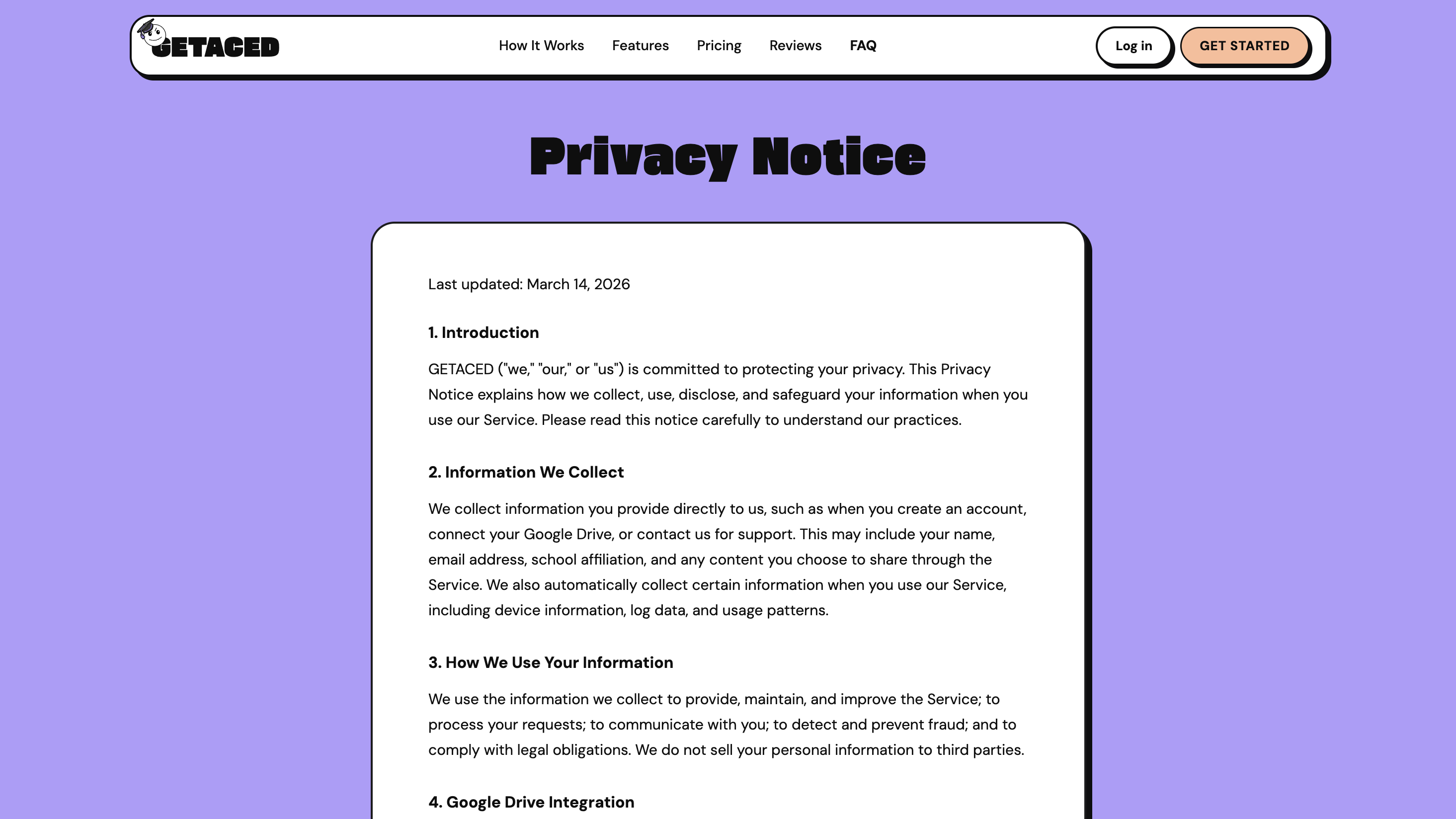
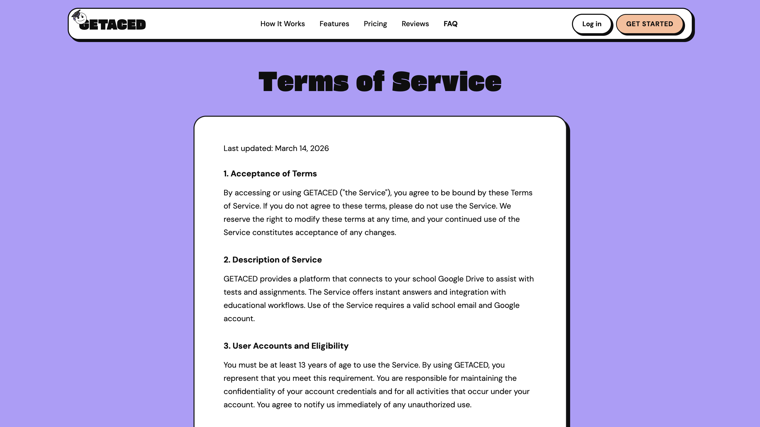
Legal & expectations
Privacy and terms are full pages, not footnote PDFs: readable type, clear sections, and language matched to what we collect and how Creem handles money.
That tone supports school-adjacent audiences and sets expectations before anyone connects an account or enters a card.
Product dashboard
Inside the app we carried the same brand flow into dense student workflows: home, customization, onboarding, billing, and history. UI and UX stay quiet so deadlines and status read first—states, empty screens, and paywalls are designed, not improvised.
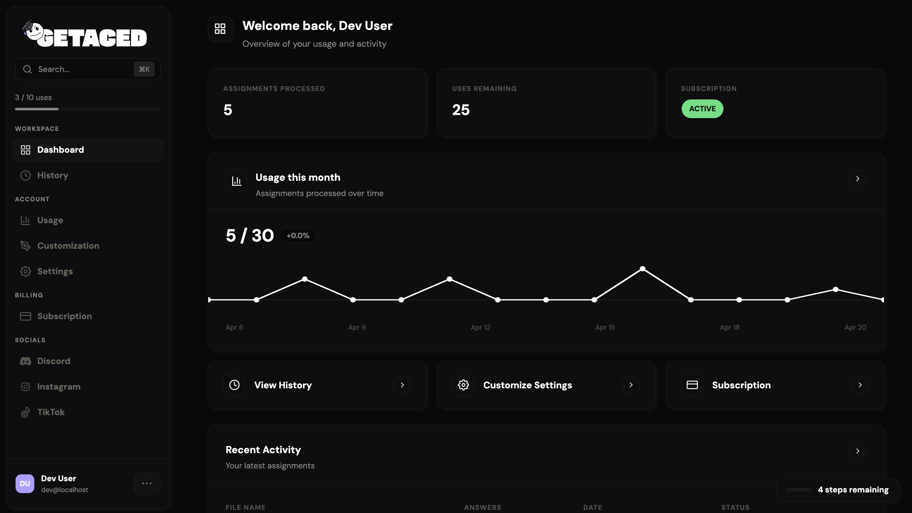
Home & overview
The signed-in home is the operational hub: upcoming work, progress, and obvious entry points into the rest of the product without a tutorial wall.
Layout and type reuse the marketing scale so the handoff from landing page to app feels invisible—same voice, different job to be done.
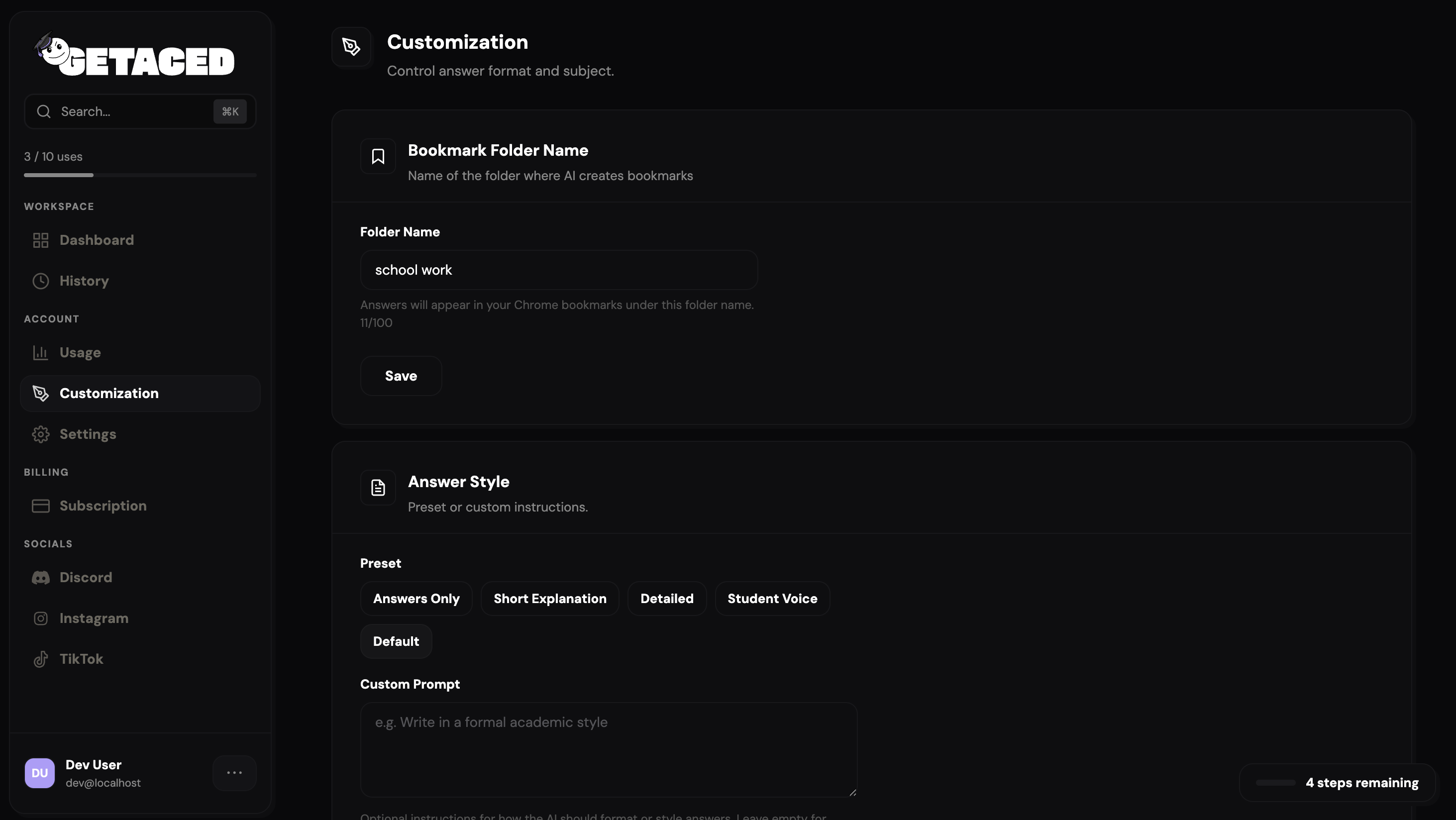
Preferences & control
Students tune notifications, subjects, and defaults without wading through engineer-facing toggles or mystery toggles.
Common choices stay fast at the top; advanced options stay discoverable but out of the way so the screen does not punish curious users.
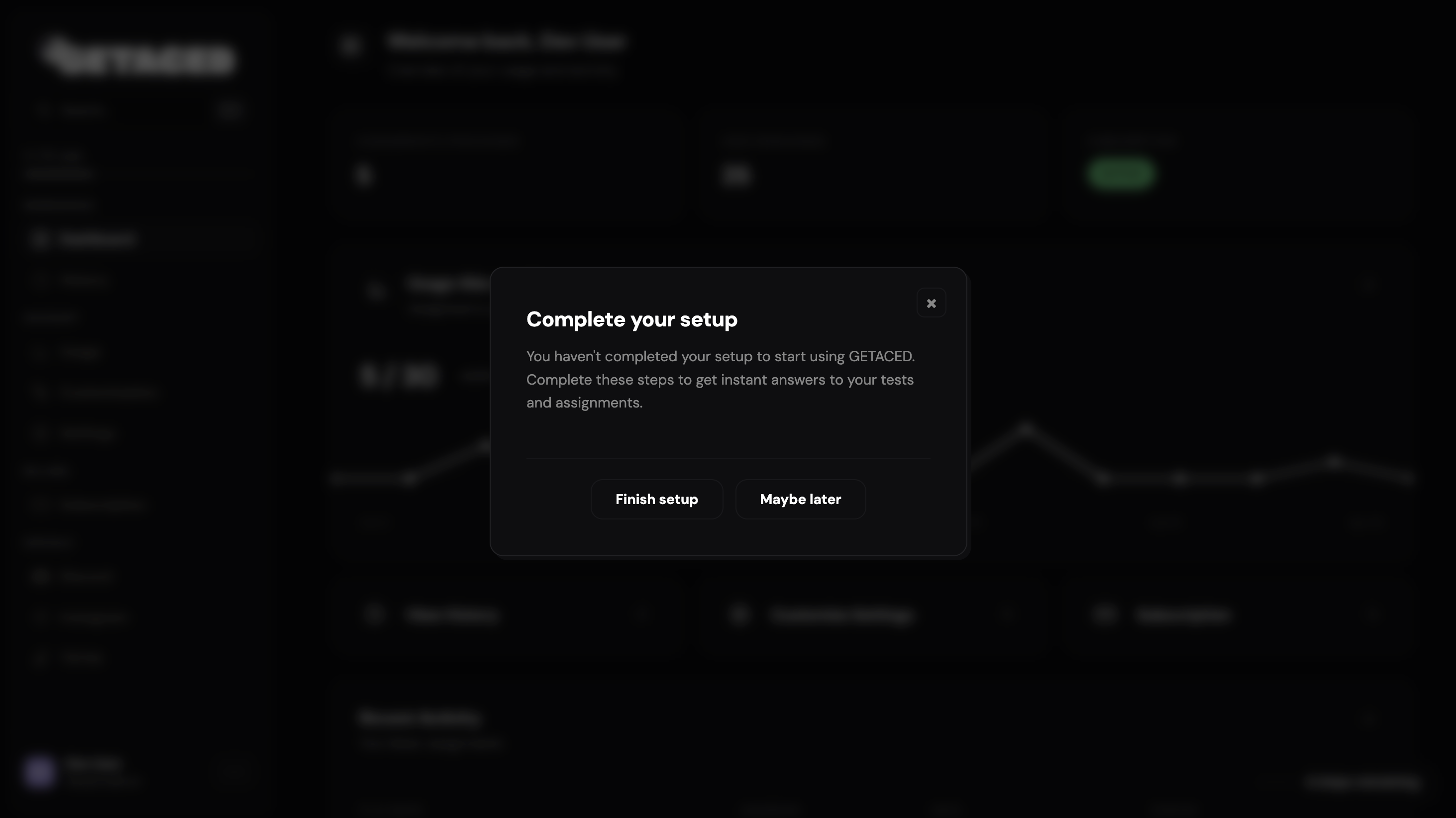
First-run onboarding
First-run guidance lives in a modal layer so people can finish setup, skip, and return later without getting stranded on a one-way tour.
The backend records completion so prompts stay relevant instead of nagging on every visit once someone has already invested thirty seconds.
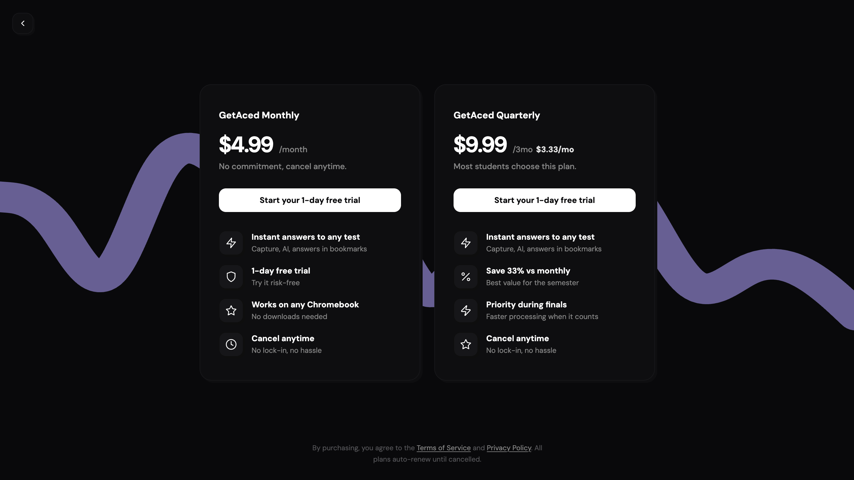
Paywall & checkout handoff
The paywall spells out what unlocks in plain language, then routes into Creem-hosted checkout so sensitive card handling stays off our origin where possible.
Frontend states cover loading, success, and failure so nobody stares at a spinner wondering whether their card was charged.
Activity & receipts
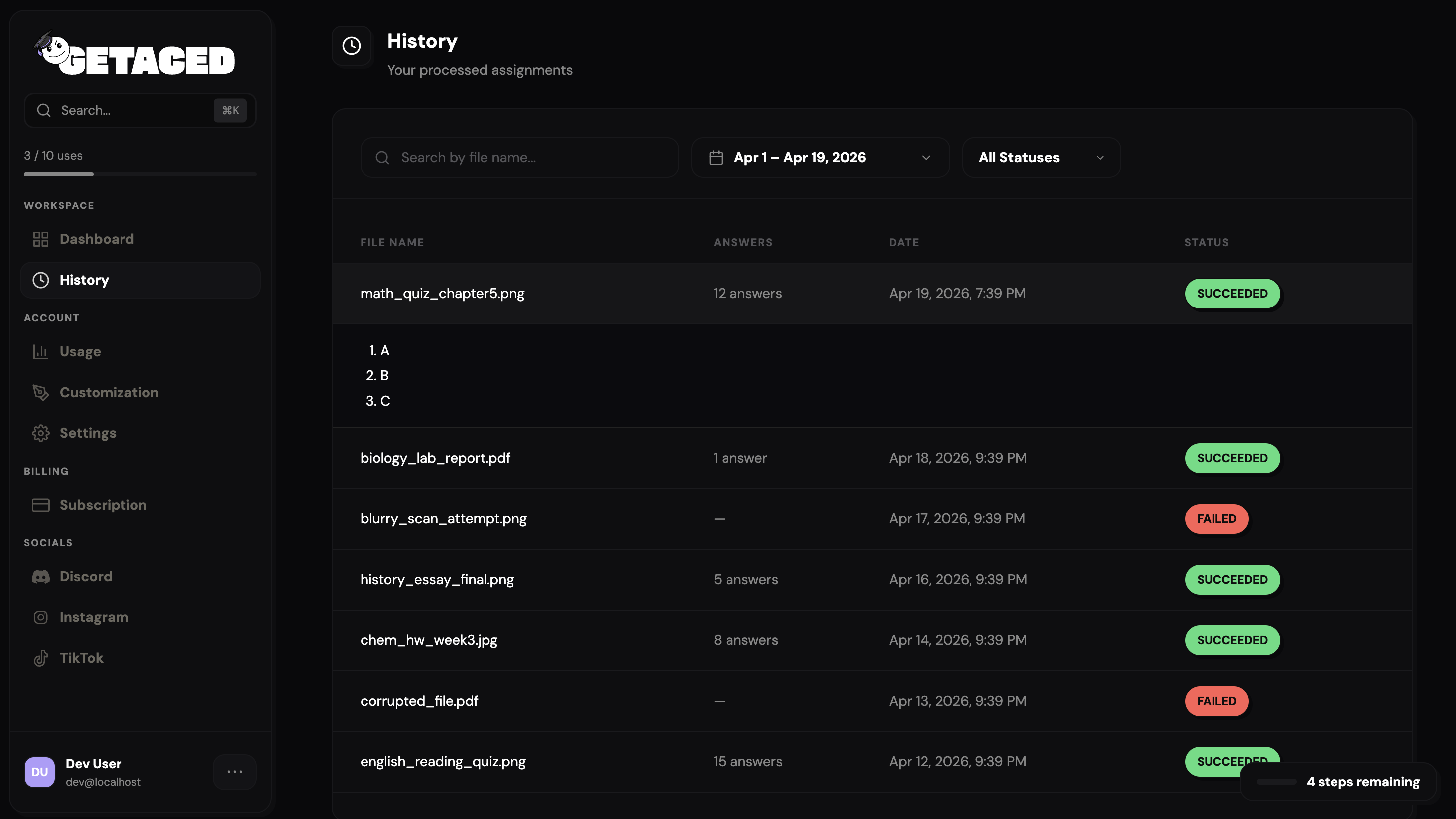
History lists sessions, edits, and payment events so students can self-serve when something looks wrong instead of opening a ticket first.
Rows are tuned for scan on small screens; detail panels drill in without losing context—useful when a parent asks what a charge was for.
Creem.io & monetization
We configured Creem end to end: products and pricing, branded checkout banner and logo, success and cancel redirects, webhooks, and API keys scoped for production and test. That ties the Next.js frontend and backend to real entitlements—subscriptions renew, cancellations reconcile, and the app never trusts the client for paid access.
Products & checkout brand
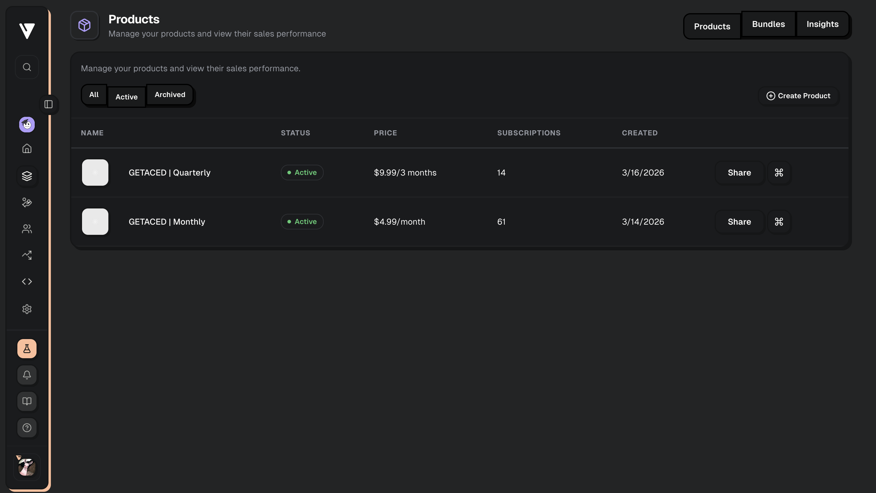
We defined products, prices, and trial behavior in Creem to match what the marketing site promises—no accidental mismatch between copy and entitlements.
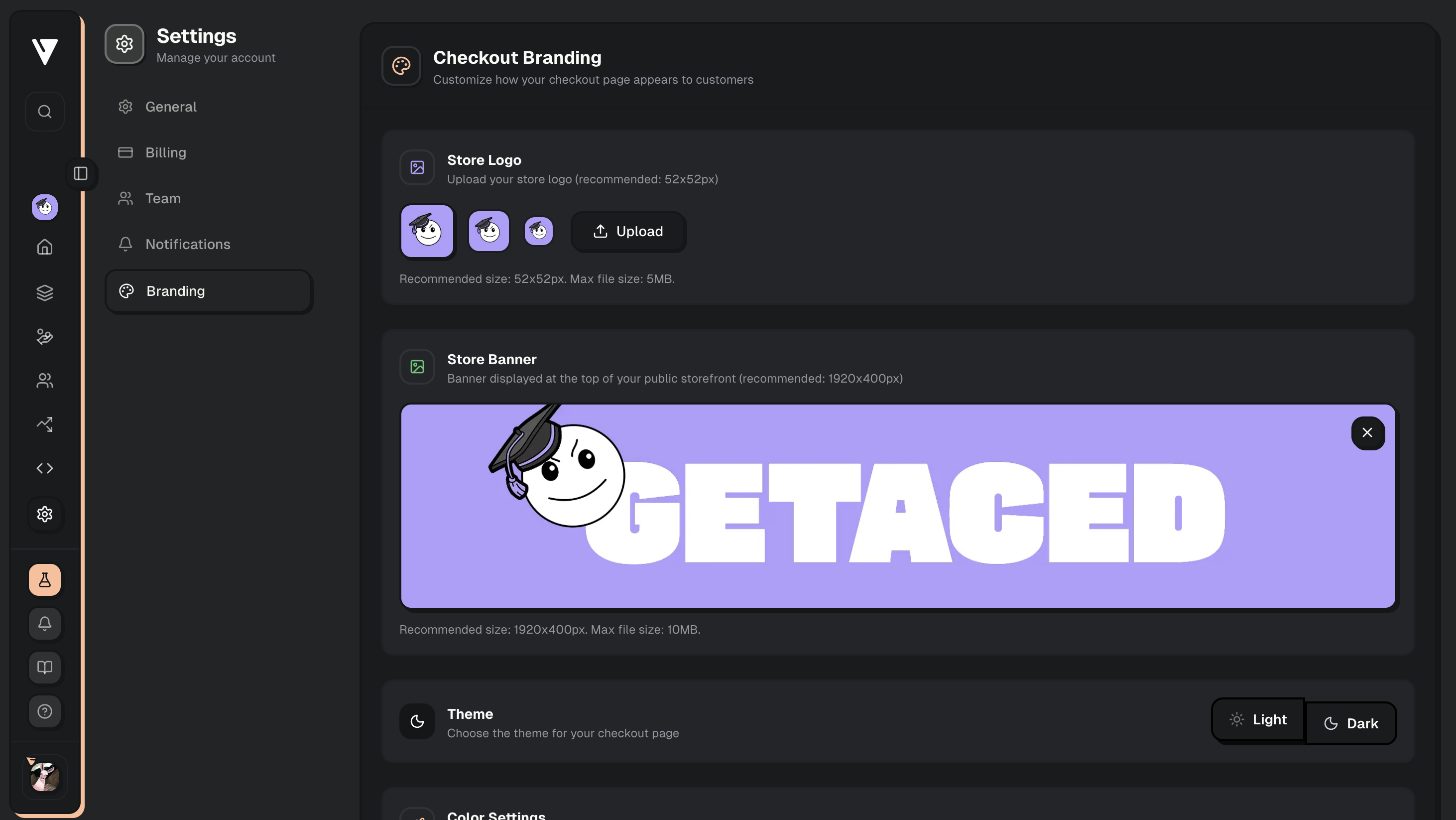
Checkout branding—banner, logo, and colors—keeps the payment step feeling like GETACED, which is one of the quietest ways to reduce drop-off.
Redirects & webhooks
Success and cancel URLs return people to deterministic routes inside the app so deep links and analytics stay honest after a payment attempt.
Webhooks hit our API over HTTPS only; we verify signatures, process events idempotently, and reconcile Creem’s subscription state with our database—never the other way around.
Keys, environments, security
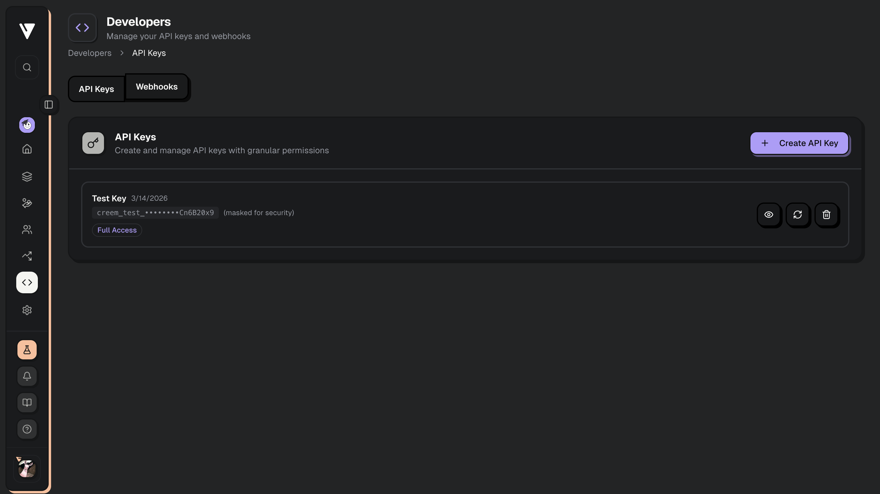
Test and live keys stay separate in configuration so a staging experiment never mutates production money by accident.
Cloudflare in front of the public app plus server-side entitlement checks, rotation-friendly secrets, and sensible rate limits close the loop on a student-grade security posture.
Strategy
We started with mark and brand direction, then a disciplined brand flow across every touchpoint: hero, pricing, proof, FAQ, and legal pages that answer real student and parent questions. Domain and DNS were set up for a clean apex and www story, with Cloudflare in front for caching, TLS, and baseline hardening so the marketing surface stays fast under traffic spikes.
Design
UI and UX balance reassurance with velocity—large type where it matters, generous rhythm on long reads, and dashboard layouts that keep coursework legible on a phone between classes. Components share one spacing and type scale so onboarding, customization, and paywalls feel like one product, not bolted-on screens.
Results
The stack is a real SaaS spine: Next.js and React on the frontend, authenticated APIs and persistence on the backend, and Creem for subscriptions and one-offs with server-verified webhooks—never trusting the browser for entitlements. Keys are environment-scoped, redirects are explicit, and Cloudflare plus sensible headers close the loop on transport and edge policy so checkout and account data meet student-grade expectations.